ListBox Overview
The ListBox component is a UI element that displays lists of items within a box and provides a number of interactive features. Users can select, reorder, and delete items directly within the ListBox. Its flexibility extends to the seamless transfer of list items between multiple list boxes, making it an invaluable asset for efficient data list management and organization.
Live Demo
Appearance
The ListBox provides built-in styling options that grant visually appealing and flexible rendering experience.
Apart from the default vision of the Telerik and Kendo UI ListBox, the component supports alternative styling options that enable you to configure the individual aspects of its appearance.
States
Depending on the action you want to imply through its appearance, the Telerik and Kendo UI ListBox can acquire the following states which you can set by using the following classes:
- A ListBox in its normal state appears active, and is usable and clickable.
k-disabled—The disabled state indicates that a ListBox is temporarily unclickable and users cannot interact with it. To indicate that they are unavailable, ListBoxes in their disabled state are usually faded and slightly out of focus.
Anatomy
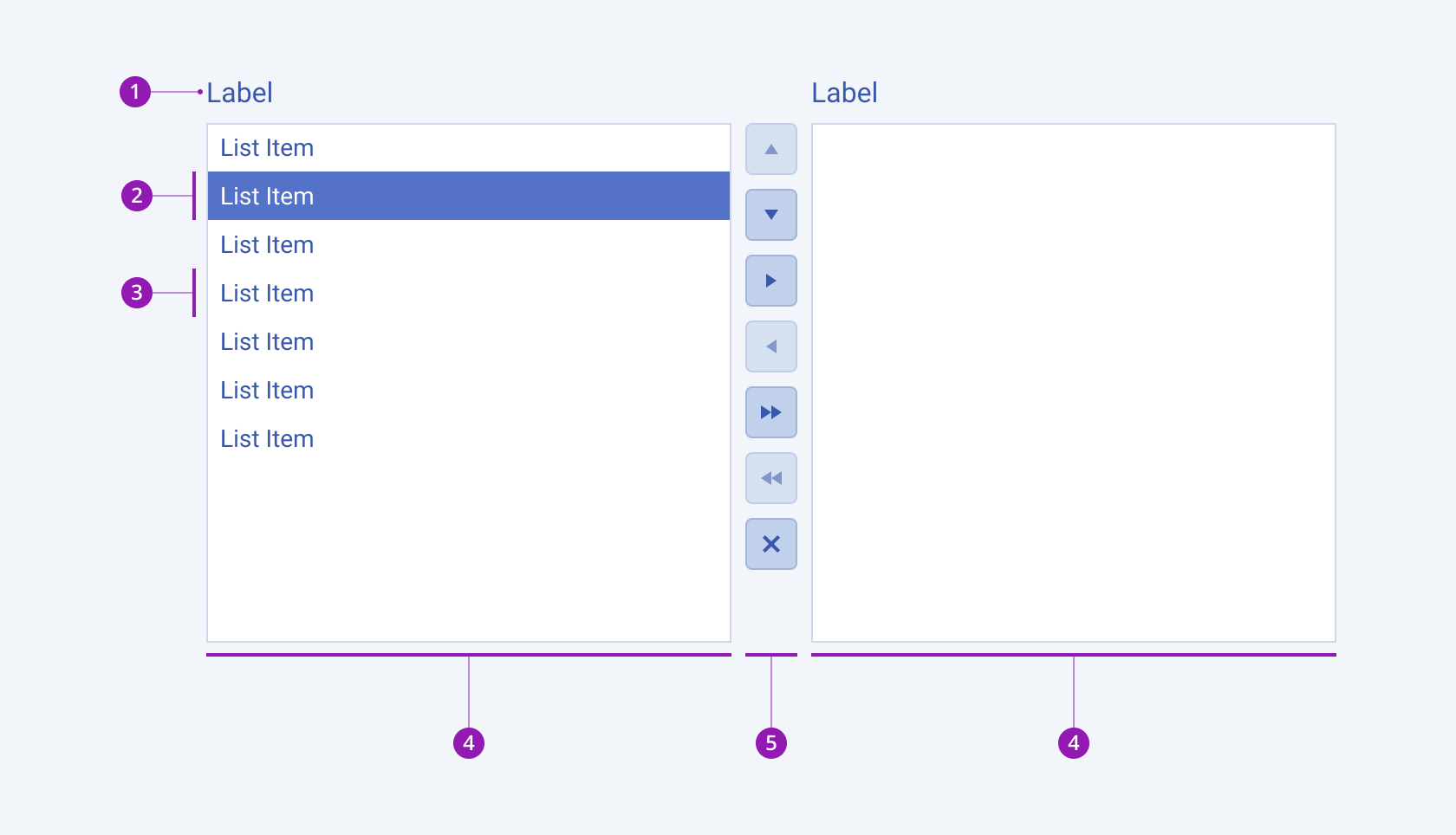
The anatomy of the ListBox summarizes the visual and functional elements of the component:

- Label
- Selected list item
- List item
- ListBox content
- ListBox action buttons
Variants
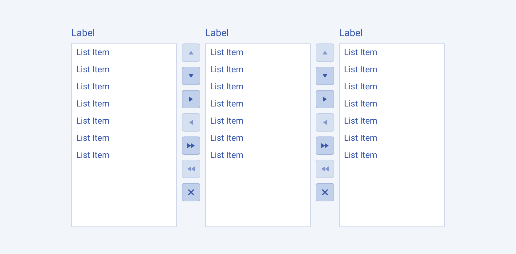
The Telerik and Kendo UI ListBox component can also display multiple lists to allow broader usage scenarios, where a list item can be moved between different states or categories:

Size
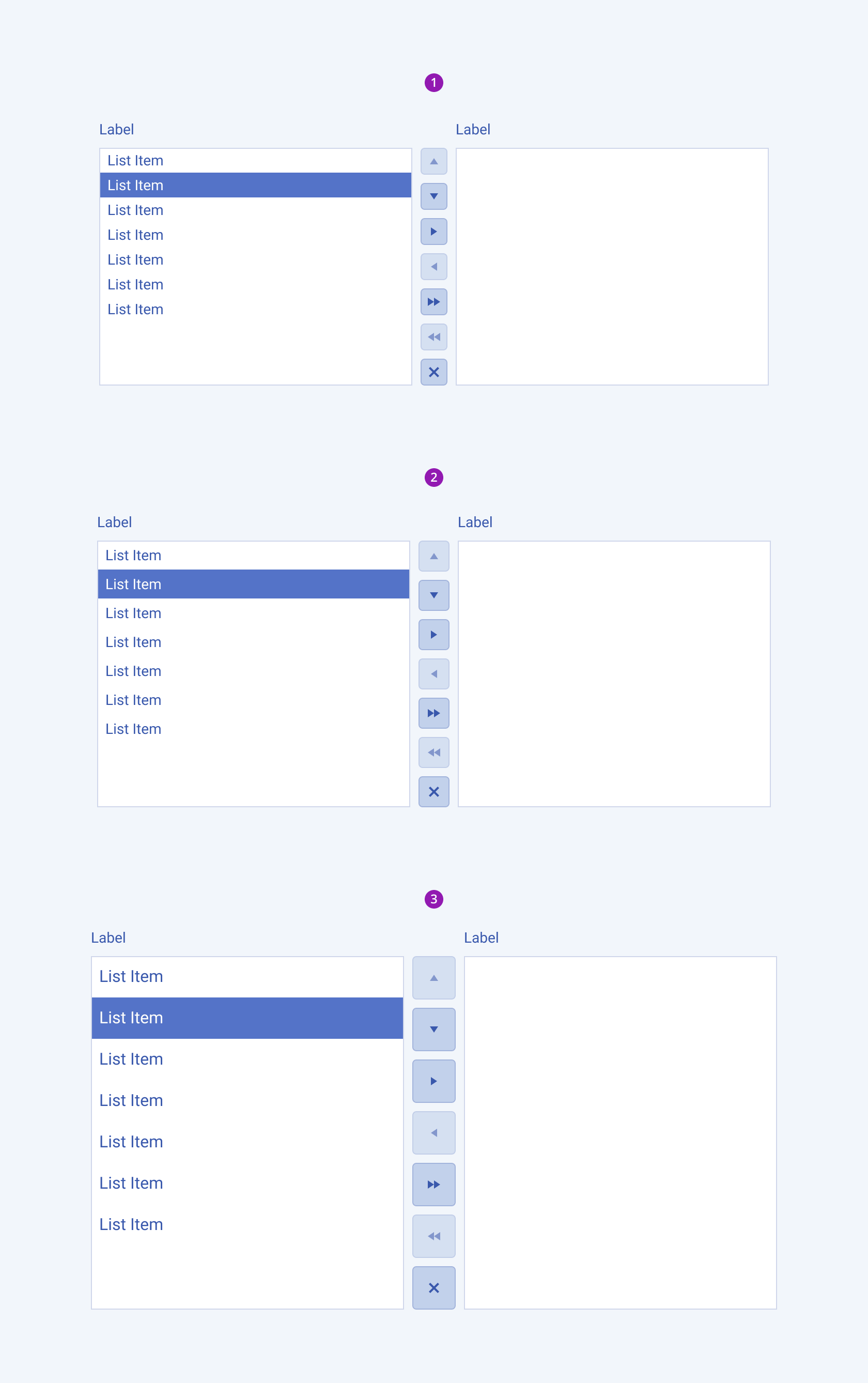
The ListBox provides the size configuration option that enables you to control how big or small the rendered ListBox will be. ListBoxes also provide options for size customization.
size provides the following available options:
small—Renders a small ListBox.medium(default)—Renders a medium ListBox.large—Renders a large ListBox.

- Small
- Medium
- Large
Framework-Specific Documentation
For the framework-specific information about the UI components, refer to the respective product documentation:


