MultiSelect Overview
A Multiselect is a user interface (UI) element that allows users to select multiple options from a dropdown list, enabling users to make multiple selections quickly and easily. The control displays the selected options as individual "chips", making it easy for users to see and manage their selections.
Live Demo
Appearance
MultiSelects provide built-in styling options that grant visually appealing and flexible rendering experience.
Apart from the default vision of the Telerik and Kendo UI MultiSelect, the component supports alternative styling options which enable you to configure the individual aspects of its appearance.
States
Depending on the action you want to imply through its appearance, the Telerik and Kendo UI MultiSelect can acquire the following states which you can set by using the following classes:
- A MultiSelect in its normal state has not been interacted with by the user. The control displays each of its currently selected items as a separate "chip".
k-hover—Тhe hover state of a MultiSelect is applied after the user hovers over the component. When in its hover state, the component is interactive and the user can click on it to open the drop-down list.k-focus—The focus state is triggered after the user clicks or tabs into the Multiselect. When in its focus state, the component is active, ready to receive user selection, and renders a visual indicator, for example, a highlighted border.k-invalid—The invalid state of the MultiSelect is triggered when the user input or selection result in an error. When in its invalid state, the component renders a visual indicator, for example, a red border, and a validation icon which indicates the input or selection issue.k-disabled—The disabled state indicates that a MultiSelect is temporarily unclickable and users cannot interact with it. To indicate that they are unavailable, MultiSelects in their disabled state are usually faded and slightly out of focus.
Anatomy
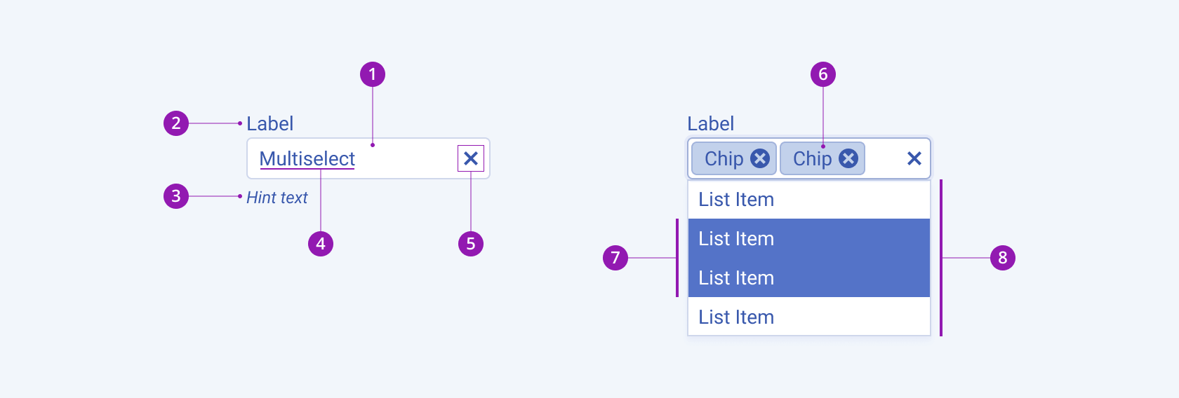
The anatomy of the MultiSelect summarizes the visual and functional elements of the component, including a container with an icon button, where the user can click to select an item from a drop-down list. The currently selected item is displayed as text within the component. When the component is used as part of a Form component, the label and hint texts are optional.
The next image shows the anatomy of a MultiSelect and includes the following elements:

- Input field
- Label (optional in Form components)
- Hint text (optional in Form components)
- Placeholder or preselected value
- Clear icon
- Chip
- Selected items
- Drop-down list
Size
The MultiSelect provides the size configuration option that enables you to control how big or small the rendered MultiSelect will be. MultiSelects also provide options for size customization.
size provides the following available options:
small—Renders small multi-select list boxes, which are suitable for compact components, such as Toolbars, where the available space is limited.medium(default)—Renders medium multi-select list boxes.large—Renders large multi-select list boxes, which are suitable for adaptive designs.none—Does not set asizeand allows you to add your own, custom value.

- Small
- Medium (default)
- Large
Fill Mode
The MultiSelect provides the fillMode configuration option that enables you to control the way in which color is applied to the rendered MultiSelect. MultiSelects also provide options for fill-mode customization.
fillMode provides the following available options:
solid(default)—A solid multi-select list box puts stronger emphasis on the action it indicates and draws the attention of users. Also, the solid fill mode is the traditional and common style that is widely used.outline—An outline multi-select list box provides a minimalistic look, and can be a good choice when you want the component to blend in with the background or other UI elements.flat—A flat multi-select list box provides a very minimalistic and clean look, and can be a good choice when you want the component to be unobtrusive with the background or other UI elements.

- Solid (default)
- Outline
- Flat
Border Radius
The MultiSelect provides the rounded option that enables you to control how much border radius will apply to the rendered MultiSelect. MultiSelects also provide options for border-radius customization.
rounded provides the following available options:
small—Renders a border radius of 2 px.medium(default)—Renders a border radius of 4 px.large—Renders a border radius of 6 px.full—Renders a border radius of 9999 px.none—Does not set aroundedand allows you to add your own, custom value.

- Small
- Medium (default)
- Large
- Full
Framework-Specific Documentation
For specific information about the component, refer to its official product documentation:


