Upload Overview
An Upload is a user interface (UI) element that enables users to select and upload files from their devices to dedicated server handlers in a controlled way. Once selected, the files are sent to the server through a request.
The Upload is rarely used as a standalone component, it is mostly used in forms where uploading a file is necessary. By default, the selected files are uploaded immediately. However, if you set the autoUpload option of the component to false, the upload will occur only when explicitly confirmed by the user through a button click.
Live Demo
Appearance
Uploads provide built-in styling options that grant visually appealing and flexible rendering experience.
States
Depending on the action you want to imply through its appearance, the Telerik and Kendo UI Upload can acquire the following states which you can set by using the following classes:
- An Upload in its normal state appears active, and is usable and clickable.
k-disabled—The disabled state indicates that an Upload is temporarily unclickable because, for example, the page requires additional user input, or something important is missing before users continue to the next step. To indicate that they are unavailable, Uploads in their disabled state are usually faded, slightly out of focus, and show a subdued text label.
The Upload handlers have their own states that are independent of the states of the Upload component itself:
k-file-invalid—The invalid state of the Upload handler indicates that the uploaded file did not meet the requirements, such as file format or size.k-file-success—The success state of the Upload handler indicates that the file is successfully uploaded and sent to the server.k-file-focus—The focus state of the Upload handler is triggered when the user navigates to the component by keyboard, voice, or mouse click.
Anatomy
The anatomy of the Upload summarizes the elements of the component.
Depending on the elements they display, the Telerik and Kendo UI Uploads can be any of the following types:
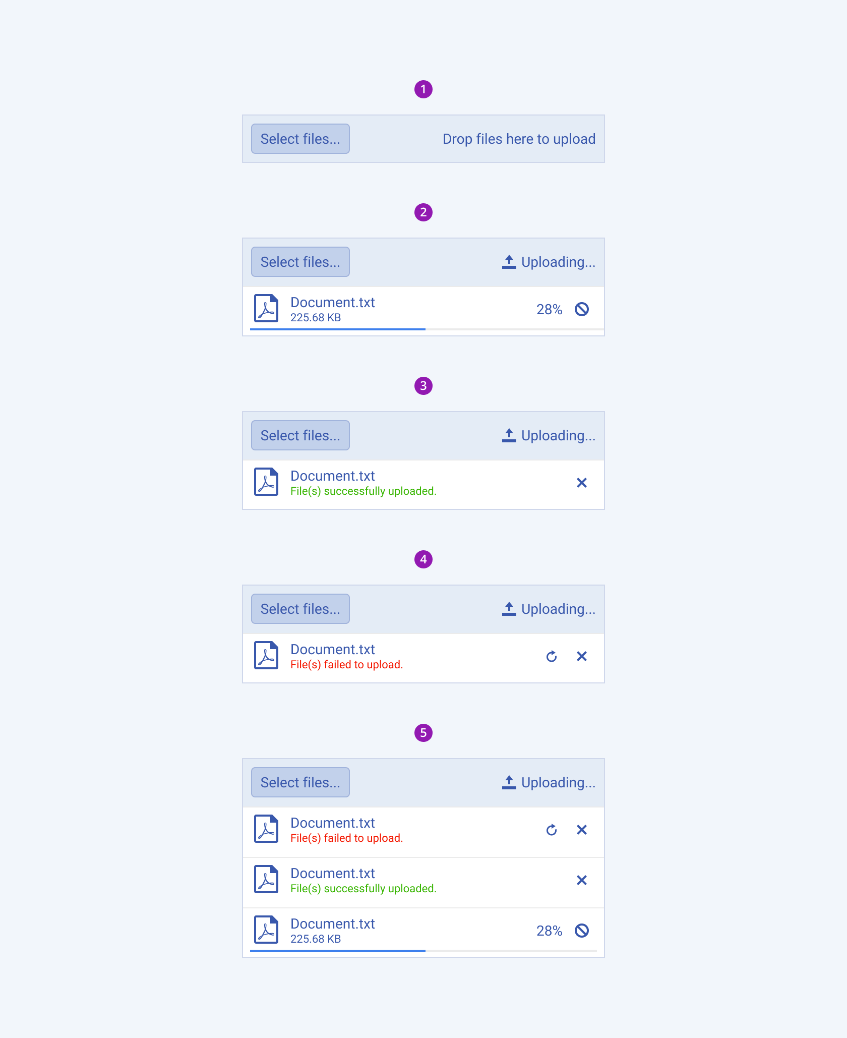
- No file uploaded—The Upload displays only a dropzone with an upload button.
- Uploading file—The Upload renders not only a dropzone with upload status, but also a separate file handler with file information, ProgressBar, progress indicator and cancel button.
- Successfully uploaded file—The Upload renders not only a dropzone with upload status, but also a separate file handler with file information and a remove button.
- Failed to upload file—The Upload renders not only a dropzone with upload status, but also a separate file handler with file information and reset and remove buttons.
- Multiple files uploaded—The Upload renders not only a dropzone with upload status, but also a separate file handler for each uploaded file.

- Dropzone
- Upload with an uploading file
- Upload with a successfully uploaded file
- Upload with a file failed to upload
- Upload with multiple files
The next image shows the anatomy of an Upload component with loaded files and includes the following elements:

- Dropzone - contains an upload button and upload status and supports the drag and drop functionality.
- Upload button - opens a new window with files to load.
- Upload status - indicates the status of the file(s).
- Upload handler - contains file information, ProgressBar, and upload actions.
- File info - contains information about the file format and file size.
- ProgressBar - indicates the speed of the uploading files.
- Upload actions - contains actions such as reset, pause, and remove.
File Processing
The Upload provides configuration options for controlling the way it processes the desired files for upload.
The following file-processing operations are supported:
- Automatic upload of files—By default, the selected files are immediately uploaded. If you set the
autoUploadoption of the component tofalse, the upload will occur only when explicitly confirmed by the user through a button click. - Upload of single or multiple files—The Upload allows the selection of multiple files by default. If you set the
multipleoption of the component tofalse, the selection will be limited to a single file. - Upload of batches of files—The Upload allows handling and uploading the selected files as a single batch.
- Upload of files in chunks—The selected files can be split into chunks and sent to the server asynchronously through multiple requests.
- Sequential Upload—To enable sequential uploading of multiple files, set the
concurrentoption tofalse. In this case, each file upload request will be initiated only after the previous one has finished.
File Restrictions
You can restrict the selected files for upload based on predefined rules for their size and extension:
allowedExtensions?—Defines the list of allowed file extensions. Recognizes entries of both.type(for example,.docx,.png,.svg,.xls, and others) andtype(for example,docx,png,svg,xls, and others) values.maxFileSize?—Defines the maximum file size in bytes.minFileSize?—Defines the minimum file size in bytes.
Framework-Specific Documentation
For specific information about the component, refer to its official product documentation:


