DateRangePicker Overview
The DateRangePicker is a user interface component that enables users to choose a date range either by using a MultiViewCalendar popup or by manually entering start and end dates. It is a crucial element for applications that require users to set specific time periods, such as booking systems, financial platforms, or analytics tools. The component includes linked calendars for an intuitive selection of the range, and it also allows for manual input, providing greater flexibility and ease of use.
Live Demo
Appearance
The DateRangePicker component provides built-in styling options that grant visually appealing and flexible rendering experience.
Apart from the default vision of the Telerik and Kendo UI DateRangePicker, the component supports alternative styling options that enable you to configure the individual aspects of its appearance.
States
Depending on the action you want to imply through its appearance, the Telerik and Kendo UI DateRangePicker can acquire various states which you can set by using the following classes:
- A DateRangePicker in its normal state is fully active, but the user is not interacting with it. This is the default state of the component. It can contain an explanatory placeholder text or an already prefilled text.
k-hover—The hover state of a DateRangePicker is applied when the user hovers over the component but does not click it. The mouse pointer changes to indicate that you can type into the component.k-focus—The focus state of the DateRangePicker is triggered when the user navigates to the component by keyboard, voice, or mouse click. This state highlights the DateRangePicker so that it covers all accessibility requirements.k-invalid—The invalid state of the DateRangePicker indicates that the input validation requirements are not met. The user is notified that the entered data is incorrect and must be revised so that the input operation can complete.k-invalid k-focus—The invalid focus state is a result of spotlighting a DateRangePicker whose value or input type does not pass the validation requirements.k-disabled—The disabled state of the DateRangePicker indicates that the user cannot interact with the component. When disabled, the component has no interactive behavior, it is faded out and slightly out of focus, which helps the user to distinguish it from the active elements on the page.
Anatomy
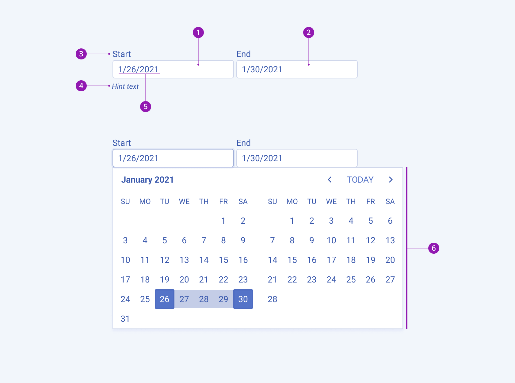
The anatomy of the DateRangePicker summarizes the elements of the component.
The next image shows the anatomy of a DateRangePicker and includes the following elements:

- Start date input field
- End date input field
- Label
- Hint text (optional in Form components)
- Placeholder or preselected value
- Popup with a MultiviewCalendar component
Size
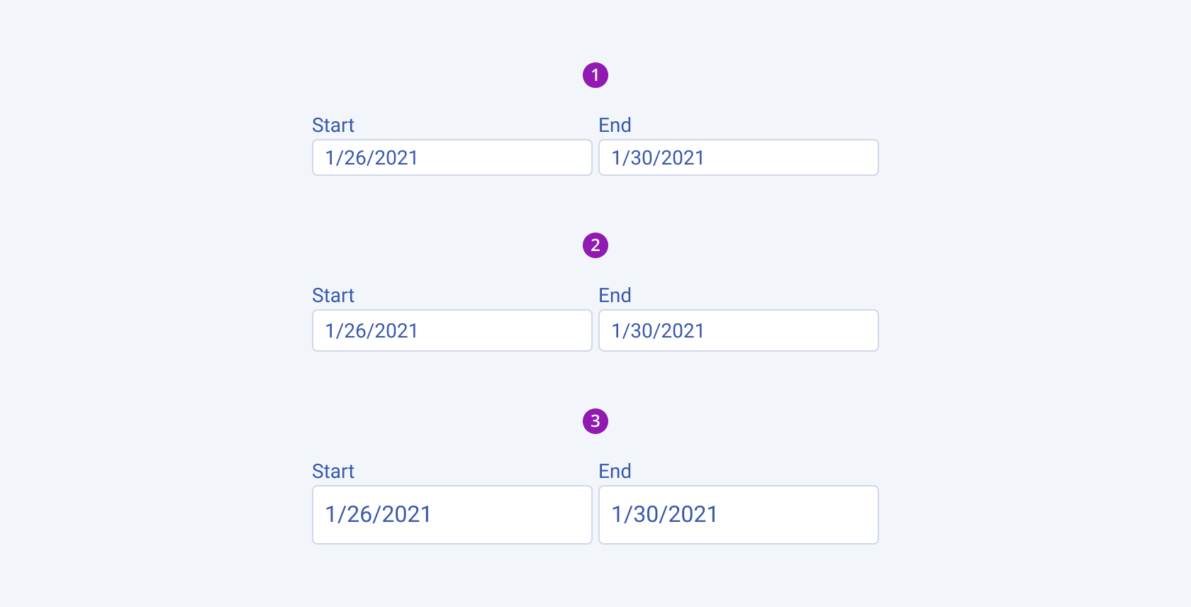
The DateRangePicker provides the size configuration option that enables you to control how big or small the rendered DateRangePicker is. Options for size customization are also at your disposal.
size provides the following available options:
small—Renders small DateRangePickers, which are suitable for compact components, such as Toolbars, where the available space is limited.medium(default)—Renders medium DateRangePickers.large—Renders large DateRangePickers, which are suitable for adaptive designs.none—Does not set asizeand allows you to add your own, custom value.

- Small
- Medium (default)
- Large
Fill Mode
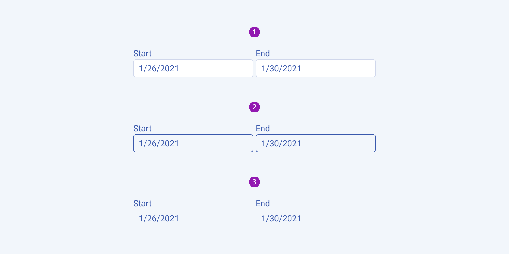
The DateRangePicker provides the fillMode configuration option that enables you to visually achieve a certain atmosphere in your app. DateRangePicker also provides options for fill-mode customization. By default, the DateRangePicker is rendered in solid colors.
fillMode provides the following available options:
solid(default)—The solid fill mode focuses on the layout and emphasizes the text field. It can be wrapped in a container with a different background color making the DateRangePicker stand out.outline—The outline fill mode focuses less on the text field. The outlined DateRangePicker does not have a background fill and can blend with the surrounding UI environment.flat—The flat fill mode emphasizes less the text field and more the data input. Also, the flat fill mode reduces additional visual noise and focuses on the content.none—Does not set afillModeand allows you to add your own, custom value.

- Solid (default)
- Outline
- Flat
Border Radius
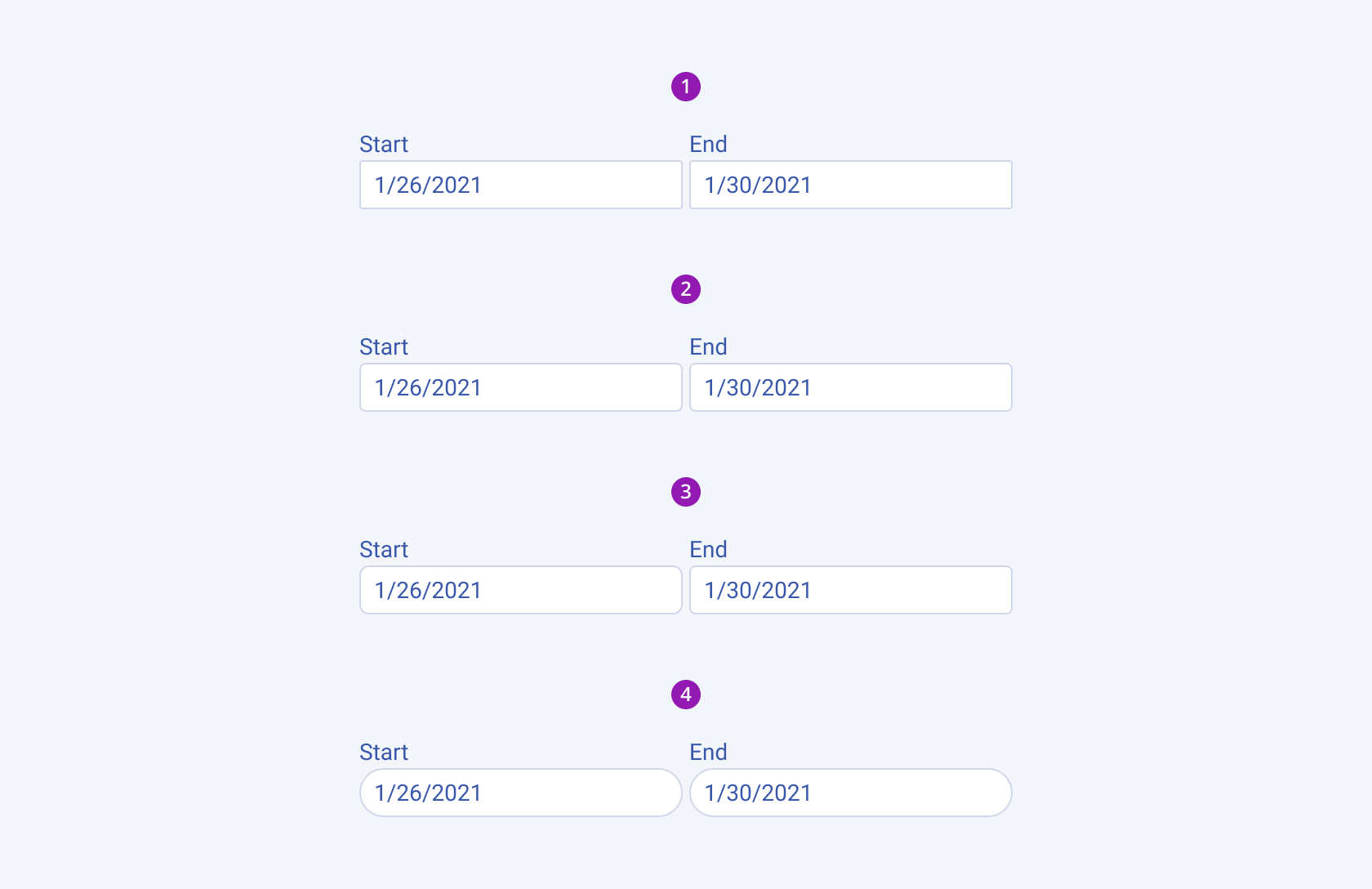
The DateRangePicker provides the rounded option that enables you to control the border radius of the rendered input field. The defined value for the border radius significantly affects the look-and-feel of the UI. The DateRangePicker also provides options for border-radius customization.
rounded provides the following available options:
small—Renders a border radius of 2 px.medium(default)—Renders a border radius of 4 px.large—Renders a border radius of 6 px.full—Renders a border radius of 9999 px.none—Does not set aroundedvalue and allows you to add your own, custom value.

- Small
- Medium (default)
- Large
- Full
Framework-Specific Documentation
For specific information about the component, refer to its official product documentation:


