Overview of the Supported UI Kits for Figma
The Figma UI Kits are free design resources that include 100+ pre-made and reusable Telerik and Kendo UI components, as well as their building blocks.
The purpose of the Telerik and Kendo UI kits for Figma is to enable the seamless handover of the design to the developers in order to ensure a pixel-perfect implementation of any design. The design structure aims to follow the implementation structure as much as possible—most layers inherit the naming convention in the implementation.
Supported Themes
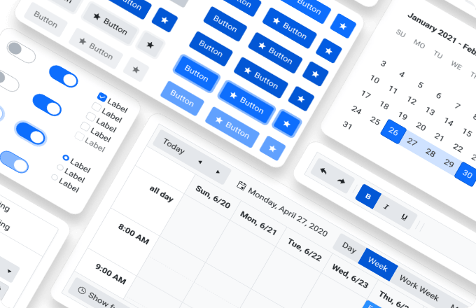
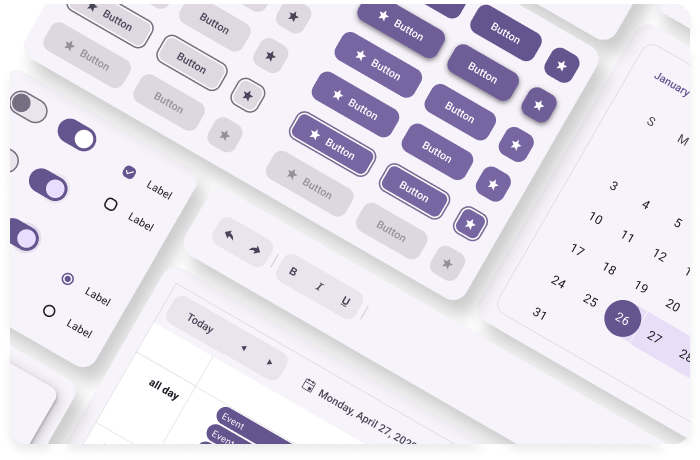
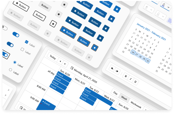
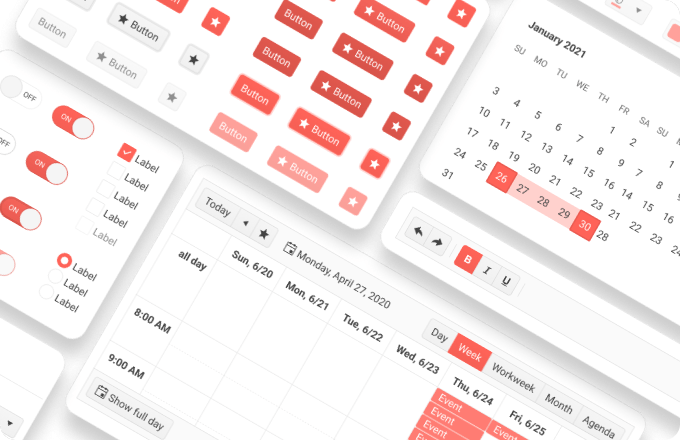
The Telerik and Kendo UI frameworks support UI kits for each of the available themes, as listed in the table below. Each theme follows specific guidelines and different look-and-feel, although all four themes include the same components.
Default Theme
Bootstrap Theme

Material Theme

Fluent Theme

Customization
The components in each design kit for Figma have the same structure and layer naming, and also observe the principles of the Atomic Design. Most of the components have nested _base master component, located just above the frame, which defines the structure, metrics, typographic style, and border radius. This approach allows for implementing changes across all nested instances of that master component at scale.
Structure
The design kits for Figma are libraries that include the Telerik and Kendo UI components and their features in their basic implementation, and do not include template examples and custom implementations.
To facilitate the usage and optimize the file size, each Figma kit delivers its components with their supported states by applying the Figma variants and properties. Complex components, like the Grid, for example, are built from instances of smaller components, such as the Grid cells.
Icons
The Telerik and Kendo UI design kits for Figma include more than 400 SVG icons which are defined as components so that they can be easily replaced within the various designs.
Upgrading to Newer Versions
The Telerik and Kendo UI design kits for Figma are regularly updated with the most recently released UI components and their features, and are reworked according to the latest Figma updates. As a result, the naming or the structure of the controls may change with time and you may need to transfer them from the latest version of the UI kit to a design file that uses a previous version.
To upgrade the UI kits to а later version while keeping your styles, download the free InstaRelinker plugin available in the Figma community.
With InstaRelinker, you can easily swap instances and replace remote styles with local ones. The tool allows you to re-link remote instances and styles that are nested within selected local main components to their local equivalents. When the plugin is running, it scans the current Figma file for local main components and automatically re-links any remote instances to names that match a local main component. If the plugin doesn't find a match, it allows you to manually select the local main component for each remote instance and re-link it. The InstaRelinker tool applies the same process for remote styles.


