Splitter Overview
The Splitter component is a versatile UI element that allows users to dynamically resize and adjust adjacent panes in web or application interfaces. By dragging the split bars or using their collapse and expand functions, users can customize the size and visibility of the panes, focusing on the information that concerns them the most. Whether used as a high-level layout component or for specific tasks like image comparison, the Splitter enhances user experience by providing adaptable and interactive content organization.
Live Demo
Appearance
Splitters provide built-in styling options that grant visually appealing and flexible rendering experience.
Apart from the default vision of the Telerik and Kendo UI Splitter, the component supports alternative styling options that enable you to configure the individual aspects of its appearance.
States
Depending on the action you want to imply through its appearance, the split bar of the Telerik and Kendo UI Splitter can acquire the following states which you can set by using the following classes:
- A split bar in its normal state appears usable and clickable.
k-hover—The hover state of the split bar is triggered when the user moves the cursor over it.k-focus—The focus state is triggered after the split bar has been spotlighted with the mouse or the keyboard, meaning that the split bar is active and the user is interacting with it.k-disabled—The disabled state of the split bar indicates that the user cannot interact with the component. When disabled, the component has no interactive behavior, it is faded out and slightly out of focus, which helps the user to distinguish it from the active elements on the page.
Anatomy
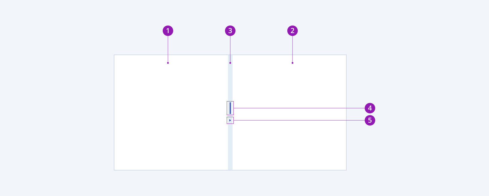
The anatomy of the Splitter summarizes the elements of the component and includes:

- Resizable pane
- Resizable and collapsible pane
- Split bar
- Resize handle
- Expand or collapse indicator
Variants
Depending on the panes' behavior, the split bar of Telerik and Kendo UI Splitter can be any of the following types:
- Resizable only
- Resizable and collapsible to the right
- Resizable and collapsible to the left
- Resizable and collapsible both to the right and left

- Resizable only
- Resizable and collapsible to the right
- Resizable and collapsible to the left
- Resizable and collapsible both to the right and left
Orientation
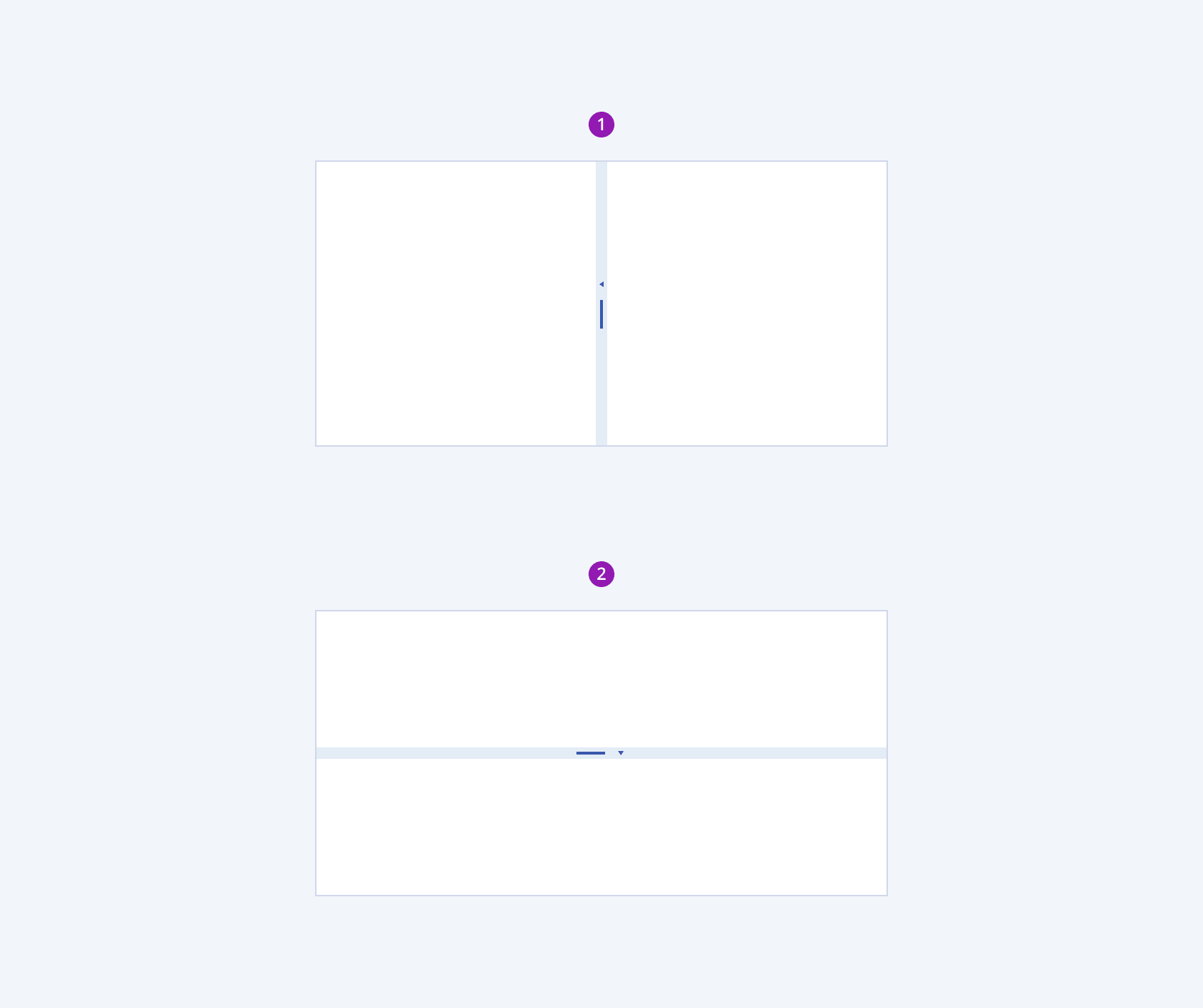
Depending on the orientation, the split bar of Telerik and Kendo UI Splitter can be any of the following types:
- Vertical
- Horizontal

- Vertical splitbar
- Horizontal splitbar
Framework-Specific Documentation
For specific information about the component, refer to its official product documentation:


