MaskedTextBox Overview
The MaskedTextBox allows users to provide textual content in a specific and predefined format which meets the requirements of a "mask" rule, and enables developers to implement user input validation mechanism for form or input fields.
Live Demo
Appearance
MaskedTextBoxes provide built-in styling options that grant visually appealing and flexible rendering experience.
Apart from the default vision of the Telerik and Kendo UI MaskedTextBox, the component supports alternative styling options which enable you to configure the individual aspects of its appearance.
States
Depending on the action you want to imply through its appearance, the Telerik and Kendo UI MaskedTextBox can acquire the following states which you can set by using the following classes:
- A MaskedTextBox in its normal state appears active, and is usable and clickable.
k-hover—Тhe hover state of a MaskedTextBox is applied when the user hovers over the component. This state indicates that the control is interactive and enabled by changing the mouse pointer to indicate that you can type within the component.k-focus—The focus state is triggered after the MaskedTextBox has been spotlighted with the mouse or the keyboard.k-invalid—The invalid state of a MaskedTextBox results from failing the validation either because of the lack of a required type of input or any input at all.k-invalid k-focus—The invalid focus state of a MaskedTextBox is a result of spotlighting a MaskedTextBox whose values or type of input didn’t pass the validation requirements.k-disabled—The disabled state indicates that a MaskedTextBox is temporarily unclickable because, for example, the page requires additional user input, or something important is missing before users continue to the next step. To indicate that they are unavailable, MaskedTextBoxes in their disabled state are usually faded, slightly out of focus, and show a subdued text label.
Anatomy
The anatomy of the MaskedTextBox summarizes the elements of the component. Depending on its elements, the Telerik and Kendo UI MaskedTextBox can be any of the following types:
- A MaskedTextBox with no label and hint
- A MaskedTextBox with a label in Form components
- A MaskedTextBox with a label and a hint in Form components
The next image shows the anatomy of a MaskedTextBox and includes the following elements:

- Input field
- Label (optional, used only in the Form component)
- Hint text (optional, used only in the Form component)
- Placeholder or input value
- Clear button
The MaskedTextBox can host a number of other elements to ensure the functionalities it supports are visualized and properly implied to the user.
The MaskedTextBox can render a Clear button that resets its value.

When included in a form component, the MaskedTextBox supports validation. Validation enables you to restrict the user input and prevent the submission of forms that are in an invalid state.

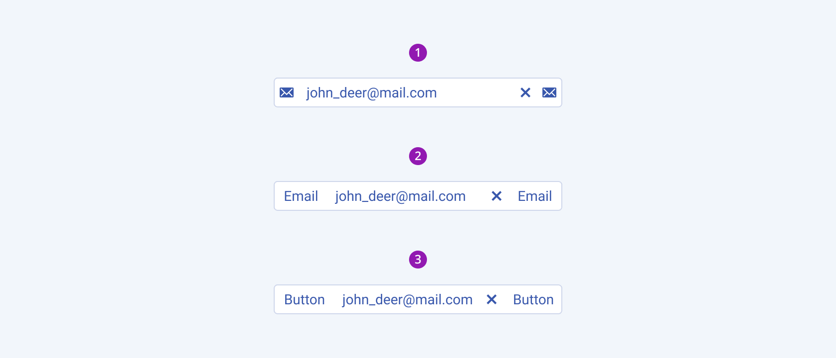
The MaskedTextBox can also accommodate custom items, such as icons, symbols, text, or a component which prompts users about the type of the required input or possible actions, as its prefix and suffix adornments.

- Icon prefix/suffix
- Text prefix/suffix
- Component prefix/suffix
The following image shows a NumericTextBox with a Clear button, and a validation and suffix visual:

Size
The MaskedTextBox provides the size configuration option that enables you to control how big or small the rendered MaskedTextBox will be. MaskedTextBoxes also provide options for size customization. By default, the MaskedTextBoxes are medium-sized.
size provides the following available options:
small—Renders a small MaskedTextBox which is suitable for compact components, such as Toolbar, or Grid, where the available space is limited.medium—Renders a medium MaskedTextBox. The medium Telerik and Kendo UI NumericTextBoxes use the same typographic style as the small NumericTextBoxes. However, the vertical height of the component is achieved by setting the$kendo-spacing, 1spacing value for their vertical paddings.large—Renders a large MaskedTextBox which is used in adaptive designs. The large Telerik and Kendo UI MaskedTextBoxes achieve the recommended touch area dimensions both by doubling the value of their vertical paddings to$kendo-spacing, 2and by using a different typographic style with a bigger font size and line height.none—Does not set asizeand allows you to add your own, custom value.

- Small
- Medium
- Large
Fill Mode
The MaskedTextBox provides the fillMode configuration option that enables you to control the way in which color is applied to the rendered MaskedTextBox. MaskedTextBoxes also provide options for fill-mode customization. By default, the MaskedTextBoxes are rendered in solid fill mode.
fillMode provides the following available options:
solid(default)—The solid MaskedTextBox has a border and a background, puts a stronger emphasis on the action it indicates and draws the user attention.
outline—The outlined MaskedTextBox has only a border and no background, provides a minimalist look, and is suitable if it aims to blend in with the background or with other UI elements. The outline fill mode puts less emphasis on the text field.flat—By its plain and discreet look, the flat MaskedTextBox is a good choice when you need an unobtrusive component which doesn't distract users from the elements of higher importance. The flat fill mode emphasizes the data input rather than the text field, reduces the additional visual noise, and helps users focus better on the content.none—Does not set afillModeand allows you to add your own, custom value.

- Solid (default)
- Outline
- Flat
Border Radius
The MaskedTextBox provides the rounded option that enables you to control how much border radius will apply to the rendered MaskedTextBox. MaskedTextBoxes also provide options for border-radius customization. By default, the MaskedTextBoxes are rendered with a medium border radius.
rounded provides the following available options:
small—Renders a border radius of 2px.medium(default)—Renders a border radius of 4px.large—Renders a border radius of 6px.full—Renders a border radius of 9999px.none—Does not set aroundedand allows you to add your own, custom value.

- Small
- Medium (default)
- Large
- Full
Framework-Specific Documentation
For the framework-specific information about the UI components, refer to the respective product documentation:


