Menu Overview
The Menu component is a UI element for displaying a list of items in a popup. It facilitates efficient navigation and organization within applications by grouping actions into selectable options for users to choose from. Commonly used in both web and desktop applications, the Menu component helps maximize screen real estate and optimize user workflows by consolidating commands and navigation links. It can be oriented horizontally or vertically and supports multiple levels of submenus, allowing for the management of large hierarchical structures without cluttering the user interface.
Live Demo
Appearance
Menus provide built-in styling options that grant visually appealing and flexible rendering experience.
Apart from the default vision of the Telerik and Kendo UI Menu, the component supports alternative styling options that enable you to configure the individual aspects of its appearance.
States
Depending on the action you want to imply through its appearance, the Telerik and Kendo UI Menu can acquire the following states which you can set by using the following classes:
- A menu Item in its normal state appears usable and clickable.
k-hover—When a user hovers over a menu item, it enters the hover state. This state indicates that the control is interactive, and that the user can click on it.k-focus—When a user clicks or tabs into a menu item it enters the focus state. This state indicates that the control is active and ready to receive user selection and includes a visual indicator such as a highlighted border.k-active—The active state is applied when a menu item is activated upon user interaction.k-selected—The selected state of a menu item is activated after the user has selected it.k-disabled—The disabled state indicates that a menu item is temporarily unclickable and users cannot interact with it. To indicate that they are unavailable, menu items in their disabled state are faded.
Anatomy
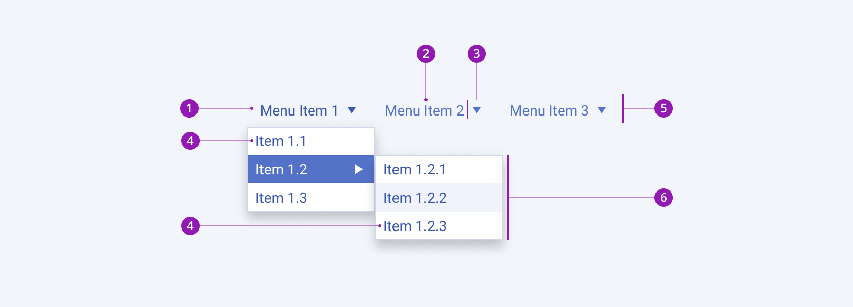
The anatomy of the Menu summarizes the elements of the component:

- Menu item
- Menu item label
- Menu item expand icon
- Submenu item
- Menu header
- Popup with submenu items
Size
The Menu provides the size configuration option that enables you to control how big or small the rendered submenu items in the popup will be. The Menu also provides options for size customization.
size provides the following available options:
small—Renders small small submenu items, which are suitable for compact scenarios, where the available space is limited.medium(default)—Renders medium submenu items.large—Renders large submenu items, which are suitable for more spacious designs.none—Does not set asizeand allows you to add your own, custom value.

- Small
- Medium (default)
- Large
Variants
Depending on the elements they display, the menu items of the Telerik and Kendo UI Menu can be any of the following types:
- Label only
- With expand icon
- With icon before
- With icon after

- Label Only
- With expand icon
- With Icon before
- With Icon after
Orientation
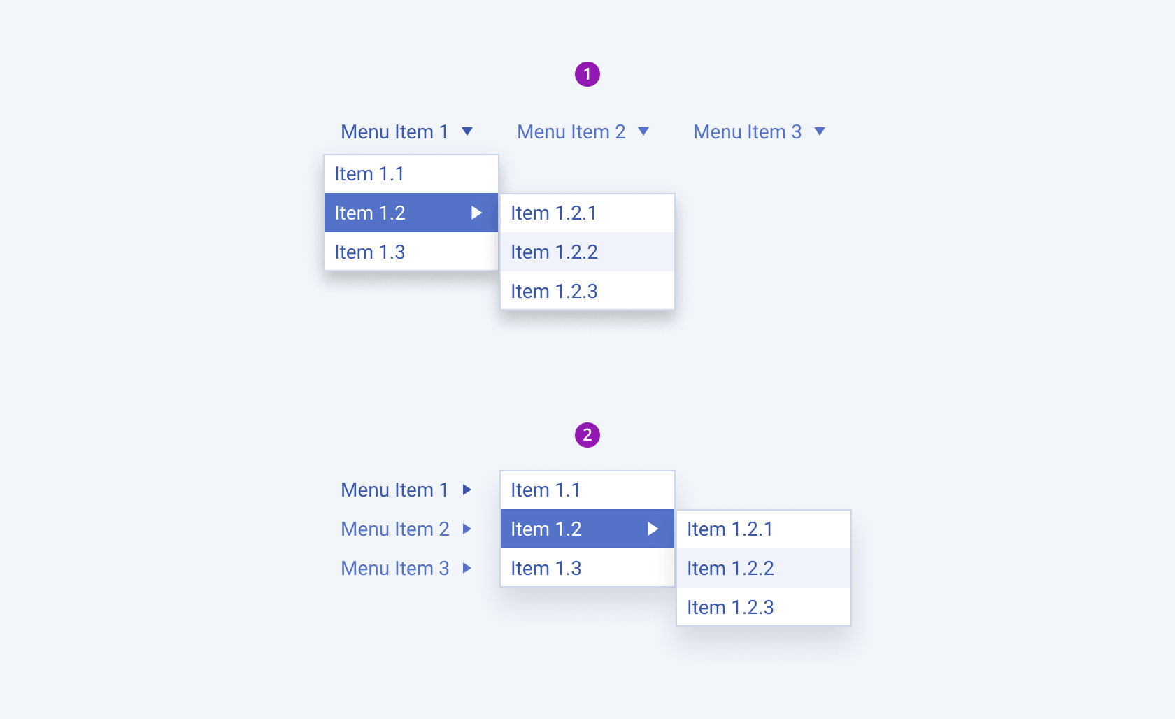
Depending on the orientation, the Telerik and Kendo UI Menu can be any of the following types:
- Horizontal—Menu items arranged side by side with submenus popping up below, perfect for top bar navigation.
- Vertical—Menu items arranged one over another with submenus extending rightward, ideal for side panel navigation.

- Horizontal
- Vertical
Separator
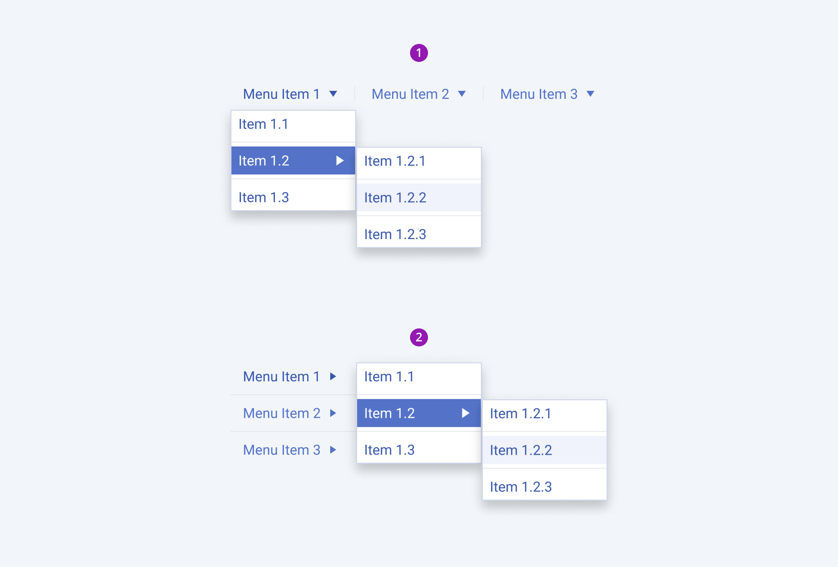
The Telerik and Kendo UI Menu can be rendered with separators to provide additional space between items and to improve visual clarity when used for grouping purposes.
- Horizontal menu with separators
- Vertical menu with separators

- Horizontal menu with separators
- Vertical menu with separators
Framework-Specific Documentation
For specific information about the component, refer to its official product documentation:


