Dialog Overview
The Dialog component is a UI element that appears on top of the main content to display information, requests, or notifications that require user attention and action. It is a modal window that captures the user's focus and interaction, temporarily suspending their engagement with the underlying interface until they address the presented options or information. Dialogs are commonly used for tasks like confirming actions, providing input, or displaying critical updates to ensure clear communication and effective user interactions.
Live Demo
Appearance
Dialogs provide built-in styling options that grant visually appealing and flexible rendering experience.
Apart from the default vision of the Telerik and Kendo UI Dialog, the component supports alternative styling options that enable you to configure the individual aspects of its appearance.
Anatomy
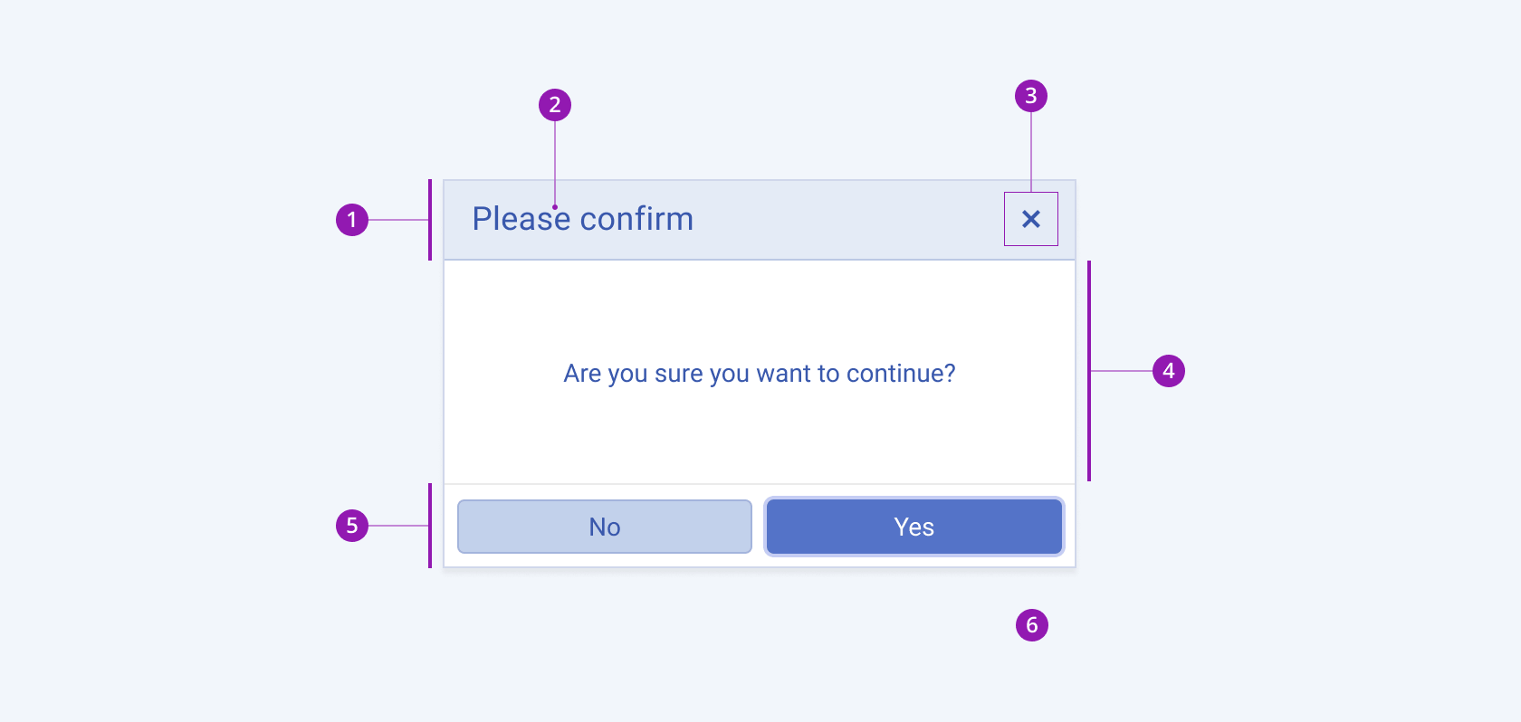
The anatomy of the Dialog summarizes the elements of the component:

- Title Bar
- Title
- Close button
- Content area
- Action bar
- Overlay
Color
The Dialog provides the themeColor configuration option that enables you to choose among the available, built-in colors that will be applied to it.
themeColor provides the following available options:
base(default)primary—Primary dialogs visualize an important action that draws the attention of the user.light—Light dialogs are used to present actions of lower importance, providing a seamless appearance, and are particularly suitable for user interfaces with a light color scheme.dark—Dark dialogs are used to present actions of lower importance, providing a seamless appearance, and are particularly suitable for user interfaces with a dark color scheme.none—Does not set athemeColorand allows you to add your own, custom value.
Framework-Specific Documentation
For specific information about the component, refer to its official product documentation:


