Usage Guidelines
The Telerik and Kendo UI Dialog requires you to follow some basic principles when using the component.
Title
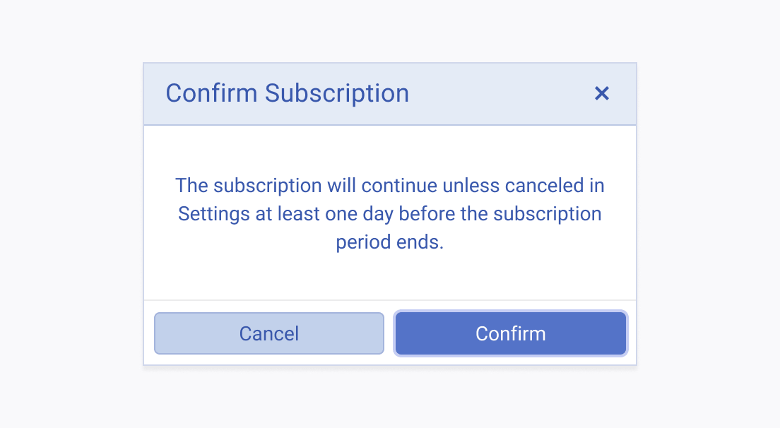
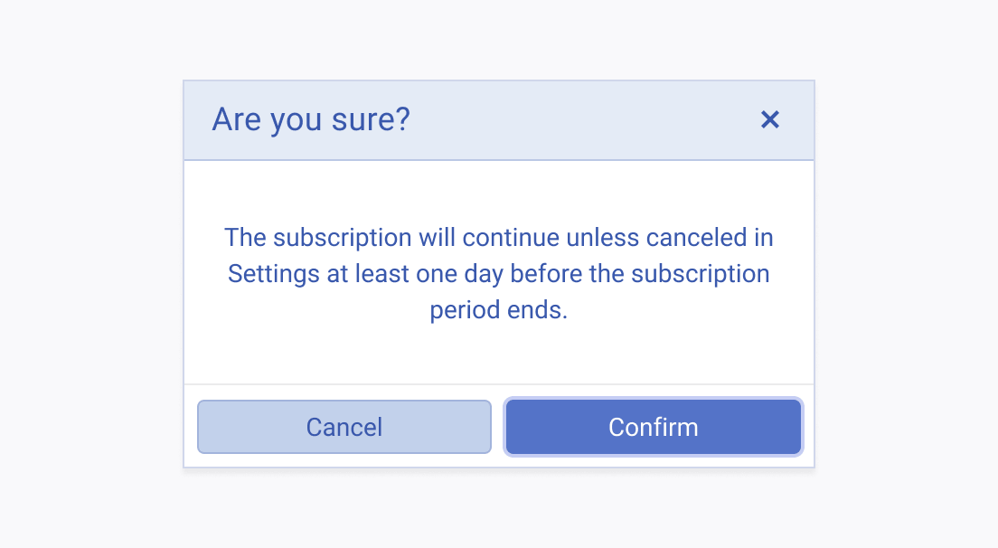
When using the Dialog component in your user interface, consider the presentation of the dialog's title, as it plays a crucial role in conveying the purpose of the modal window. Additionally, the primary button label should also reflect the dialog's purpose, ensuring that users have a clear understanding of the action they are taking when they interact with the dialog. This dual communication, through both the title and the primary button label, enhances the user experience by reducing ambiguity and helping users make informed decisions.


Action Button Labels
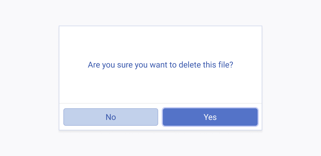
When implementing Dialog components within your user interface, it's crucial to pay special attention to the labels of the buttons within the dialog. The button labels serve as a direct indicator of the user's decision outcome, ensuring clarity and ease of use.


