Overview
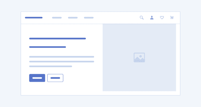
The Hero (also called Hero section) is widely used in web design and is the first element users see on the page. It is located above all the content, just below the navigational elements, such as menu or top navigation. The Hero UI section typically extends full width across the screen and consists of a large image, or video, captivating headline, and call-to-action button(s). The main goal of the Hero section is to create a positive first impression, hook the users and make them scroll the page or act in a certain way.
A well-designed Hero is visually attractive, perfectly reflects the essence of the company and its values and sets the tone of the overall user experience on the page. It must serve multiple purposes at the same time: capture the user's attention, enhance the navigation, provide sufficient information, and provoke interest or even feelings.
Key Principles
- Full width—the Hero usually takes the full width of the page.
- Size—the Hero UI section should respect the 16:9 aspect ratio.
- Impeccable image, video, and graphics quality—to attract the users, the visuals within the Hero must be of a good quality, load fast enough and at the same time.
- Messaging—the text within the Hero UI section must be concise, clear, and captivating.
Hero Variants
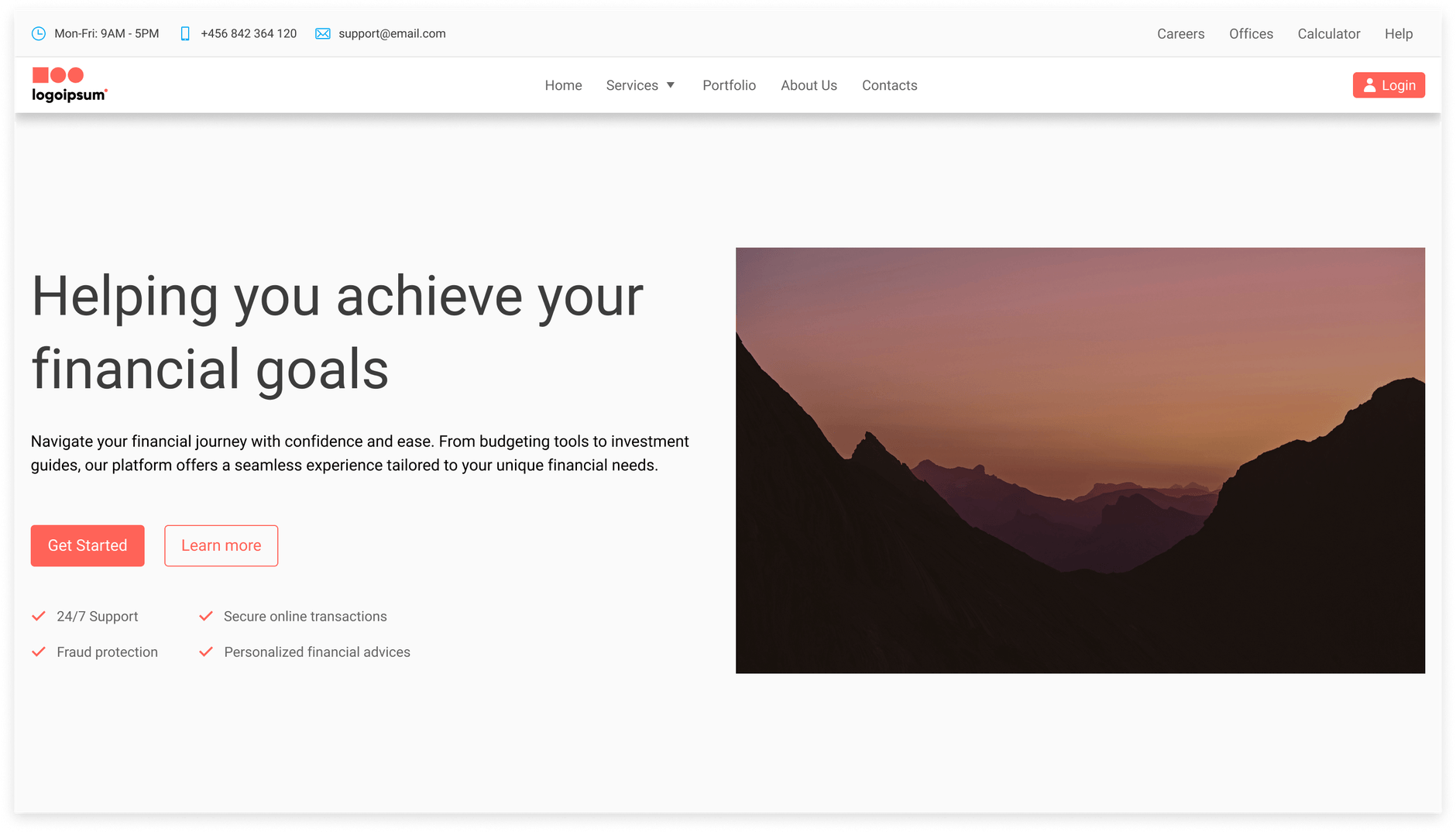
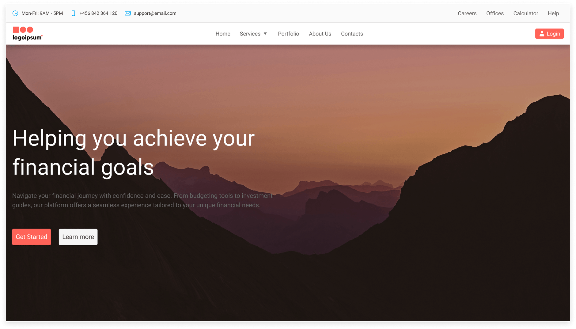
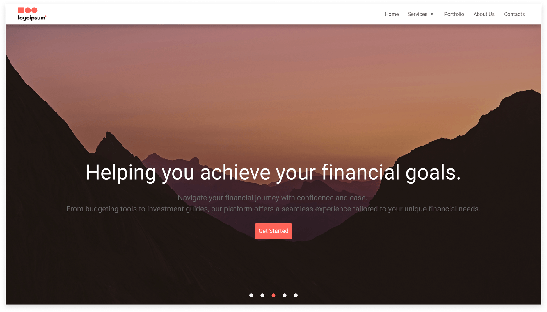
The Telerik and Kendo UI Hero offers design variants showcased in our demos, each tailored to enhance your application development by covering different usage scenarios.
Hero 1
Hero 2
Hero 3
Hero 5

UI Components Documentation
For product-specific information, refer to the corresponding Telerik and Kendo UI documentation:
