ColorPicker Overview
The Telerik and Kendo UI ColorPicker component is a versatile UI element that allows users to select colors from a wide spectrum or choose from a set of predefined swatches, making it ideal for scenarios where precise color customization, flexibility, and ease of use are essential. In its dropdown, it offers both a color gradient view for custom color picking and a color palette view for quick selections. ColorPicker allows users to preview the selected color before submitting it and ensure that specific contrast requirements are met.
Live Demo
Appearance
ColorPickers provide built-in styling options that grant visually appealing and flexible rendering experience.
Apart from the default vision of the Telerik and Kendo UI ColorPicker, the component supports alternative styling options that enable you to configure the individual aspects of its appearance.
States
Depending on the action you want to imply through its appearance, the Telerik and Kendo UI ColorPicker can acquire the following states which you can set by using the following classes:
- A ColorPicker in its normal state appears usable and clickable. The control displays a preselected color or a preview mask indicating that no color has been selected yet.
k-hover—When a user hovers over a ColorPicker, it enters the hover state. This state indicates that the control is interactive and that the user can click it to open a dropdown with color controls.k-focus—When a user clicks or tabs into a ColorPicker, it enters the focus state. This state renders a visual indicator, such as a highlighted border, and indicates that the control is active and ready to use.k-disabled—The disabled state indicates that a ColorPicker is temporarily unclickable and users cannot interact with it. To indicate that they are unavailable, ColorPickers in their disabled state appear faded and slightly out of focus.
Anatomy
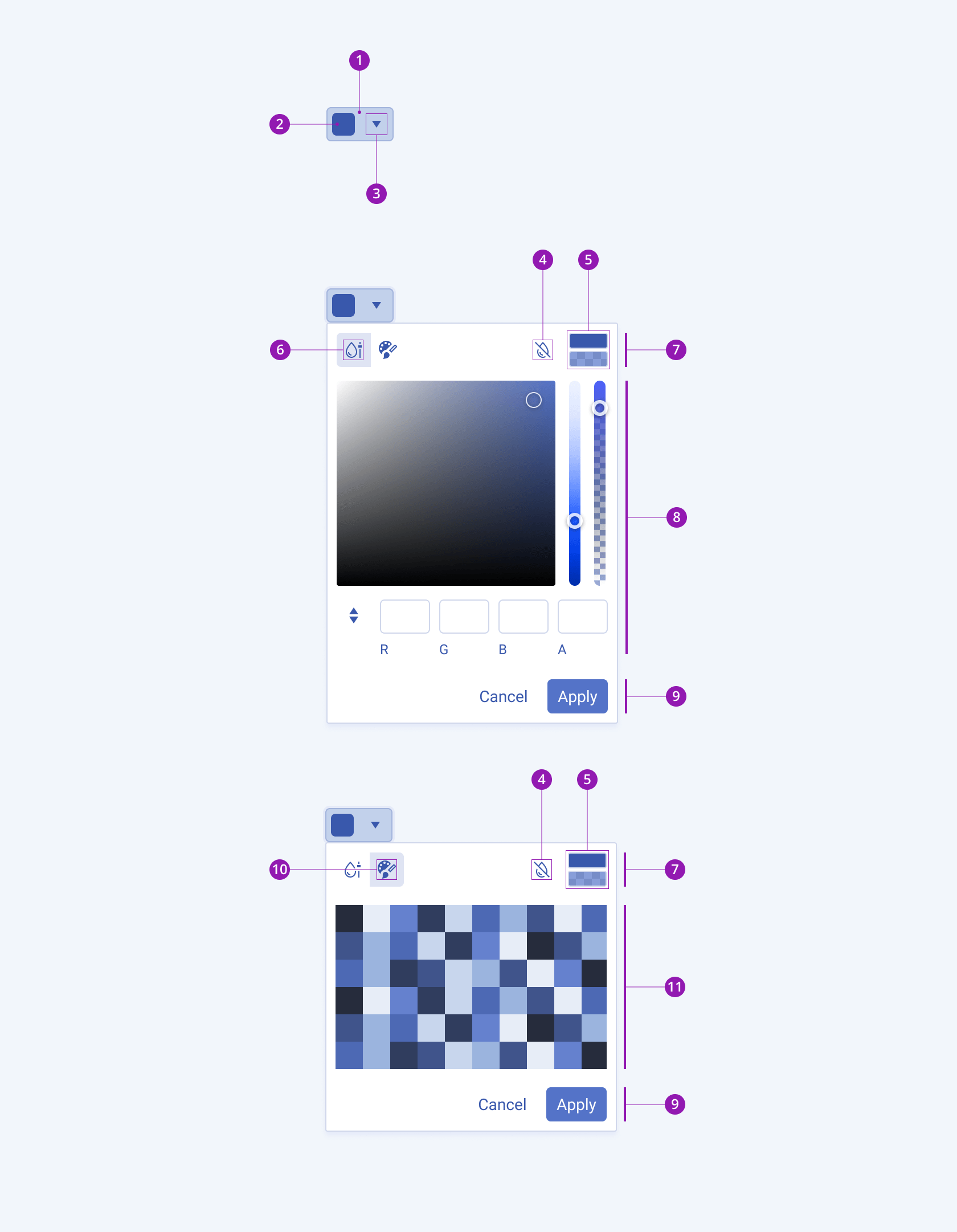
The anatomy of the ColorPicker summarizes the elements of the component:

- Container
- Color preview
- Icon button
- Reset color icon button
- Selected and previous color preview
- ColorGradient icon button
- ColorPicker header
- ColorGradient
- ColorPicker footer
- ColorPalette icon button
- ColorPalette
Variants
Depending on the element the color preview displays, the Telerik and Kendo UI ColorPicker can be any of the following types:
- ColorPicker with a Swatch color preview—The ColorPicker displays the currently selected color as a tile.
- ColorPicker with an Icon and color indicator—The ColorPicker renders a customizable icon with a color indicator.

- ColorPicker with a Swatch color preview
- ColorPicker with an icon and a color indicator
Size
The ColorPicker provides the size configuration option that enables you to control how big or small the rendered ColorPicker will be.
size provides the following available options:
small—Renders a small ColorPicker that is suitable to use in compact designs.medium(default)—Renders a medium ColorPicker.large—Renders a large ColorPicker that is suitable to use in adaptive designs.none—Does not set asizeand allows you to add your own, custom value.

- Small
- Medium
- Large
Fill Mode
The ColorPicker provides the fillMode configuration option that enables you to control the way in which color is applied to the rendered component. The ColorPicker also provides options for fill-mode customization. By default, the ColorPicker is rendered in solid fill mode.
fillMode provides the following available options:
solid(default)—On a page, a solid ColorPicker puts the strongest emphasis on the color selection action and draws the attention of users.outline—The outline ColorPicker has a medium emphasis and reduces the visual noise when the page displays many elements of equal importance.flat—The flat ColorPicker places the lowest emphasis on the color selection action and has neither a background nor a border. The main purpose of the flat ColorPicker is to avoid distracting users from the main content.none—Does not set afillModeand allows you to add your own, custom value.

- Solid
- Outline
- Flat
Border Radius
The ColorPicker provides the rounded option that enables you to control the border-radius of the rendered component. The defined value for the border-radius affects the look and feel of the UI. The ColorPicker also provides options for border-radius customization.
rounded provides the following available options:
small—Renders a border radius of 2 px.medium(default)—Renders a border radius of 4 px.large—Renders a border radius of 6 px.full—Renders a border radius of 9999 px.none—Does not set aroundedvalue and allows you to customize the configuration.

- Small
- Medium
- Large
- Full
Framework-Specific Documentation
For specific information about the component, refer to its official product documentation:


