ColorPicker

The ColorPicker is a compact color selection component providing a wide color spectrum and predefined palette.

Usage Guidelines

The Telerik and Kendo UI ColorPicker requires you to follow some basic principles when using the component.

Purpose

Effective use of color selection tools in your user interface can have a significant impact on the user experience. It's important to strike a balance between versatility and simplicity when choosing between the ColorPicker and ColorPalette components.
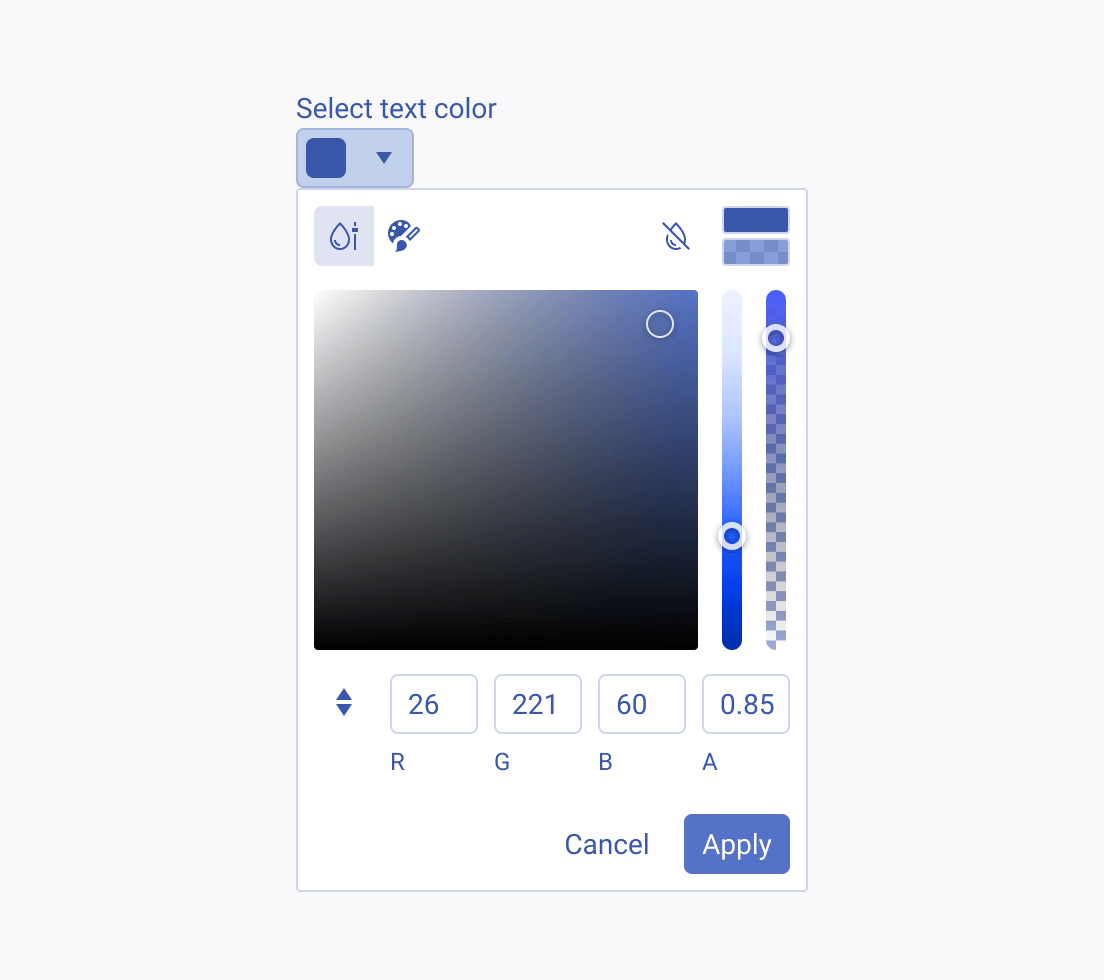
Use ColorPickers where a wide spectrum of color options is required, offering users the ability to precisely select and customize their desired colors.
Avoid using ColorPicker in scenarios where users are restricted to a predefined color palette or don't need its advanced features. In such cases, use either a ColorPalette or a simplified ColorPicker only with a palette view to provide a more streamlined color selection experience.

Compactness

In the field of user interface design, choosing the right color selection tool is crucial for an efficient and user-friendly design. When it comes to compact and space-constrained layouts, ColorPickers are a good choice to allow precise color matching. However, in scenarios where space is more generous, such as sidebars or extended layouts, it's advisable to use the FlatColorPicker component instead.
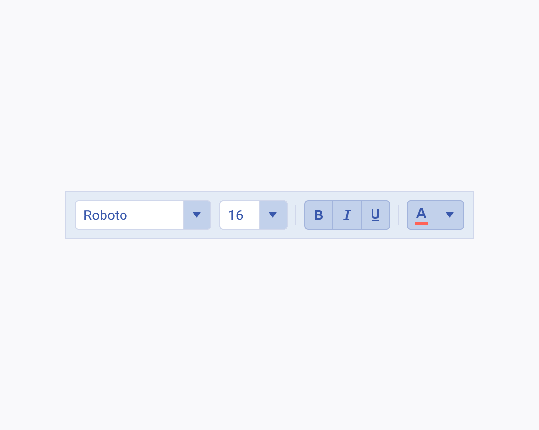
Use the ColorPicker component in user interfaces, such as toolbars, where the compact design and space efficiency are priorities.
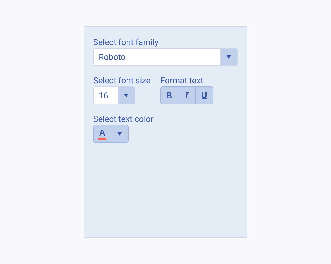
Avoid using ColorPickers in user interfaces, such as sidebars or spacious layouts, where ample space is available, and the focus is on delivering intuitive and user-friendly interactions. Use FlatColorPicker component instead.