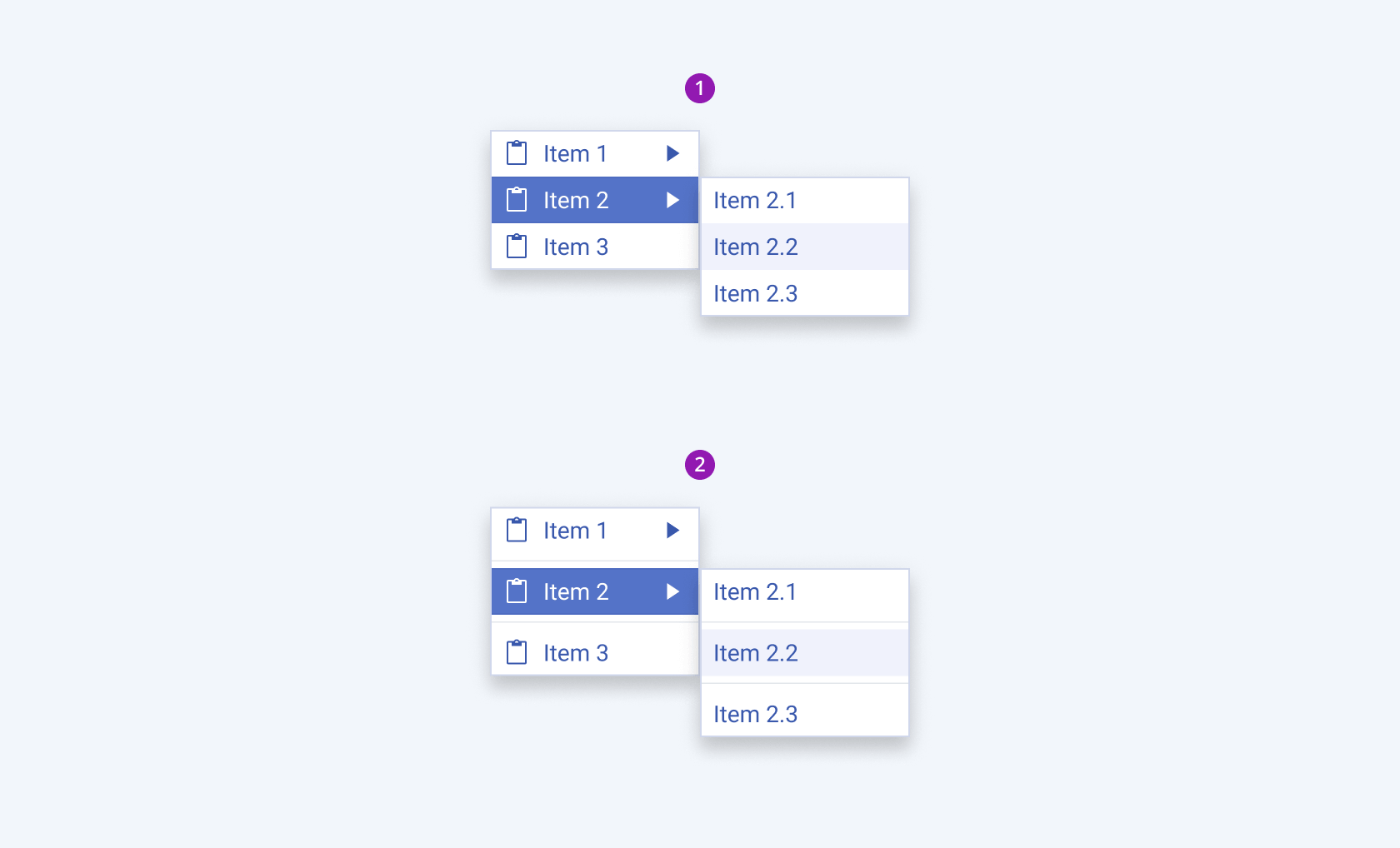
ContextMenu Overview
The ContextMenu component is a UI element that appears upon user interaction, typically a right-click on a webpage or application area. This component provides a list of menu items relevant to the selected object or area, making it a powerful tool for enhancing user efficiency and interaction. ContextMenus are context-sensitive, meaning they dynamically adapt their content to the current state or focus of the application, and provide options directly related to the user's activities or the element they are interacting with. They are commonly used to add functionality to elements without cluttering the main interface, allowing for a clearer and intuitive user experience.
Live Demo
Appearance
ContextMenus provide built-in styling options that grant visually appealing and flexible rendering experience.
Apart from the default vision of the Telerik and Kendo UI Menu, the component supports alternative styling options that enable you to configure the individual aspects of its appearance.
States
Depending on the action you want to imply through its appearance, the items in the Telerik and Kendo UI ContextMenu can acquire the following states which you can set by using the following classes:
- A submenu Item in its normal state appears usable and clickable.
k-hover—When a user hovers over a submenu item, it enters the hover state. This state indicates that the control is interactive, and that the user can click on it.k-focus—When a user clicks or tabs into a submenu item, it enters the focus state. This state indicates that the control is active and ready to receive user selection and includes a visual indicator such as a highlighted border.k-active—The active state is applied when a submenu item is activated upon user interaction.k-selected—The selected state of a submenu item is activated after the user has selected it.k-disabled—The disabled state indicates that a submenu item is temporarily unclickable and users cannot interact with it. To indicate that they are unavailable, submenu items in their disabled state are faded.
Anatomy
The anatomy of the ContextMenu summarizes the elements of the component:

- Submenu item icon
- Submenu item label
- Submenu item expand icon
- Submenu item
- Popup with submenu items
Size
The ContextMenu provides the size configuration option that enables you to control how big or small the rendered submenu items in the popup will be. The ContextMenu also provides options for size customization.
size provides the following available options:
small—Renders small submenu items, which are suitable for compact scenarios, where the available space is limited.medium(default)—Renders medium submenu items.large—Renders large submenu items, which are suitable for more spacious designs.none—Does not set asizeand allows you to add your own, custom value.

- Small
- Medium (default)
- Large
Variants
Depending on the elements they display, the submenu items of the Telerik and Kendo UI ContextMenu can be any of the following types:
- Label only
- With icon before
- With icon before and expand icon
- With expand icon

- Label Only
- With icon before
- With icon before and expand icon
- With expand icon
Separator
The Telerik and Kendo UI ContextMenu can be rendered with separators to provide additional space between items and to improve visual clarity when used for grouping purposes.
- ContextMenu
- ContextMenu with separators

- ContextMenu
- ContextMenu with separators
Framework-Specific Documentation
For specific information about the component, refer to its official product documentation:


