The Telerik and Kendo UI ContextMenu requires you to follow some basic principles when using the component.
Icon Before
Icons can significantly enhance the understanding of submenu items by providing visual cues. To maintain balance and avoid undue emphasis on certain items, it's crucial to apply icons consistently across all submenu items.
Apply icons consistently before labels in submenu items to enhance user experience and minimize cognitive load.
Avoid using icons randomly in submenu items, as this can confuse users and disproportionately highlight certain items over others of equal importance.
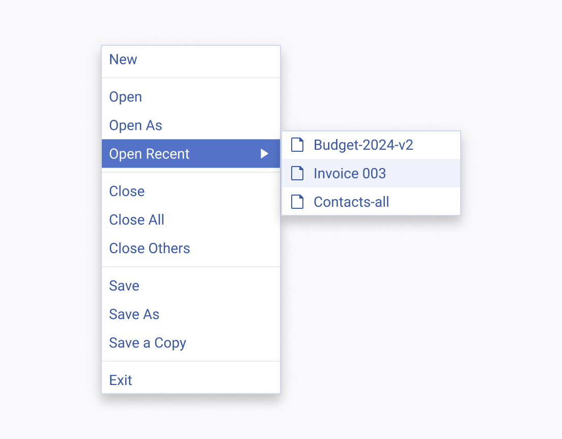
Grouping with Separators
Separators effectively create distinct sections within popups, organizing a larger number of submenu items into manageable groups.
Use separators to divide submenu items into coherent sections in complex menus, reducing the need for multiple levels and minimizing the number of popups.
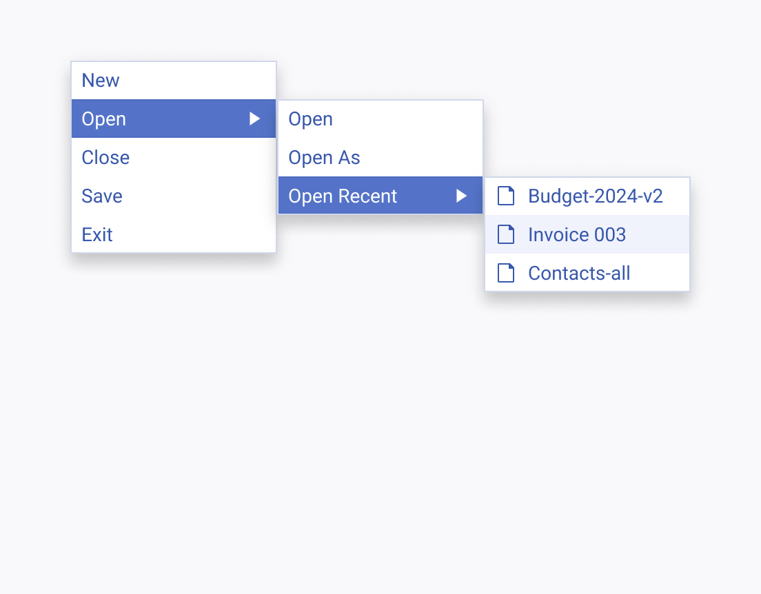
Avoid creating excessive levels or popups, as too many can overwhelm users and complicate navigation.


