ProgressBar Overview
A ProgressBar is a visual indicator component used to track the progress of a task or process. It provides the user with a clear visual cue that indicates how much of a task has been completed or how far a process has progressed. This component helps you to improve the user experience by keeping users informed about ongoing tasks and providing a sense of completion or progress. In addition, the ProgressBar component provides various options that allow you to customize its label, orientation, and direction to best suit the needs of your application.
Live Demo
States
Depending on the action you want to imply through its appearance, the Telerik and Kendo UI ProgressBar can acquire the following states which you can set by using the following classes:
- A ProgressBar in its normal state appears active.
k-disabled—The disabled state shows that a ProgressBar doesn't provide an indication. To indicate that they are unavailable, ProgressBars in their disabled state are usually faded and slightly out of focus.
Appearance
ProgressBars provide built-in styling options that grant visually appealing and flexible rendering experience.
Anatomy
The anatomy of the ProgressBar summarizes the elements of the component:

- ProgressBar container
- ProgressBar indicator
- Progress status label
Orientation
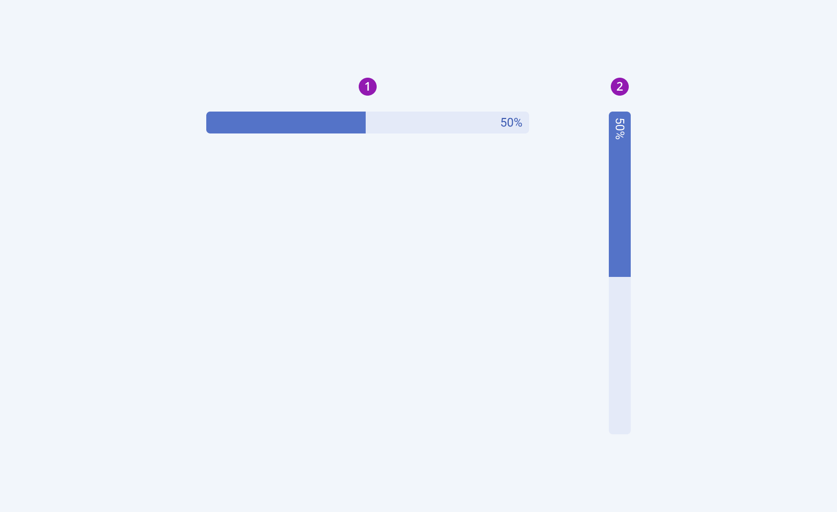
The Telerik and Kendo UI ProgressBar component provides both horizontal and vertical alignment for flexible integration into various user interface layouts:

- Horizontal
- Vertical
Direction
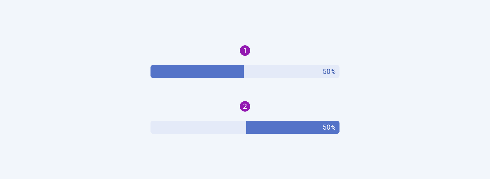
For flexible integration into different usage scenarios, the ProgressBar component allows you to choose between the forward and reverse directions of the progress indicator.

- Forward
- Reverse
Status Label
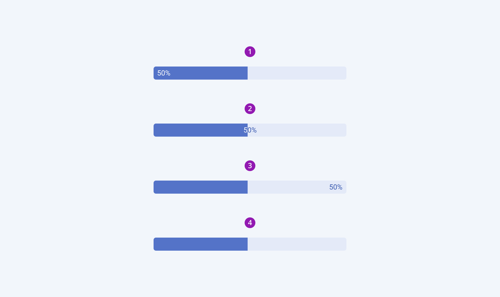
The ProgressBar component provides several options for positioning status labels, allowing you to choose whether to place them at the beginning, middle, or end or to omit the labels altogether. This flexibility allows you to customize the ProgressBar to meet your specific design and user experience requirements.

- Label at start
- Label in the center
- Label at the end
- No label
Framework-Specific Documentation
For specific information about the component, refer to its official product documentation:


