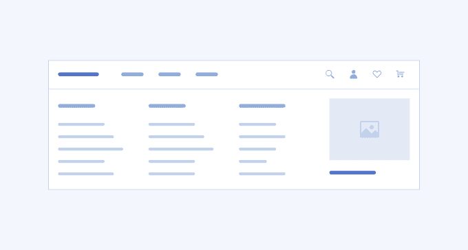
Overview
The Flyout menu is indispensable for applications or websites with complex informational structure and extensive data that must be organized in an intuitive, logical and compact manner. These could be e-commerce platforms, institutional websites, business applications, and others. The structure and layout of the Flyout menu differs depending on the navigational model, business and customers’ needs. It could have a header and footer, include different navigational components such as tabstrip, list items, buttons, and display images or videos, sliders, icons.
The Flyout Menu plays an essential role for a smooth user experience. Not only does it conserve screen space, but also spares the visual clutter, unnecessary clicks, and scrolling by allowing the users to navigate gradually and reach only what they want to. At the same time, the Flyout menu could cause accessibility issues for users with reduced dexterity so an alternative navigation should always be provided.
A well designed Flyout menu gradually displays the navigation model, has an attractive layout and various content, and is intuitive and easy to use.
Key Principles
- Hierarchy—the Flyout menu displays non-primary information or actions.
- Simplicity—the Flyout menu must be straightforward and easy to use.
- Non-exclusivity—the Flyout menu must not be the only option to navigate complex content as some users are unable to use it.
Flyout Navigation Demo
The Telerik and Kendo UI Flyout Navigation enhances your application development by offering a sleek design, showcased in the demo below.
Flyout Navigation 3

UI Components Documentation
For product-specific information, refer to the corresponding Telerik and Kendo UI documentation:


