Pager Overview
A Pager is a user interface (UI) element that divides a large amount of data into multiple pages and navigates the users through them. Pagers are usually used in data tables, search results, and directories. They reduce the cognitive load, decrease the loading time, and optimize the screen space by displaying the content in small chunks.
The Telerik and Kendo UI Pager provides consistent styling. It wraps buttons, dropdown or an input, and pager info that indicates the number of items shown on the page.
Live Demo
Appearance
Pagers provide built-in styling options that grant visually appealing and flexible rendering experience.
Apart from the default vision of the Telerik and Kendo UI Pager, the component supports alternative styling options which enable you to configure the individual aspects of its appearance.
States
Depending on the action you want to imply through its appearance, the Telerik and Kendo UI Pager can acquire the following states which you can set by using the following classes:
- A Pager in its normal state allows interaction with the elements within it.
k-disabled—The disabled Pager does not allow interaction with any elements within it as they are disabled, too.
Anatomy
The anatomy of the Pager summarizes the elements of the component.
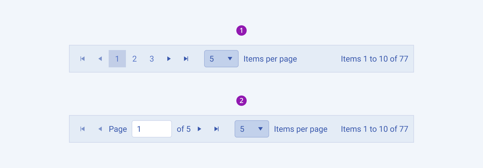
Depending on the elements they display, the Telerik and Kendo UI Pagers can be any of the following types:
numeric;Renders buttons with numbers.input—Renders a NumericTextBox for entering the page number.

- Numeric
- Input
The next image shows the anatomy of a Pager and includes the following elements:

- Container
- Previous buttons: navigate to the previous pages
- Numeric buttons: display the available pages (or a part of them)
- Truncation: indicates additional pages that cannon be displayed with numeric buttons
- Next buttons: navigate to the next pages
- Page size option: allows the user to set the number of items on the page
- Info: describes the range of items displayed up to the total
Size
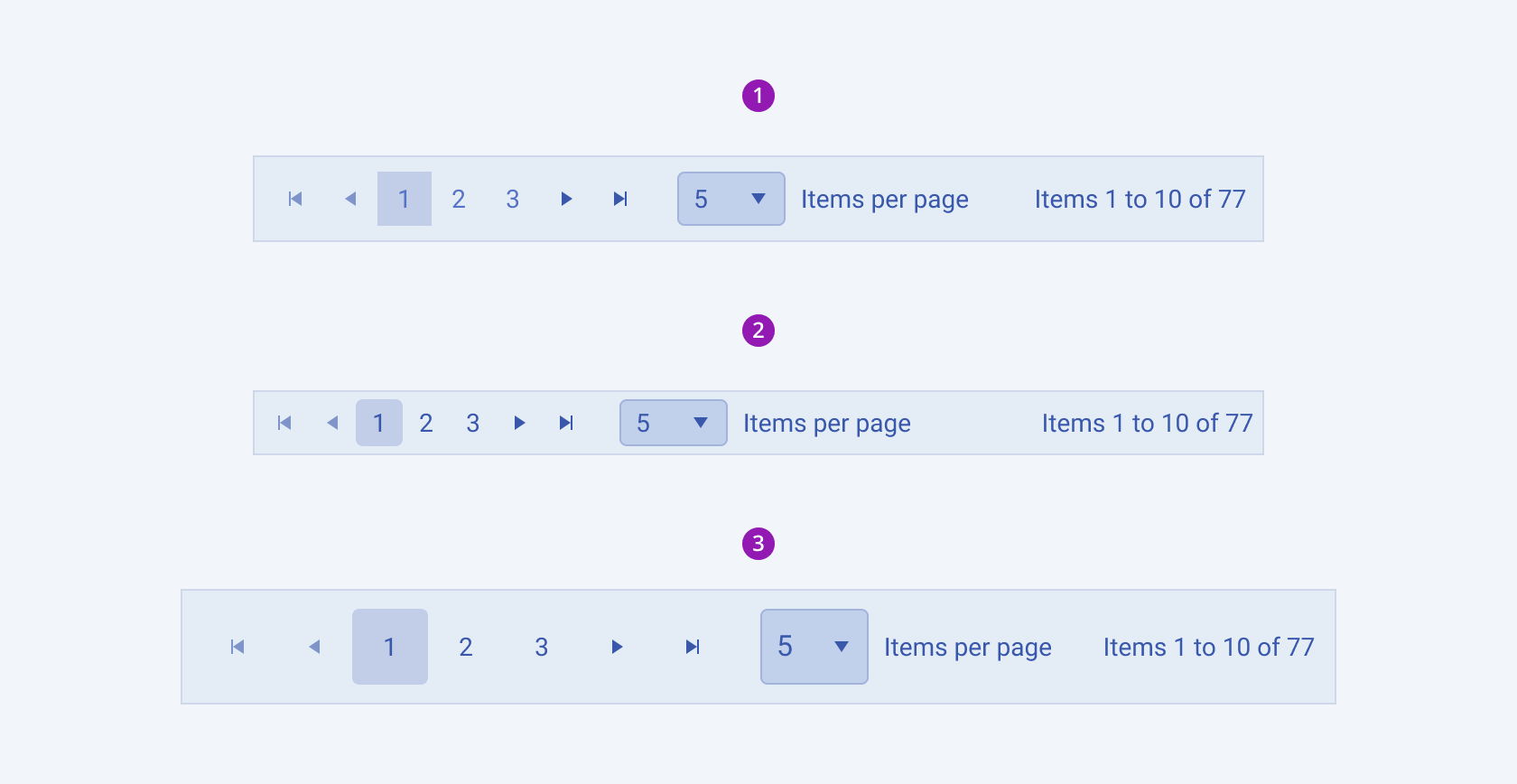
The Pager provides the size configuration option that enables you to control how big or small the rendered Pager will be. Pagers also provide options for size customization.
size provides the following available options:
-
small—Renders a small Pager, used along with small components in UI designs where the available space is limited.The small Telerik and Kendo UI Pager wraps small-sized components and applies a
$kendo-spacing, 1spacing value for their paddings. -
medium(default)—Renders a medium Pager.The medium Telerik and Kendo UI Pager wraps medium-sized components and applies a
$kendo-spacing, 2spacing value for their paddings. -
large—Renders a large Pager which is used with adaptive components and in mobile devices.The large Telerik and Kendo UI Pagers achieve the recommended touch area dimensions by wrapping large-sized components and applying a
$kendo-spacing, 2.5spacing value for their paddings. -
none—Does not set asizeand allows you to add your own, custom value.

- Medium (default)
- Small
- Large
Framework-Specific Documentation
For specific information about the component, refer to its official product documentation:


