Usage Guidelines
The Telerik and Kendo UI Pager requires you to follow some basic principles when using the component.
Content
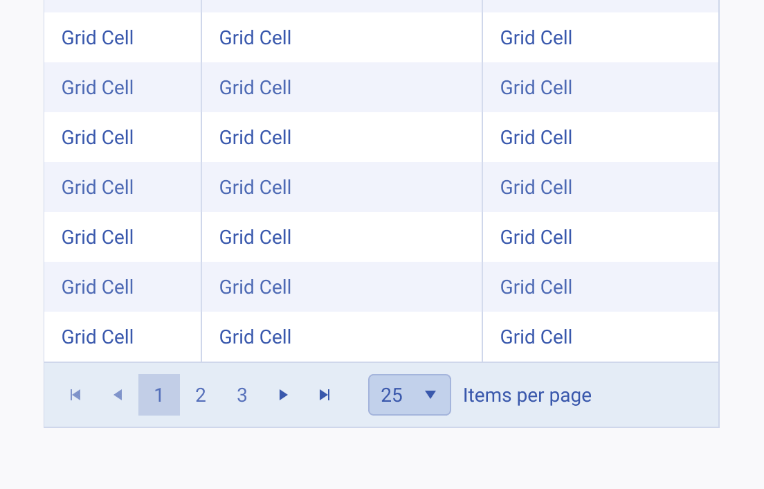
The Pager component is used to reduce the cognitive load on the user, navigate them through the content, and reduce the loading time on the page. It is recommended in cases where more than 25 items are displayed on a single page.


Position
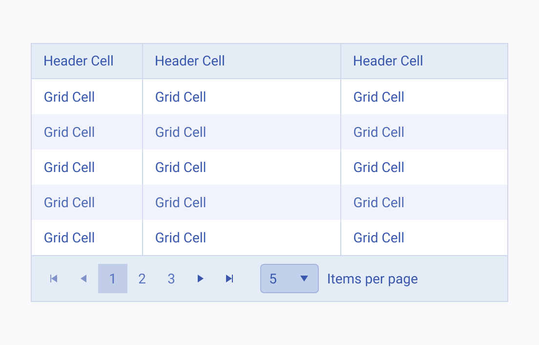
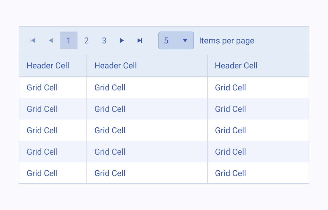
The Pager is located below the content it is associated with. Its position must remain unchanged on every page. On mobile devices, the Pager is usually replaced with scrolling, either vertical, or horizontal.


Exclusivity
As a navigational component, the Pager is usually required only once per page. Using it more than once on a single page is confusing and severely affects the user’s understanding.


