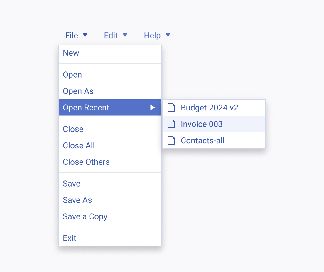
The Telerik and Kendo UI Menu requires you to follow some basic principles when using the component.
Icon Before
Icons can significantly enhance the understanding of menu items by providing visual cues. To maintain balance and avoid undue emphasis on certain items, it's crucial to apply icons consistently across all menu items.
Apply icons consistently before labels in both menu and submenu items to enhance user experience and minimize cognitive load.
Avoid using icons randomly in menu and submenu items, as this can confuse users and disproportionately highlight certain items over others of equal importance.
Grouping with Separators
Separators effectively create distinct sections within menu popups, organizing a larger number of options into manageable groups.
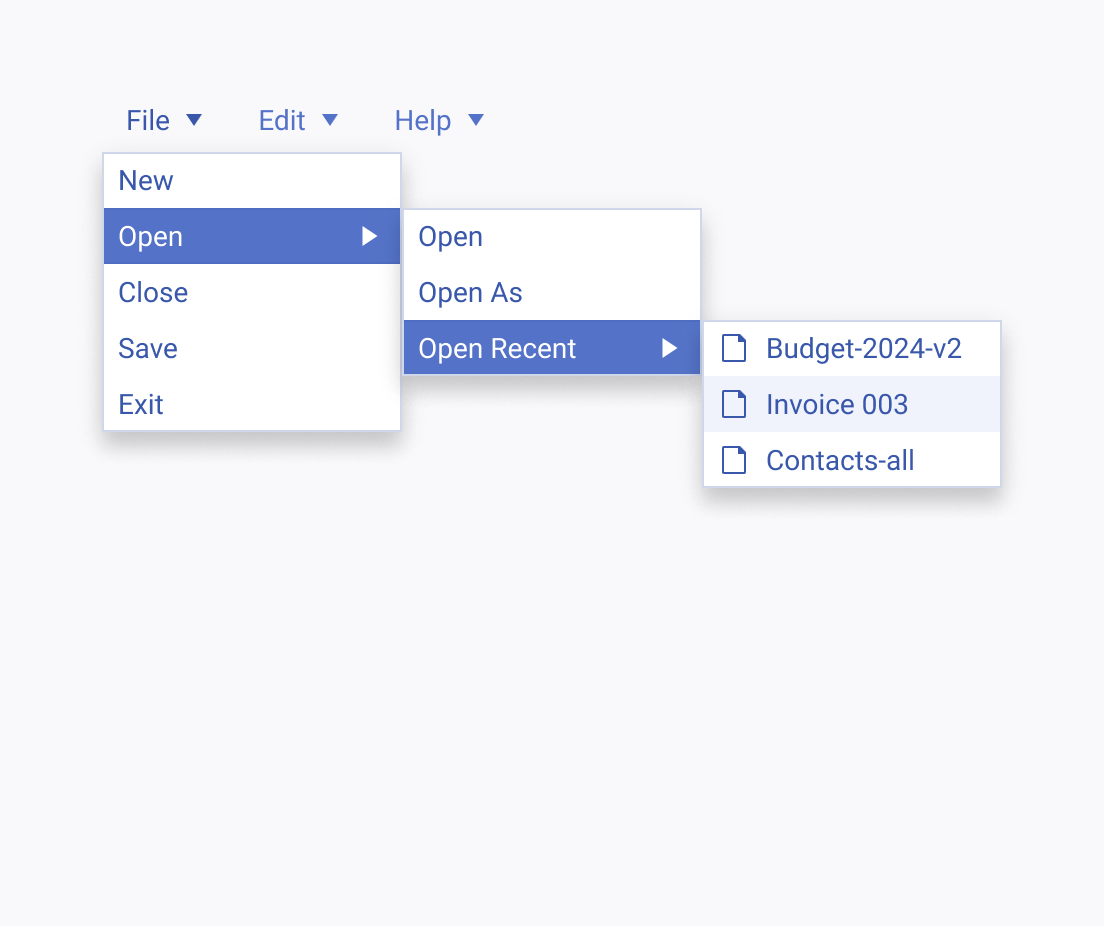
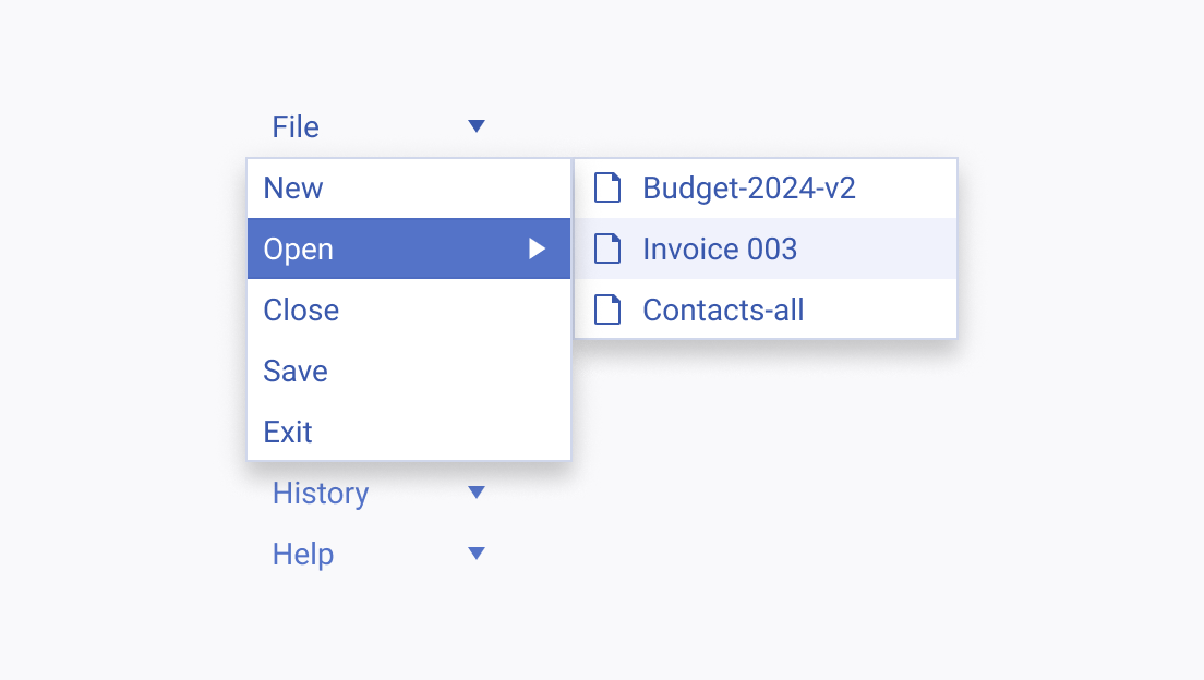
Use separators to divide submenu items into coherent sections in complex menus, reducing the need for multiple levels and minimizing the number of popups.
Avoid creating excessive levels or popups, as too many can overwhelm users and complicate navigation.
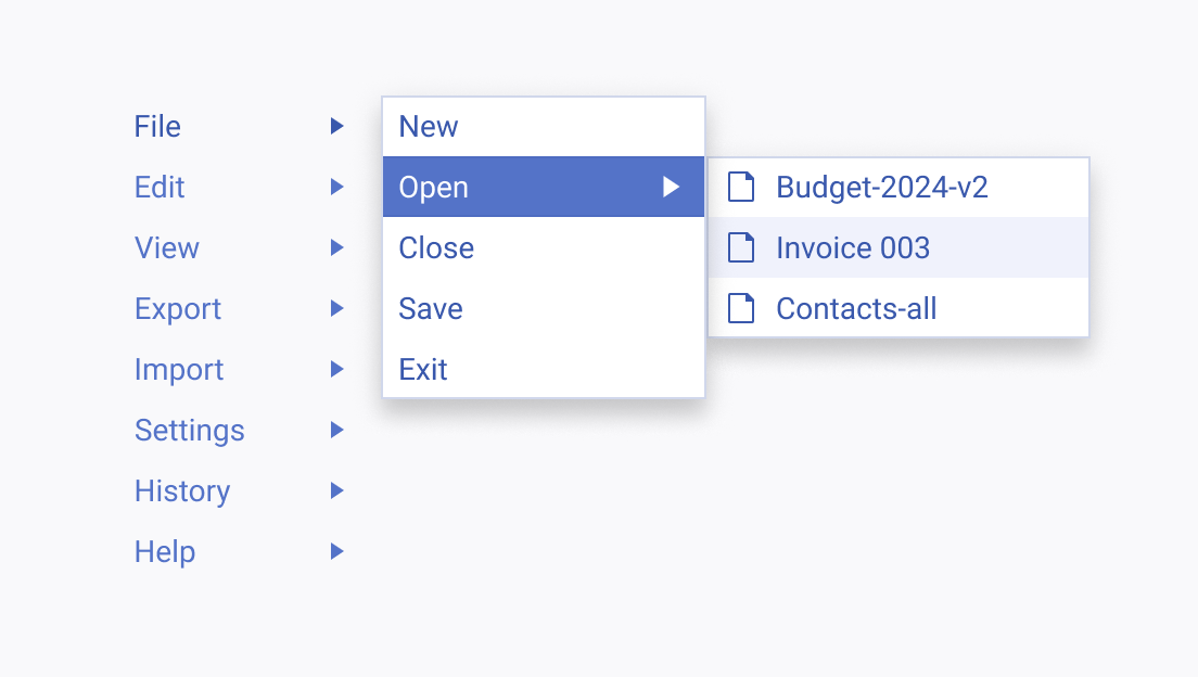
Orientation and Layout
The orientation of the Menu component can be configured to suit various layout scenarios like toolbars and side panels, enhancing usability and aesthetic appeal.
Use vertical orientation in components such as side panels to ensure content is fully visible and does not overlap.
Avoid using horizontal orientation in vertical components as it may lead to important navigation elements being obscured or overlapped.


