Usage Guidelines
The Telerik and Kendo UI Splitter requires you to follow some basic principles when using the component.
Number of Split Bars
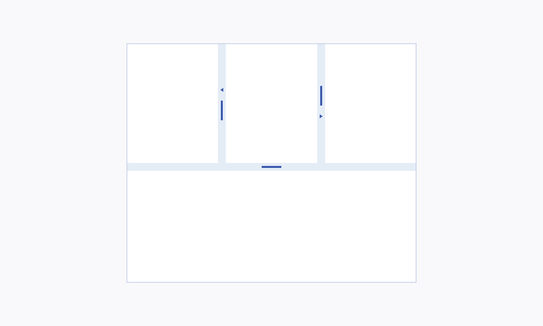
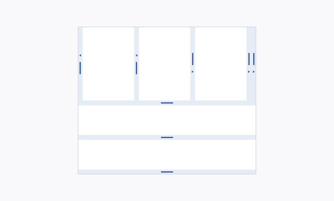
Incorporating the Splitter component sparingly is vital for a clear and user-friendly interface. Limiting their use helps avoid clutter and enhances navigation, ensuring a more streamlined and efficient user experience. This method effectively balances functionality with design simplicity.


Minimum Pane Size
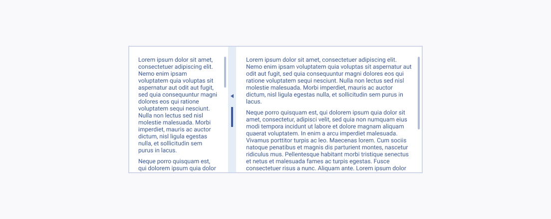
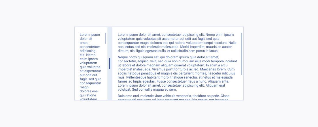
Establishing a minimum pane size is essential for keeping content legible and ensuring a navigable user experience. This prevents crucial information from becoming unreadable in constrained layouts.


