Guidelines and Design Principles
The component icons for the Telerik and Kendo UI themes are designed to be intuitive and minimalistic, to capture the essence of a shape. They contribute to the main purpose of the Telerik and Kendo UI design language—to be simple and user-friendly. You can use these icons to represent any object and to highlight an element.
To add your own icons that are consistent with the style of the delivered component icons, follow the guidelines in this article.
Grid and Proportion
The UI components icons system is optimized for maximum legibility in a font size of 16 pixels:
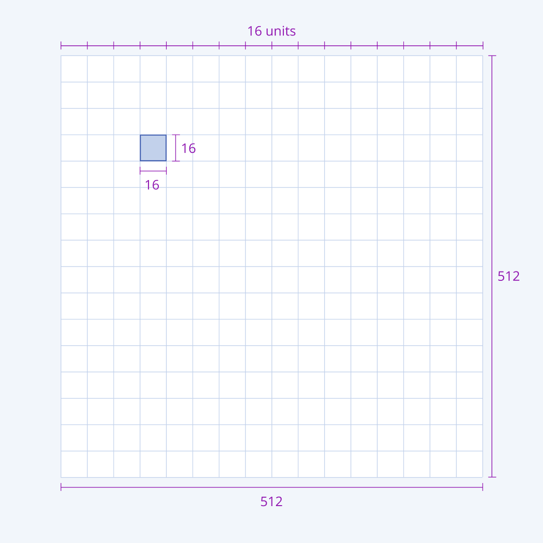
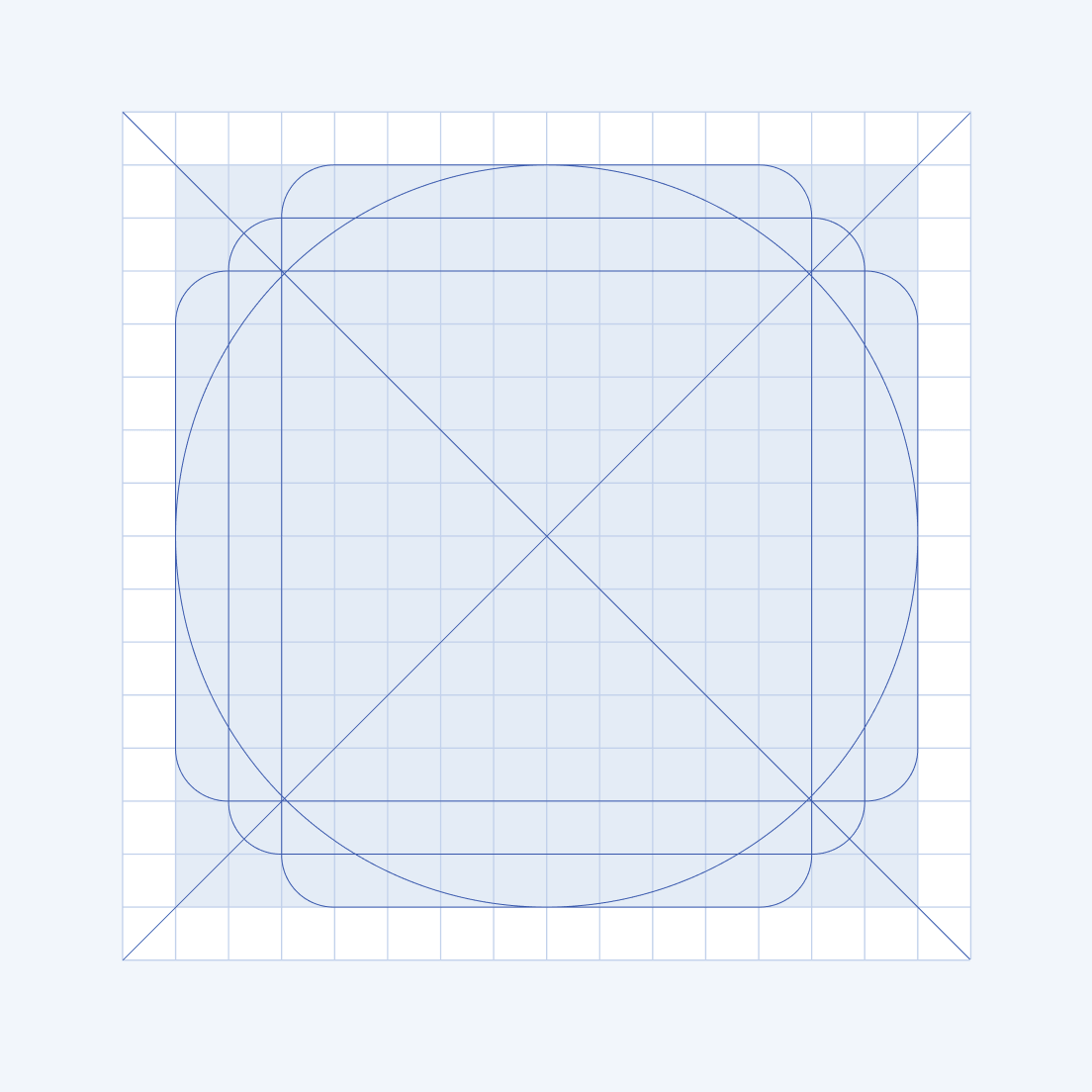
- For pixel-perfect accuracy, the system uses a 512 x 512 pixel canvas to create the icons. This canvas is based on a 16-pixel grid base.
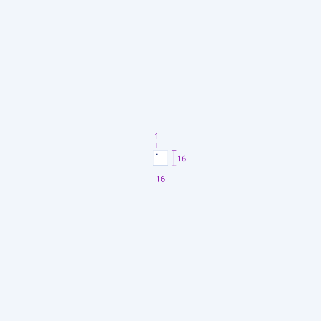
- The system uses a gridline on every 32 pixels. This creates 16 units, each 16 x 16 pixels. As a result, 1 unit on a 512 x 512 pixel canvas is equal to 1 pixel on a 16 x 16 pixel canvas.
Layout
The components icons system sets the following requirements for the layout of the icons:
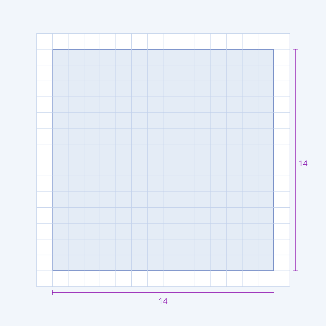
- The icon's content on the canvas is limited to 14 x 14 units of live area. The live area is surrounded by 2 units of trim area. No part of the glyph is allowed to go outside the trim area.
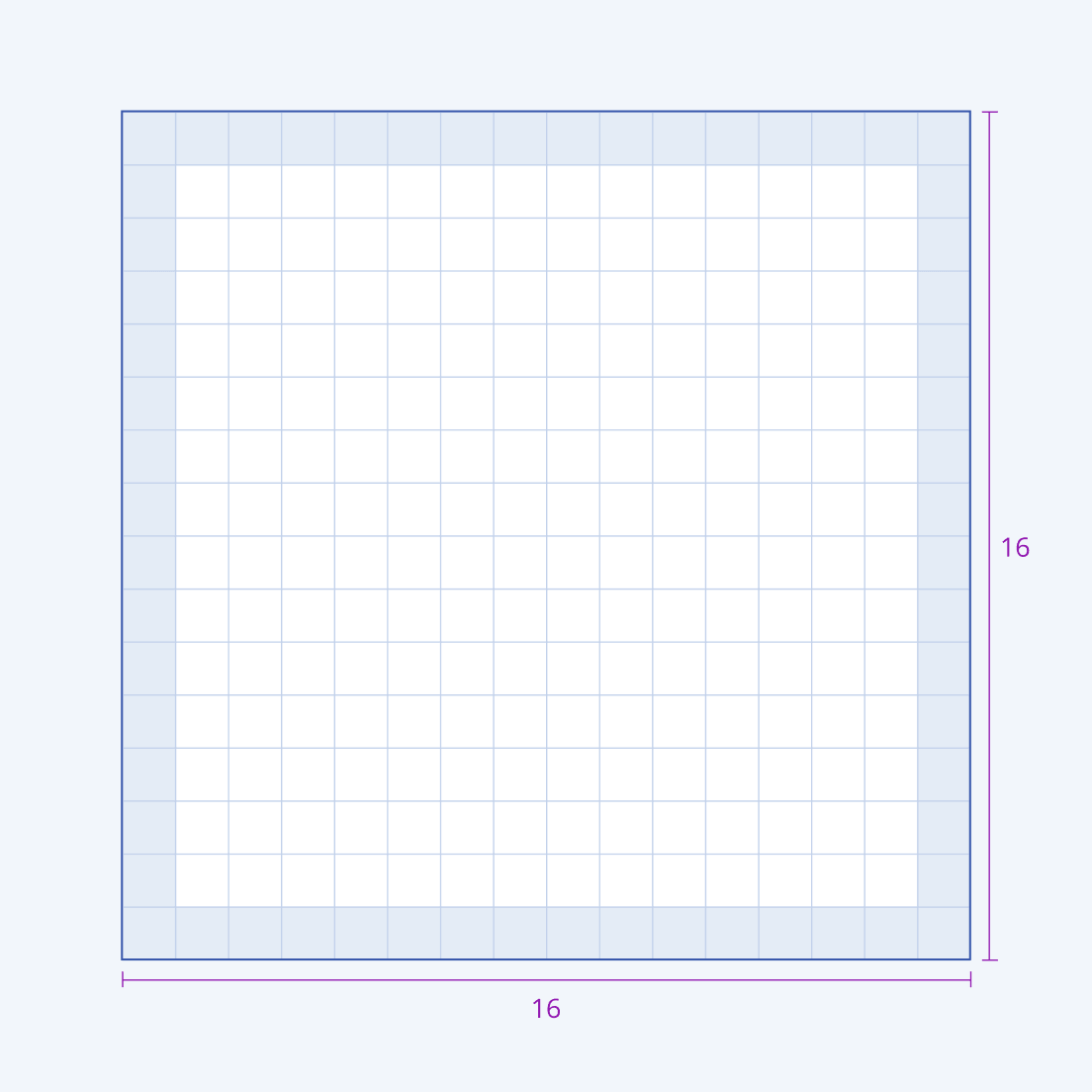
- If the icon contains a lot of details, you can increase the live area to 16 x 16 units. This is an exception to the rule, and you must avoid it.
- When adding icons, be careful with their proportions. To look consistent, they must use the same scale as the already available glyphs.
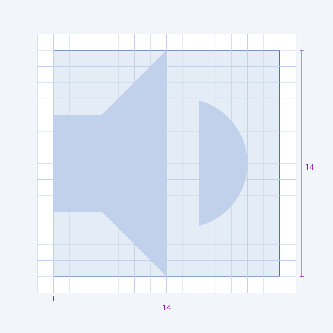
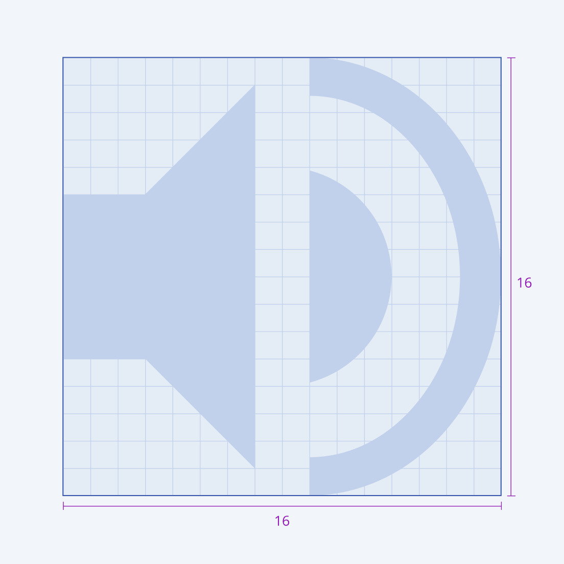
Position
Always place the icon in the middle of the live area. If you cannot center the icon because of its specific shape, then align it to the top left corner of the live area.
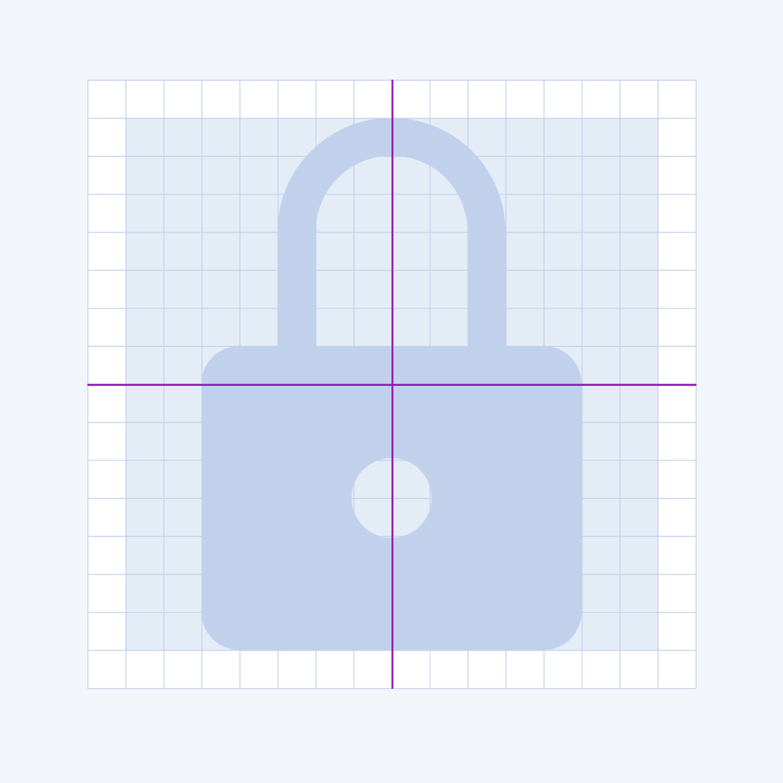
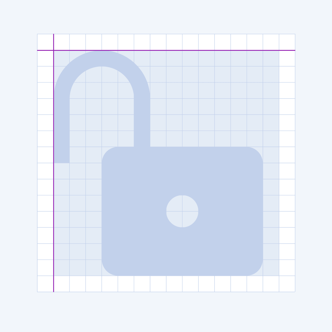
Geometry
The UI components icon system integrates a preset of main diagonals and basic shapes like squares, circles, and rectangles. This small palette of universal and simple elements keeps the consistency and simplicity of the artwork and specifies the position of the glyph in the icon grid.
Style
The shape of the icons aims at clarity, minimalism, and geometry. It tries to improve readability on both small and large sizes. To ease the users’ perceptions, the shapes utilize well-known metaphors.
The following characteristics are specific to the components icon system:
- The Icons are flat and graphic to match the brand's look and feel.
- The geometric shapes are pure—straight lines and circles. Organic shapes aren't utilized.
- All lines must be either vertical, horizontal, or at a 45-degree angle, relating to symbol angles.
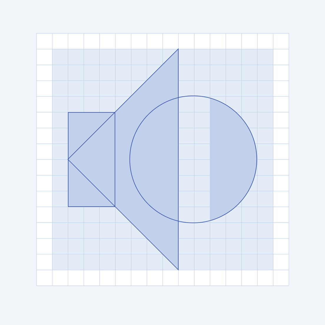
- The main stroke width is 1 px for a size of 16 px. This stroke is applied for curve zones, circles, angles, and negative spaces.
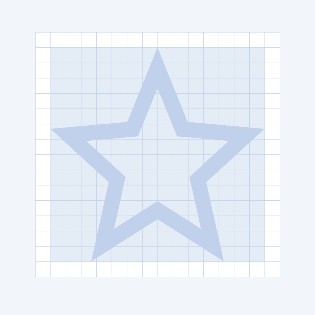
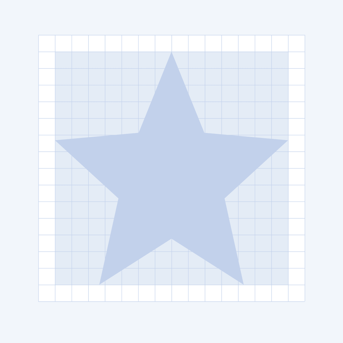
- Although the default fill style is solid, some of the icons have outlined versions. Avoid mixing both styles as it leads to inconsistency.
Export
Before exporting them, unify all icon shapes into a single path. Otherwise, the exported icon will not be converted correctly to a font icon and will not be visualized in all browsers. The required command is called Flatten selection in Figma and Make a Compound Path in Adobe Illustrator.


