Usage Guidelines
The Telerik and Kendo UI Tooltip requires you to follow some basic principles when using the component.
Purpose
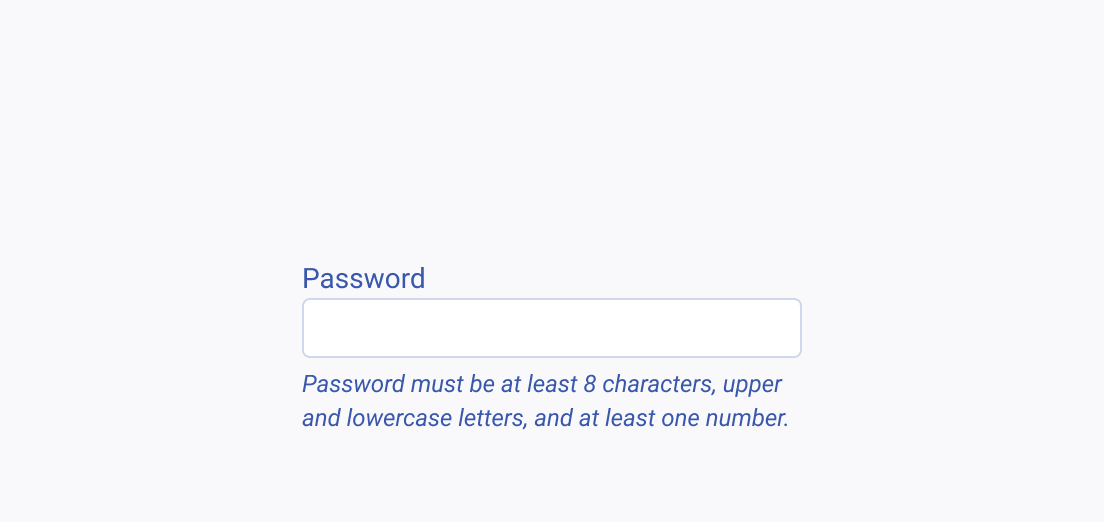
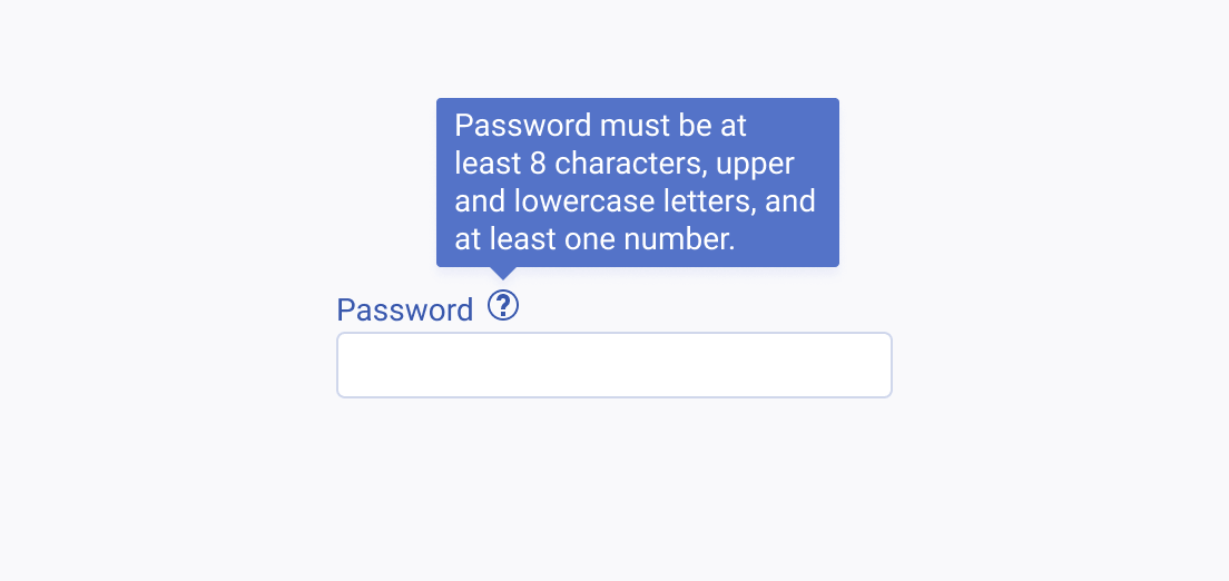
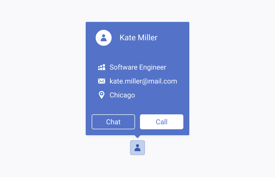
Tooltips are important UI elements for providing brief, additional context or instructions in a non-intrusive way. They are ideal for enhancing the user's understanding without complicating the interface. However, for more complex or interactive content, Popover components are a better choice as they provide more detail and functionality while keeping the interface clean and user-friendly.
Concise Content
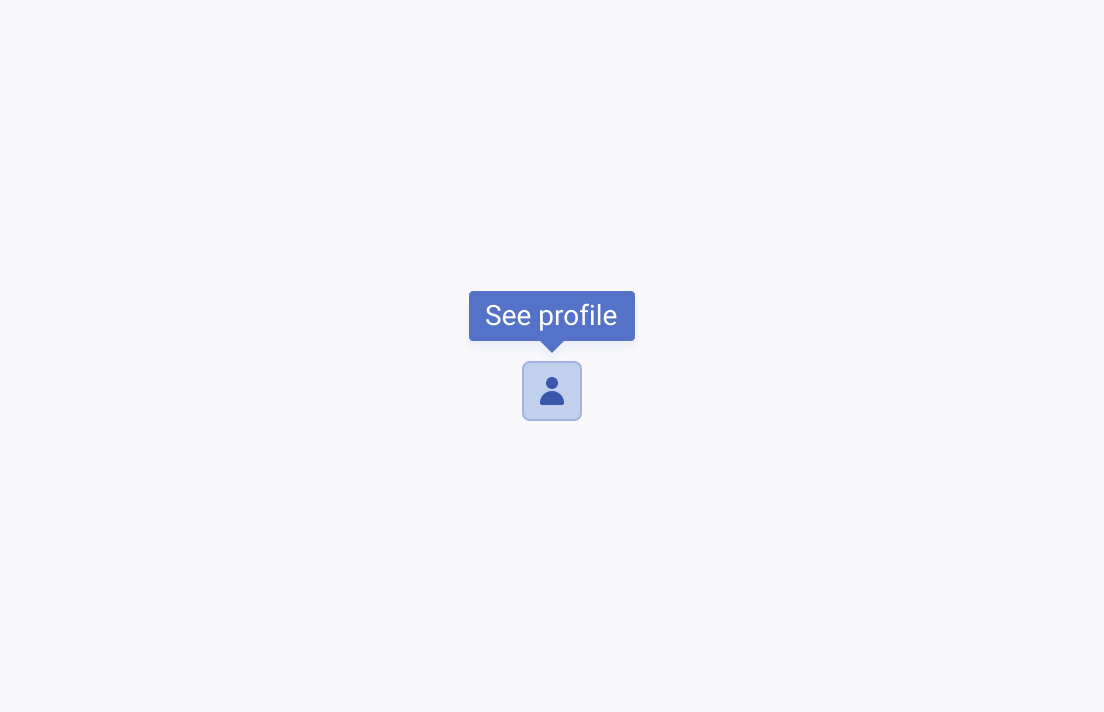
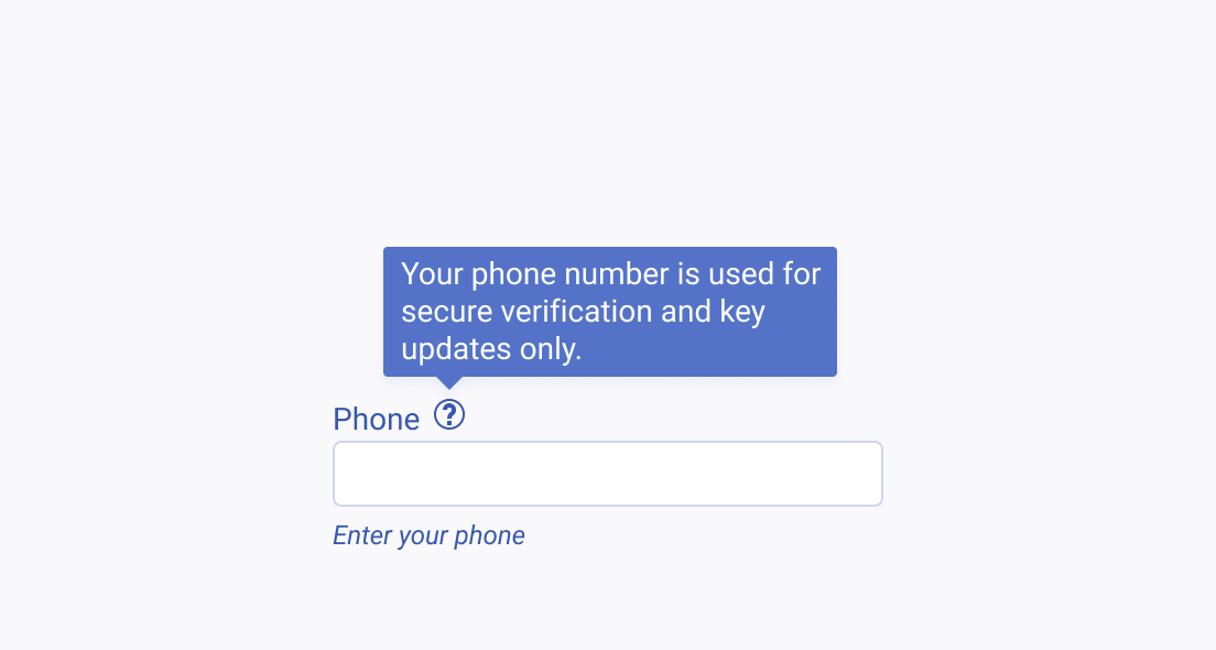
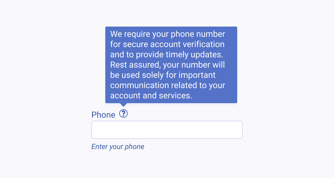
The effectiveness of tooltips hinges on their ability to convey information concisely. By limiting tooltip content to a few words or a single sentence, they can provide essential hints or brief explanations without overwhelming the user. Concise tooltips enhance the user experience by adding clarity without obscuring significant portions of the interface or creating information overload.
Important Information
It's vital to keep crucial information directly visible in the user interface, rather than hidden in tooltips. Tooltips have limited discoverability and can pose usability challenges, particularly on devices without hover functionality. Relying on tooltips to convey essential information can impede task completion.
