Usage Guidelines
The Telerik and Kendo UI ExpansionPanel requires you to follow some basic principles when using the component.
Purpose
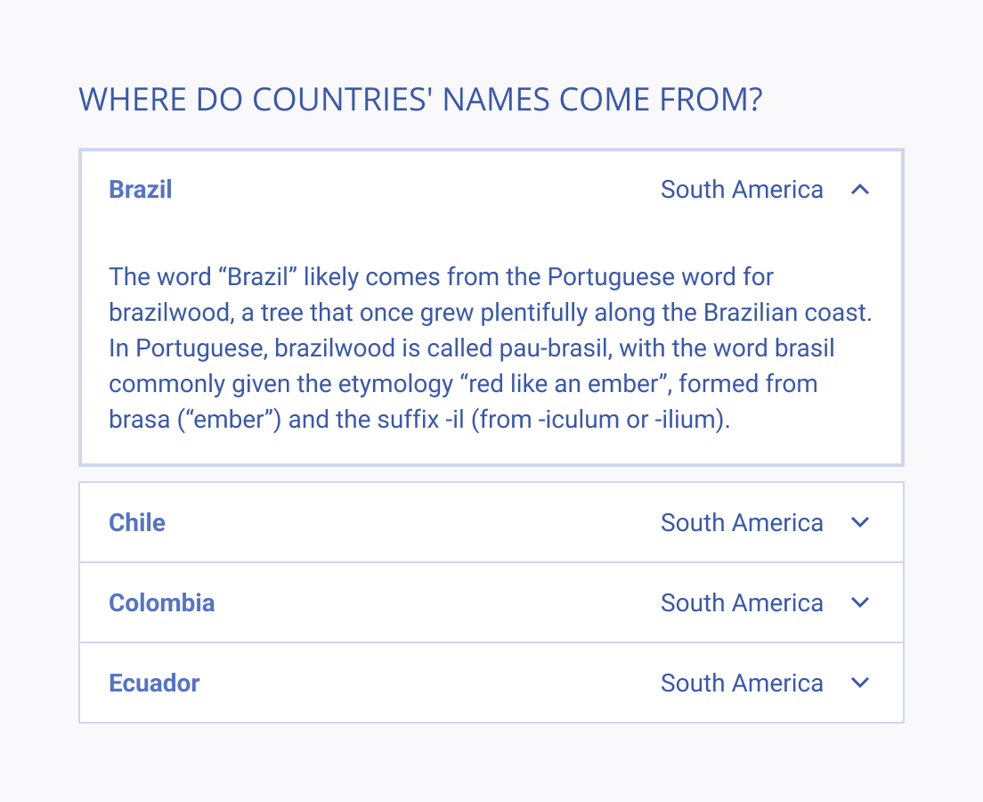
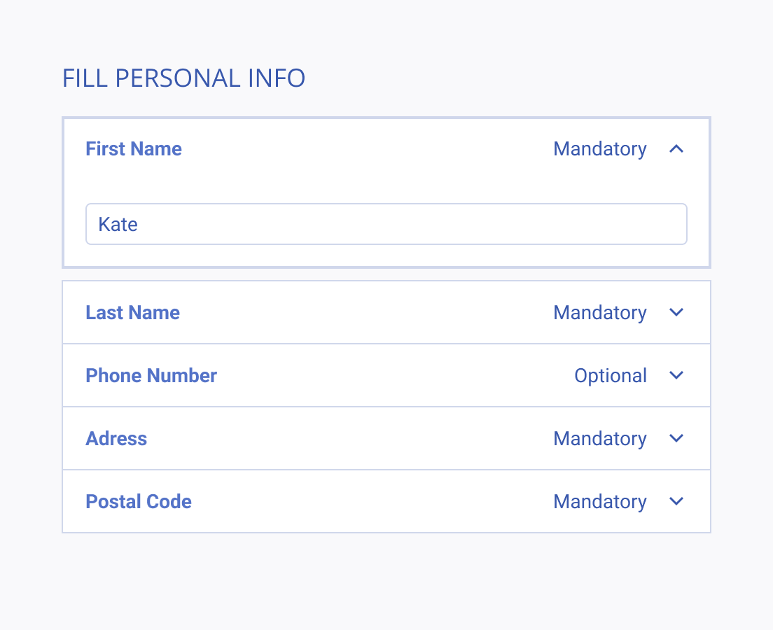
ExpansionPanels, also known as accordion components, are valuable tools for organizing and simplifying user interfaces. They allow users to interact with and reveal additional content or options as needed, effectively reducing clutter and improving user experience. However, it's crucial to ensure that these panels are used thoughtfully, as overuse or hiding essential information behind them can hinder accessibility and frustrate users.


Titles and Icons
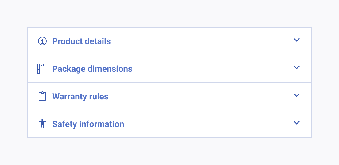
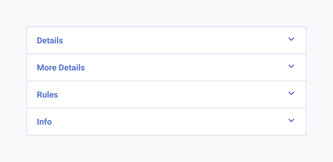
When incorporating ExpansionPanels into a user interface, it's crucial to strike a balance between providing clarity and avoiding unnecessary user interactions. Utilize descriptive titles and icons to guide users through the hidden content while reducing cognitive load.


