Reasoning Overview
The Reasoning component communicates that an AI model is working through a request and presents reasoning content in a structured way. It is intended for conversational and agentic interfaces in which a response may take time to generate or may benefit from additional context.
The component keeps a concise label visible in the reasoning header, while allowing longer reasoning content to expand below it. The reasoning content updates progressively during streaming and automatically collapses when finished.
Appearance
The Reasoning component consists of two parts: an Agent Step Header and an expandable content area.
In its in-progress state, a shimmer animation indicates that reasoning content is still being generated.
Once generation is complete, the component transitions to a completed state, where the animation is removed and the header label is updated to reflect the completed status.
States
In progress—Indicates that reasoning content is still being generated. The component uses an animated activity treatment in this state.Completed—Indicates that the reasoning process has finished.Expanded—Displays the reasoning content when the component is expandable.Collapsed—Hides the reasoning content and keeps the header visible when the component is expandable.
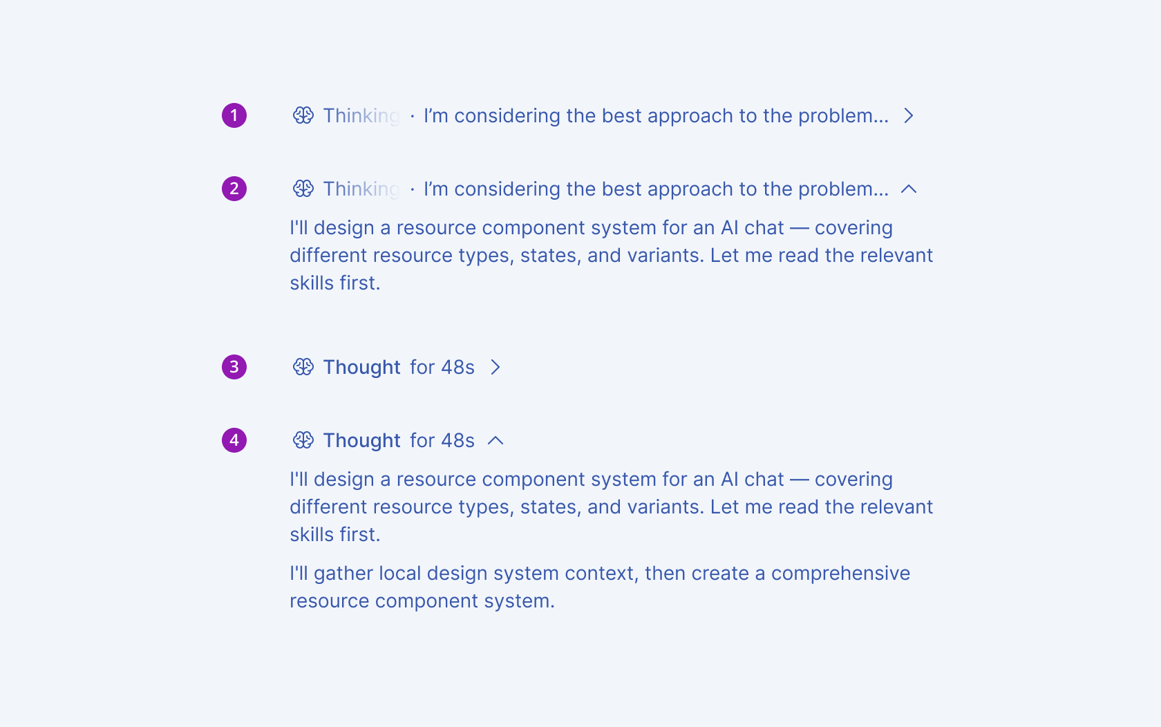
- In progress – collapsed
- In progress – expanded
- Completed – collapsed
- Completed – expanded
Anatomy
The anatomy of the Reasoning component includes the following elements:
- Icon (optional)—Visually identifies reasoning activity and can be customized.
- Label—Provides the primary description of the reasoning activity.
- Secondary label (optional)—Provides supporting context, such as elapsed time or model status.
- Expand/collapse control—Indicates whether expandable content is currently shown or hidden.
- Content container—Displays the reasoning information supplied to the component & visually groups the reasoning content with its header.
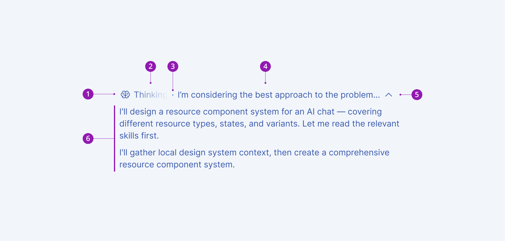
- Icon (optional)
- Label
- Separator (optional)
- Secondary label (optional)
- Expand/collapse control
- Content container
Framework-Specific Documentation
For specific information about the component, refer to its official product documentation: