Checkpoint Overview
The Checkpoint component creates a clear recovery point between conversation turns. It helps users revisit an earlier state, regenerate the latest response, or begin the conversation again without adding persistent visual weight to every message.
The component displays a contextual action between separator lines. The application determines what happens after the action is selected and updates the conversation accordingly.
Appearance
The Checkpoint component appears as a lightweight separator with a centered recovery action button. By default, the action is revealed on hover to keep the conversation layout compact. It can remain visible when persistent access is needed, including in touch-based interfaces where hover is unavailable.
Recovery States
Start over—Offers an action that resets the conversation and begins again from the start.Restore—Offers an action that returns the conversation to an earlier turn or saved point.Redo—Offers an action that regenerates the latest response without discarding the rest of the conversation.
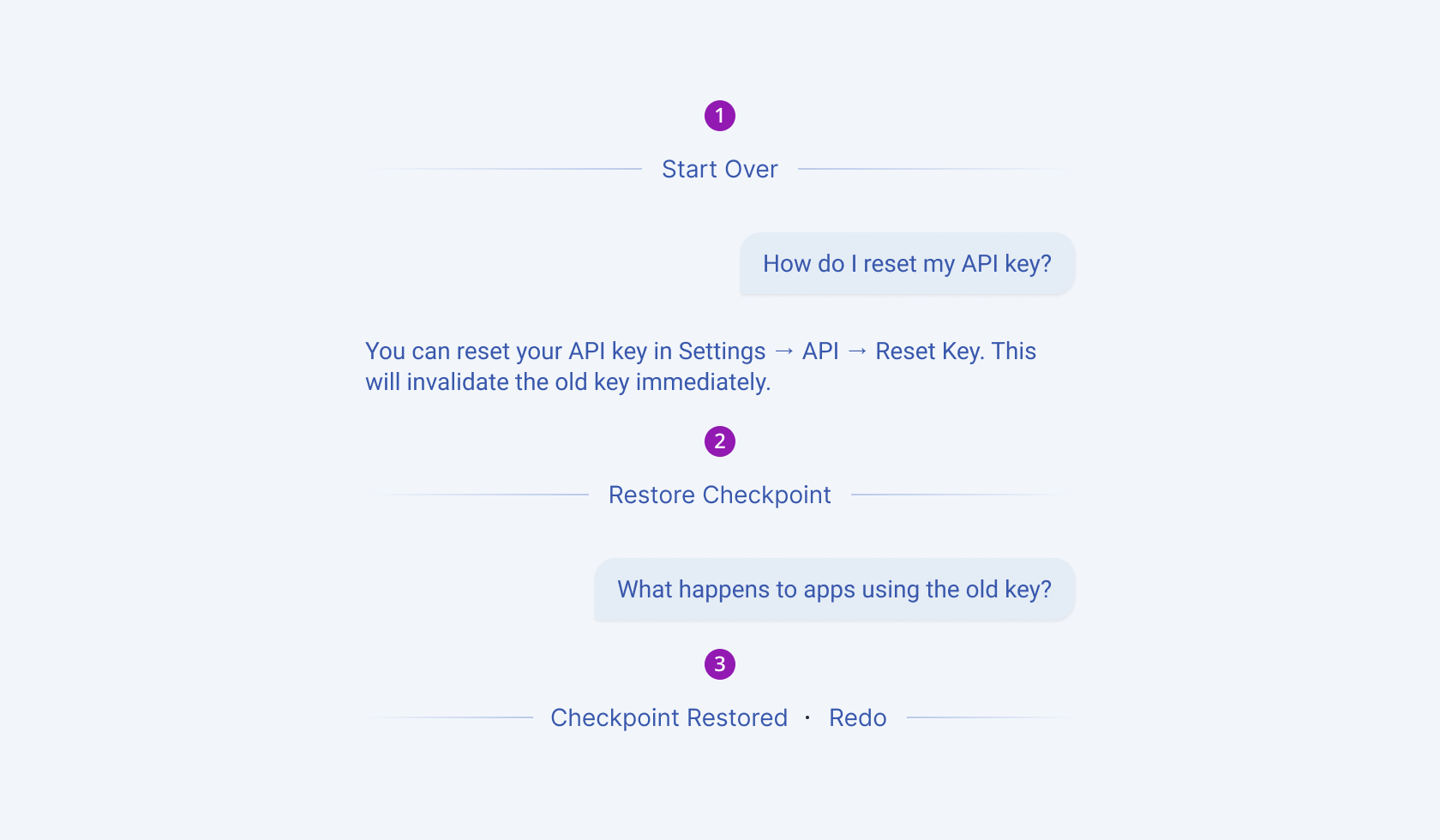
- Start Over
- Restore Checkpoint
- Redo
Visibility
Revealed on hover—Keeps the action hidden until the user hovers over the checkpoint. This is the default visibility behavior.Always visible—Keeps the restore action available without hover and is appropriate for touch-based interfaces.
Anatomy
The default Checkpoint component includes the following elements:
- Separator—Marks the restore point and visually connects the content on either side of the action.
- Action button—Triggers the restore behavior associated with the selected state.
- Status label—Indicates that the checkpoint has been restored.
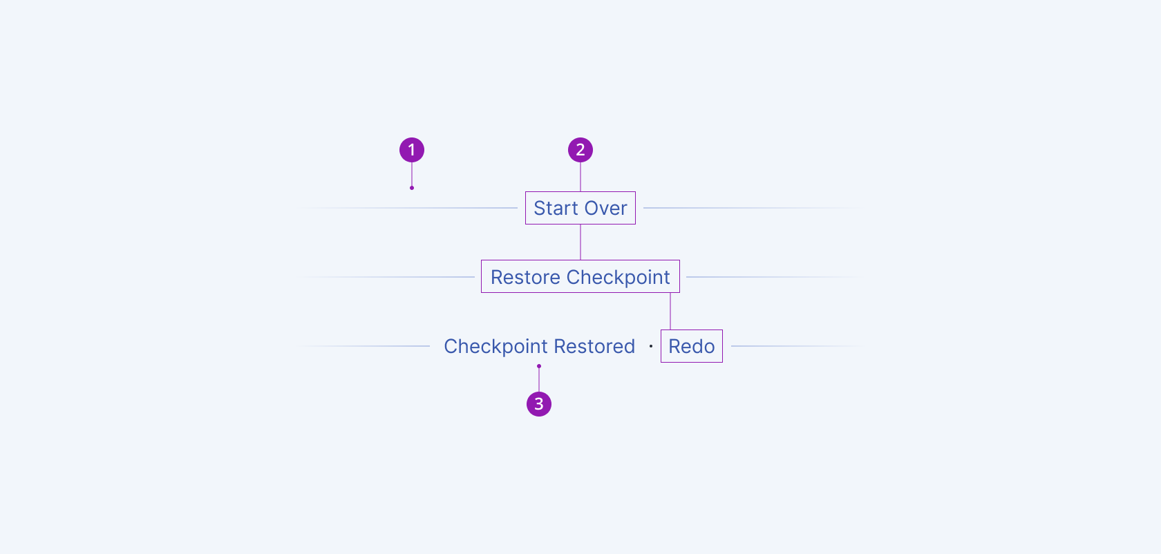
- Separator
- Action button
- Status label
Framework-Specific Documentation
For specific information about the component, refer to its official product documentation: