KendoReact
React Data Grid
- 100% React Data Grid, written in TypeScript without compromises or workarounds.
- Part of the KendoReact library along with 100+ professionally-designed components.
- Includes support, documentation, demos, virtual classrooms, learning resources and more!
-
The React Data Grid That Makes Your Life Easier
Building a data grid for your React app is hard and can take a lot of time. Are you looking for a data table that’s ready to roll, meets your feature requirements and is straightforward, even pleasant, to use? If you need a fast data grid that suits your needs, a grid that’s extensible, well maintained and documented, read on to learn about the KendoReact Data Grid (Table).
-
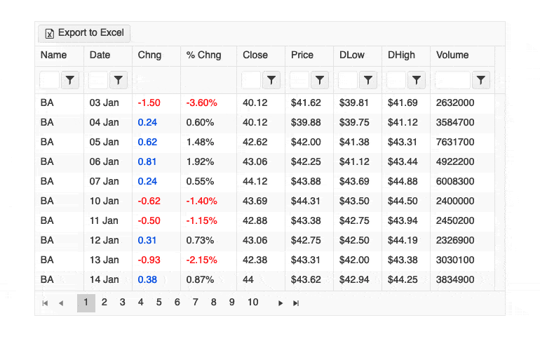
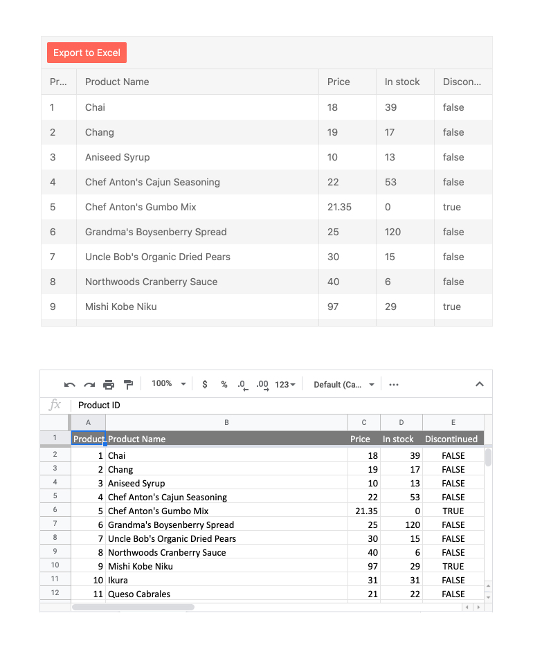
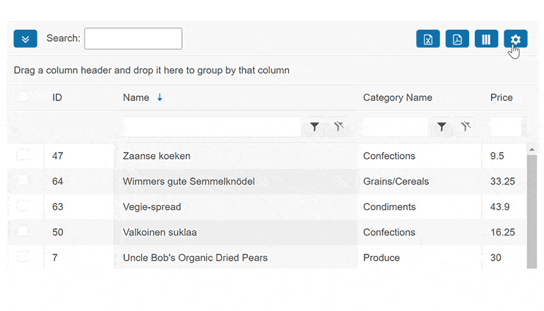
Export to Excel and PDF
The React Grid features integration with the Excel and PDF Export libraries in the KendoReact library. This integration allows for all content found within the Data Grid to be exported to either Excel or PDF with a single click. With a large set of configuration options available, developers can decide if only the current data set displayed should be exported or if the entire data set should be included in the export, and every exported file can be customized on-the-fly.
-
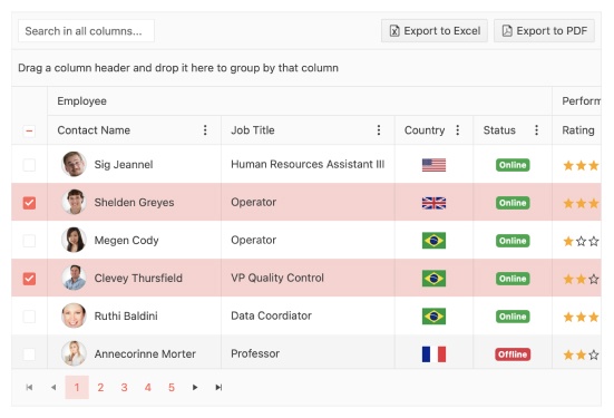
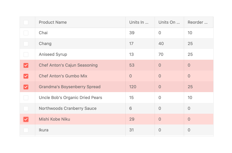
Row and Cell Selection
The KendoReact Grid supports multiple selection modes. It allows for selection of single or multiple cells and rows, plus checkbox and row-click selection, which can be applied to single or multiple records. The selection can be programmatically set and the KendoReact data table provides methods for extracting and interacting with the selected rows.
-
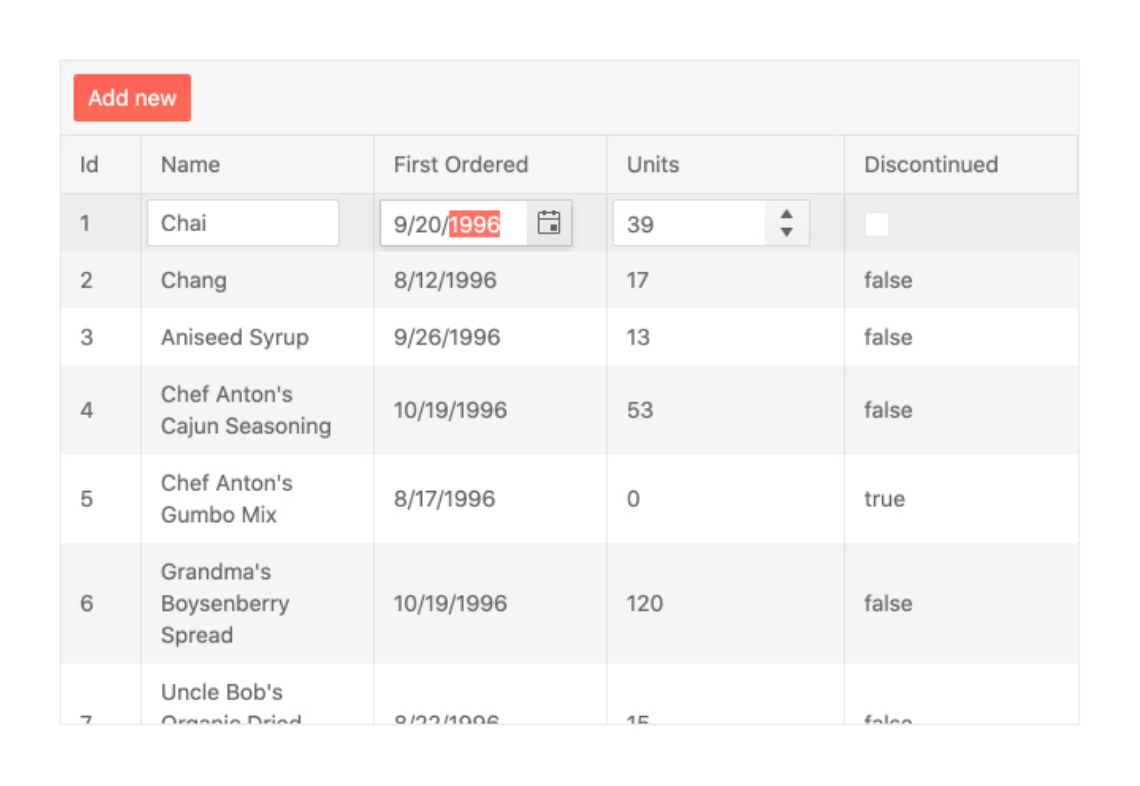
Inline, In-cell and Custom Editing
It’s easy to create, update, and delete Grid data records inline (inline editing) and in-cell. You can also use other components as custom editors, for example a React DropDownList or Calendar.
-
Virtualization
With column and row virtualization and virtual scrolling, the KendoReact Grid can work with large data sets without slowing down, offering the smooth user experience you’re after.
-
Accessibility
Accessibility is one of the main pillars of the KendoReact library and this can be seen across all available React UI components. The KendoReact Grid is AAA rated with WCAG 2.0 and compliant with Section 508 and WAI-ARIA standards.

-
Keyboard Navigation
Navigating through the data table with just a keyboard is a breeze thanks to the KendoReact Data Grid built-in keyboard navigation feature. This feature allows end-users to interact with any part of the table using just their keyboard.
-
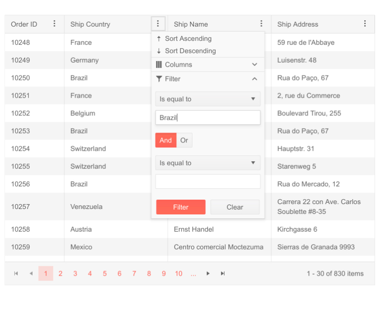
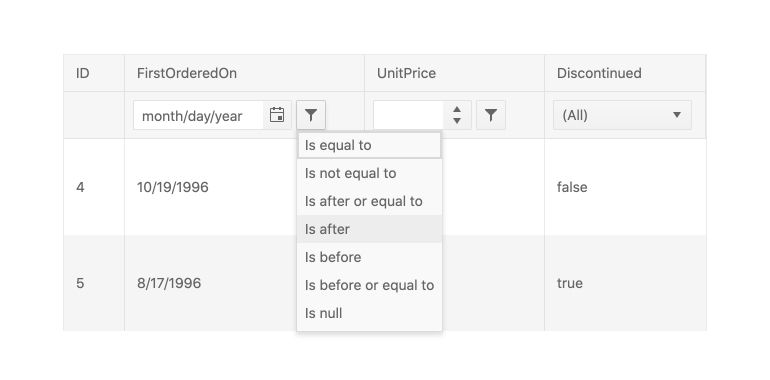
Column Menu
The column menu provides a convenient way to apply data processing features to the specified columns. The user can sort and filter the grid data, toggle the locked and sticky state of the columns, or change their visibility. You can customize the order of the menu items and create custom controls as necessary.
-
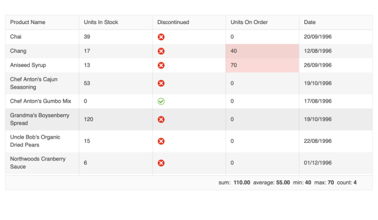
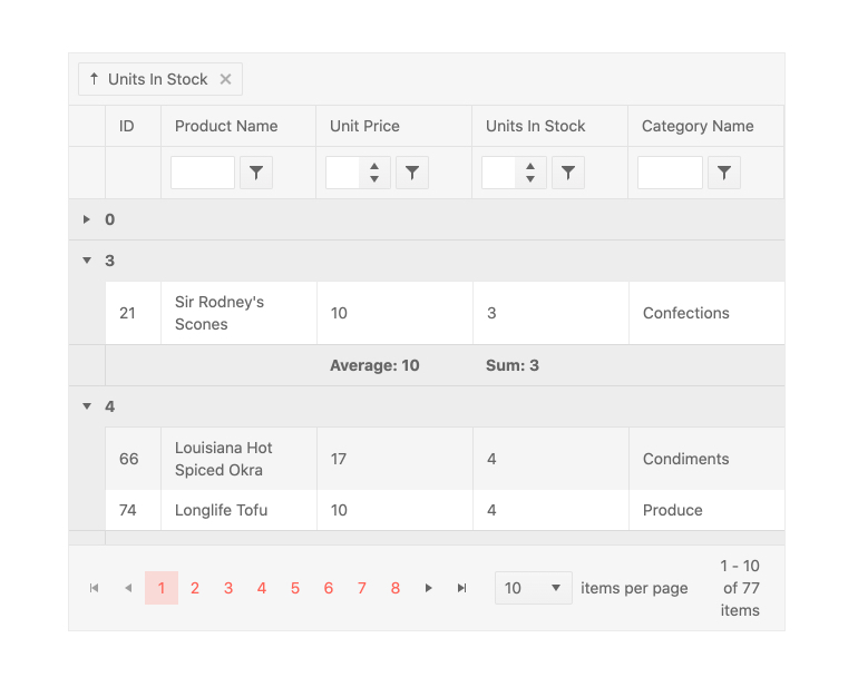
Selection Aggregates
The Selection Aggregates feature enables you to select single or multiple cells or rows withing the grid and calculate different metrics based on the selected data, allowing you to get a quick snapshot of key aggregates. You can utilize the built-in approach and display the metrics at the bottom of the Grid or create your own elements to present the data as needed.
-
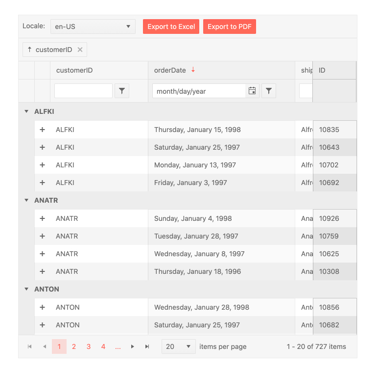
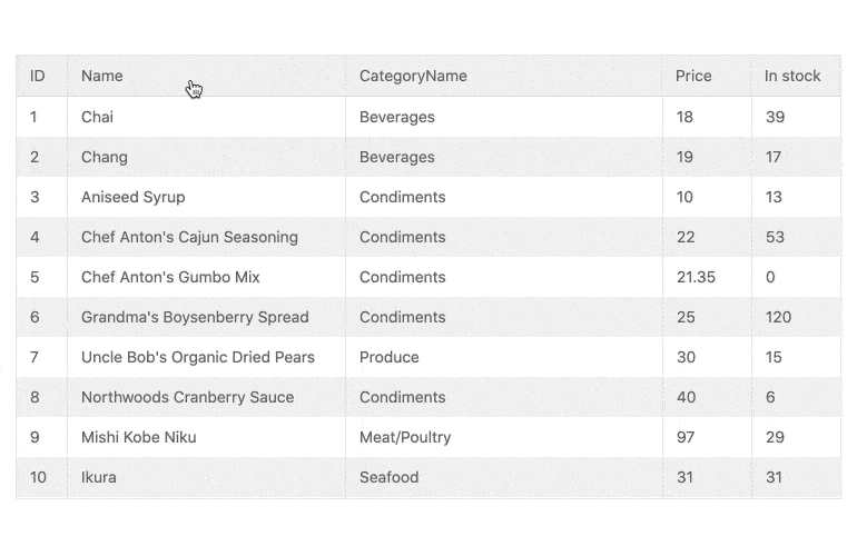
Page, Sort, Filter and Group Data
Let users slice and dice their data by providing the familiar Excel-like UI to do paging, single or multi-column sorting, filtering, or grouping, all through quick configuration options.
-
GridHelper
The GridHelper enhances the capabilities of KendoReact Data Grid by providing a built-in feature for data operations, common functionalities, and extensive customization options for end-users, such as column hiding and PDF/Excel export and more.
-
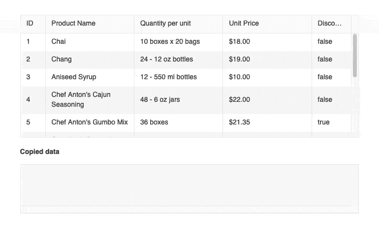
Clipboard
The KendoReact Data Grid enables you to perform all standard clipboard operations from and to the Grid by using the system clipboard.
The grid clipboard supports the following keyboard options:- Copy selected or focused content
- Cut selected or focused content
- Paste the clipboard content
See the React Data Grid Clipboard demo
-
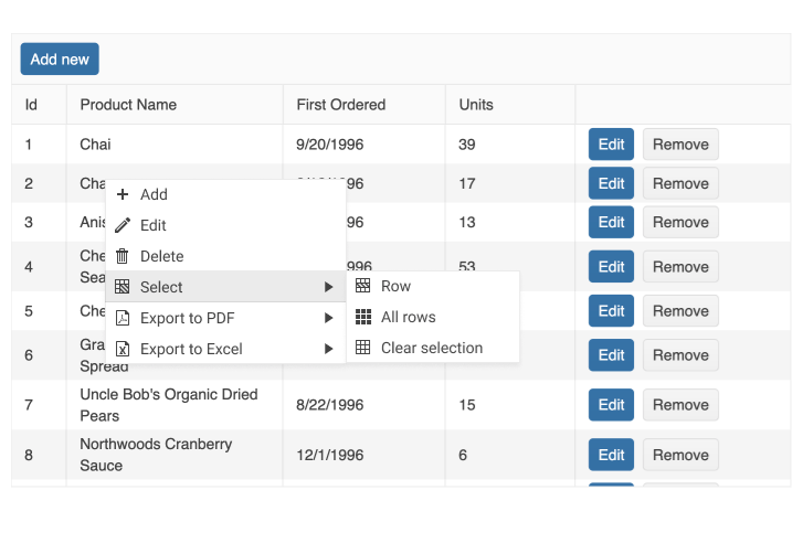
Context Menu
Leverage the seamless integration between the KendoReact Grid and Context Menu components to elevate the user experience and expose the available options for follow-up actions. With a simple right-click on any of the grid rows, users can see all the actions they can perform from the menu.
-
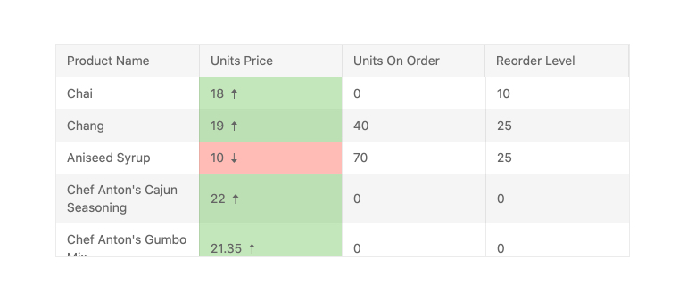
Custom Cells
The KendoReact Grid has built-in default elements for displaying information in cells or UI components that can be used while editing data items, such as a React DatePicker for any field that is bound to a date. In cases where more customization is needed, any cell within the React data table can use a custom renderer in both read and edit modes, enabling you to take full control over what is displayed within the Data Grid.
-
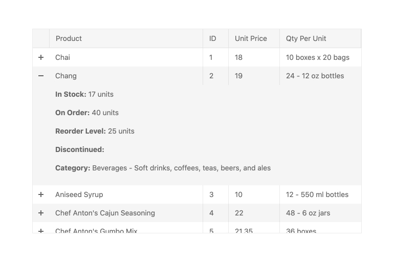
Detail Rows
Some rows within the React Grid may need to display additional information when expanded and this is where the Detail Rows feature of the KendoReact data table shines. This feature allows for a custom renderer to be attached to the content area presented when a row is expanded, giving you full control over what to display in this area.
-
Row Pinning (Sticky Rows)
Rows within the KendoReact Data Grid can be pinned, or locked, at the top and bottom of the table. When a row is pinned, it will remain in place as the user scrolls through the rest of the content of the React Data Grid. Row pinning can be done programmatically or exposed as an interactive UI element within each data row.
-
Locked (Frozen) Columns
The KendoReact Data Grid allows for frozen (also called locked or sticky) columns to be added to the left- and right-hand sides of the table. These can be defined ahead of time, dynamically added by the user or applied externally. The React Data Grid allows interactions through a menu that can appear when users interact with the header of a column. Users can use this column menu to easily lock (pin) columns.
-
Column Interactions
The KendoReact Grid allows for any column to be resized, reordered, dragged to be grouped, locked, and toggled between being show or hidden. Each option can be applied across all columns in the entire data table or defined on a column-by-column basis.
-
Persist Grouping
Through the persist grouping feature, the state of the KendoReact Data Grid groups will persist throughout data operations. This means the expanded or collapsed state will remain when users page, filter or sort data.
-
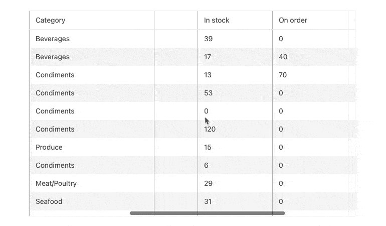
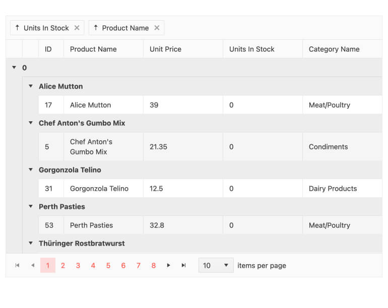
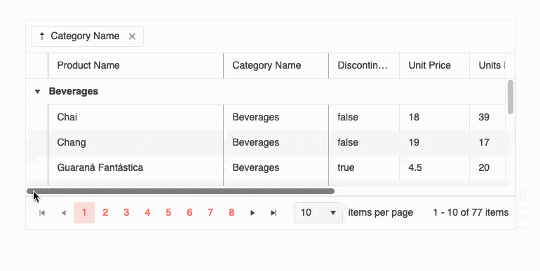
Grouping and Aggregates
With grouping enabled, end-users can group data by any column they choose, with no limit to the number of groups they can create. You can choose to display aggregate information in the header or footer areas. Each group can be sorted, expanded, and collapsed individually, and there are methods to expand/collapse all groups.
-
Locked Group Headers
To help satisfy requirements and provide great UX, the React Data Grid allows you to combine the use of grouping headers and frozen columns. In this scenario, you can display collapsible grouping headers and frozen grouping columns.
-
Tree View
Many competing data grid libraries have a TreeView mode for displaying hierarchical data, but KendoReact includes a dedicated component for this. The KendoReact TreeView component uses the same performance, data binding flexibility, and customizability found in the Data Grid, and delivers features specific to a TreeView scenario. The best part? Both components are included in KendoReact.
-
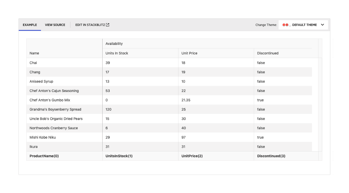
Multi-Header Columns
Column headers are tied to data fields based on the underlying data model bound to the Data Grid. As some fields may not make sense on their own, it can become useful for end- users to group these columns into a category, which is where the Multi-Header Columns feature of the React Grid comes into play. This allows for column headers to span across several sub-columns, organizing the data in the table and allowing for column interactions to be applied to this group of columns all at once.
-
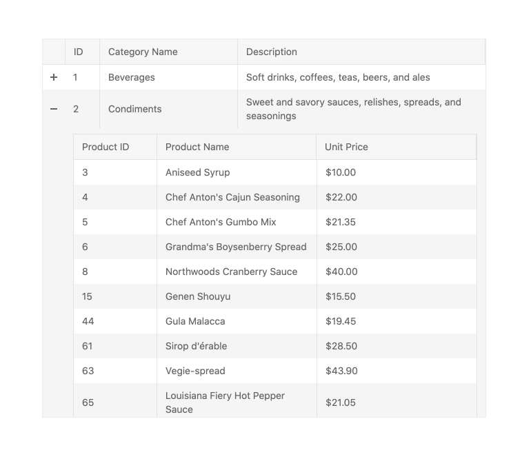
Hierarchy (Master-Detail Tables)
With the built-in Hierarchy feature, the KendoReact Grid can feature an unlimited depth of parent and child tables. Each level of the hierarchy can be displayed as a React data table with the same features as the parent table (like sorting and paging), or can be customized to highlight a limited set of features based on the requirements for that level of the hierarchy.
-
Compact Rendering Mode
Small screens are a primary channel for app delivery and developers are challenged with presenting data grid views in ways that device users can understand. To help solve this need, the React Data Grid now has a compact rendering mode. In this mode, cell padding will automatically be decreased regardless of the built-in theme used (Kendo Default, Material, Fluent, Bootstrap).