
KendoReact
React Slider
- Choose this sleek selection tool to enable users to select values through a handle interface.
- Part of the KendoReact library along with 100+ professionally-designed components.
- Includes support, documentation, demos, virtual classrooms, learning resources and more!
-
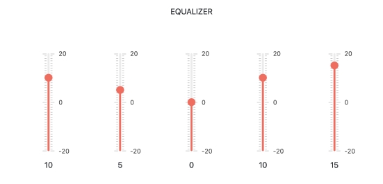
Give Users an Interactive Way to Select Numerical Values
The React Slider provides a sleek and intuitive UI interface for increasing, decreasing and selecting predefined values by dragging a handle along a track, or selecting a value by utilizing the provided side arrow buttons.

-
Orientation
Out of the box, the KendoReact Slider can render itself in both horizontal or vertical modes. Switching between the two is as simple as updating a single configuration option.

-
Labels
With the KendoReact Slider, any value on its track can be provided with a label to indicate to the user what that particular tick represents.

-
Controlled and Uncontrolled Modes
The KendoReact Slider works with both controlled and uncontrolled modes, allowing React developers to choose whether the KendoReact Slider should maintain its state (controlled mode) or if the state should be handled outside of the component (uncontrolled mode).
-
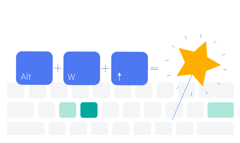
Keyboard Navigation
Thanks to built-in support for keyboard navigation, interaction with the React Slider can be done completely by utilizing the keyboard.
-
Accessibility
The KendoReact Slider complies with modern accessibility guidelines, sporting compliance with Section 508 and WAI-ARIA modes. It's also AAA rated with WCAG 2.0.

