KendoReact
React SegmentedControl
- Part of the KendoReact library along with 120+ free and paid enterprise-grade UI components.
- Includes legendary technical support, design resources, comprehensive documentation, demos, and more!
-
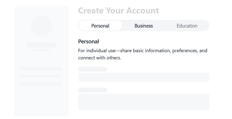
Simplified Mode Switching
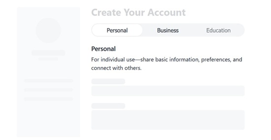
KendoReact SegmentedControl enables you to present a small set of mutually exclusive options. It renders a group of buttons where only one item can be selected at a time, with a sliding indicator that clearly shows the current selection. This UI component makes it a good alternative to radio buttons or dropdowns when space is limited and quick switching is important.
-
Appearance
Adjust how the KendoReact Segmented Control looks and behaves, so it fits naturally into different layouts and UI contexts. You can control the overall size of the control using the size property, with three available options: small, medium (default) and large. In addition to sizing, each item can include icons or combine icons with text. For more advanced styling, you can apply a custom class to the active icon using iconClassName, making it easy to highlight the selected state visually.
e5b33c13a8374e418361186d53d81a16.gif?sfvrsn=55847244_2)
-
Layout Mode
Select how options are sized and distributed, so you can match the layout to your design and content. You can define whether items take only the space they need or expand to fill the available width. The KendoReact Segmented Control supports two straightforward modes:
- Compact (default): Each item is sized based on its content
- Stretch: All items expand evenly to fill the container
This flexibility helps you create interfaces that are both space-efficient and visually balanced.
-
Customization
The SegmentedControl in KendoReact gives you full control over how each item is rendered, making it easy to go beyond the default look and tailor the component to your exact needs by combining elements like icons, labels, badges, or additional metadata.

-
Disabled Segments
Disable individual options when they are not available or relevant. By setting the disabled property to true for specific items in the configuration, you can prevent selection and clearly communicate limitations to users.

-
Controlled Mode
KendoReact SegmentedControl supports a controlled mode, giving you explicit control over which option is selected at any time. Instead of relying on internal state, you manage the selected value directly in your React component and update it in response to user interaction.

-
Keyboard Navigation
The KendoReact SegmentedControl includes keyboard navigation support, allowing users to move between options and make selections without using a mouse.
See the KendoReact SegmentedControl keyboard navigation demo