KendoReact
React Icon & SvgIcon
- Quickly render font or SVG Icons in your app with these components, accessing 400+ icons out-of-the-box.
- Part of the KendoReact library along with 100+ professionally-designed components.
- Includes support, documentation, demos, virtual classrooms, learning resources and more!
-
Built-in Icon and SVG Icon Collection
The React Icon and React SVGIcon components display icons within your application. To ensure React developers can use these icons in any scenario, the KendoReact Icon component displays icons as font icons, while the SVGIcon renders all its icons as SVG elements. Adding these React UI components to a React application gives you access to over 400 integrated icons from KendoReact.
-
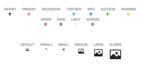
Appearance
The size, color and orientation of the KendoReact Icon and SvgIcon components can be easily customized through the available properties. You can use both predefined theme colors and assign custom ones to make the React Icon and SvgIcon components your own.