KendoReact
Free React Typography
- Ensure consistent styles across your entire app by setting fonts, colors, sizes, margins, and more for CSS classes on the application level.
- Part of the KendoReact library along with 120+ free and paid enterprise-grade UI components.
- This component is free to use, including in production—no sign-up or license required!
-
Build Great UI with Consistent Styling
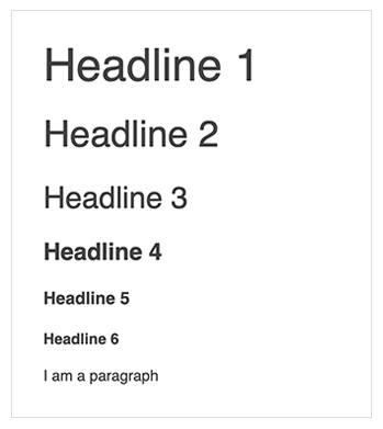
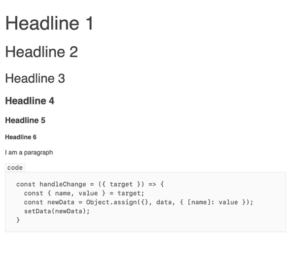
Ensuring text styling is consistent with your design system app-wide is easy with the React Typography component! With its help, you get full control over what text styles and rules should be enforced throughout your entire project, from a single source of truth. This component gives you confidence in the ability to apply consistency in look-and-feel across your entire React application. The KendoReact Typography component brings a ready-to-use typographic scale (type scale) that matches the existing Kendo UI themes and can be used by other KendoReact components, for example the React Editor.
-
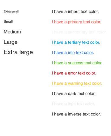
Appearance
You can configure the KendoReact Typography component appearance in various ways, including selecting font size, weight and case, setting predefined values for text alignment, changing the theme colors and controlling the margins. These appearance options are available within any KendoReact theme and can also be customized to fit any requirements.