
KendoReact
React TimePicker
- Highly customizable React TimePicker with support for time zones, different time formats, placeholder text, and more.
- Part of the KendoReact library along with 120+ free and paid enterprise-grade UI components.
- Includes legendary technical support, design resources, comprehensive documentation, demos, and more!
-
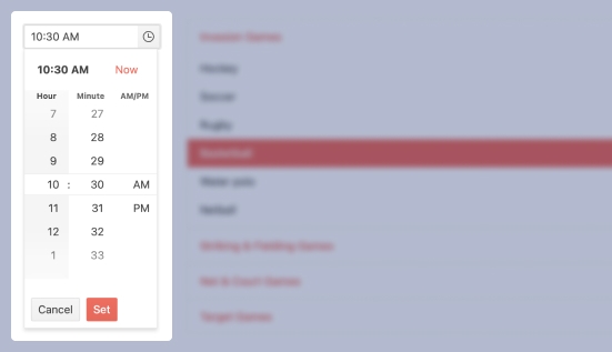
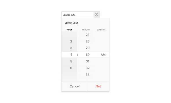
Enable Users to Easily Select Time Values
The React TimePicker provides an intuitive interface for entering or selecting any time of day. With several configuration options to help the component fit into any combination of UX requirements, the component is a versatile option for handling time inputs.
-
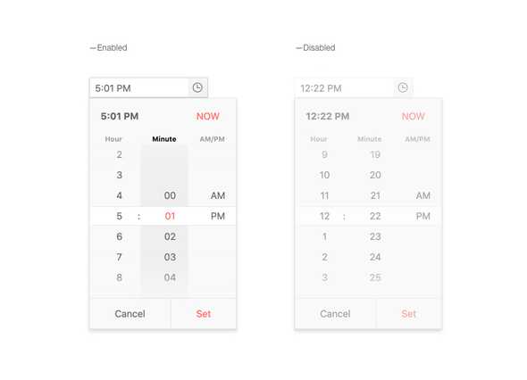
Disabled TimePicker
By default, the KendoReact TimePicker is enabled. However, there may be requirements where the TimePicker has to be disabled to prevent user interactions until certain requirements have been met. Luckily, enabling or disabling the KendoReact TimePicker can be toggled with a single configuration option.
-
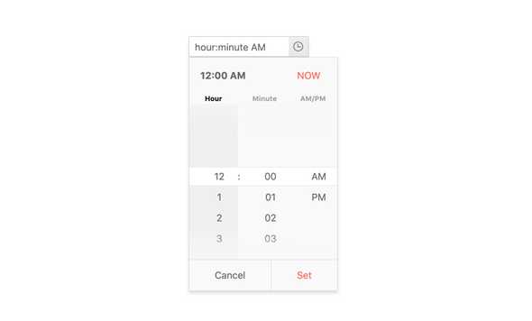
Default Value
Out of the box, the React TimePicker loads with an empty input. However, setting an initial and default value is as easy as binding to a single configuration option and letting the component load with an initial value.
-
Time Limits
For scenarios that need to limit the time slots that the KendoReact TimePicker offers to users, there are min and max configuration options to help limit the range of time slots available.

-
Formats
Time can be displayed in many formats, including the initial scenario most of us think about: 12-hour or 24-hour clocks. Beyond this, the React TimePicker can handle any time of format string to define how time is displayed in its input, including being able to add in additional information from the date value it is bound to.
-
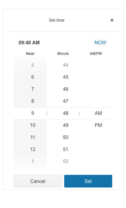
Adaptive Rendering
The KendoReact TimePicker supports an adaptive mode that provides a mobile-friendly rendering of its calendar popup. When enabled, the component will automatically adapt to the current screen size and will change its rendering accordingly.
-
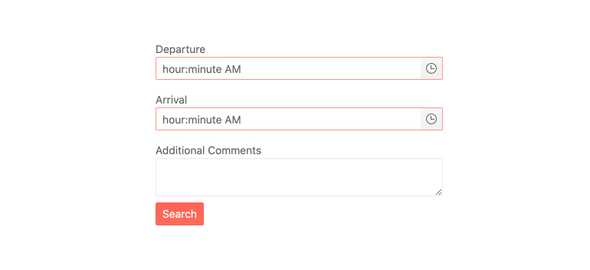
Placeholders
Having several different types of input elements on a page can be confusing to the end user. Having the ability to add in a placeholder into the KendoReact TimePicker component allows developers to give users a clear indication of what the component is representing and how they should interact with the component.

-
Floating Label
The React TimePicker supports adding floating labels as part of its input. This feature displays an initial message within the component, which then floats outside the component when the user enters the input. The floating label is then replaced by the mask of the component, ensuring that users are aware of the content format they should adhere to.
-
Forms Support
Thanks to features like custom validation messages and validation requirements like minimum, maximum and required properties, the KendoReact TimePicker component can easily integrate into any standard HTML form element, any third-party React form library or the KendoReact Form component.
-
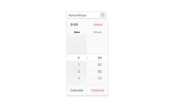
Globalization
For scenarios that require either multiple different locales to be available, the React TimePicker component can easily be updated to handle time in the most intuitive way for every user—no matter their location and language preference. Beyond formatting, any built-in strings can easily be updated to display content appropriate for each user’s locale.
-
Controlled and Uncontrolled Modes
By default, the KendoReact TimePicker is in an uncontrolled state, meaning that the form data tied to the component is handled by the DOM itself. However, making the KendoReact TimePicker work in a controlled mode, when the form data is handled by the React component itself, can easily be done by just defining the date value of the component.
-
Keyboard Navigation
Thanks to keyboard navigation, the KendoReact TimePicker can be navigated through using just the keyboard. This includes opening the popup and selecting a particular time, as well as updating the value of what has been selected using just a keyboard.
-
Accessibility
Accessibility is an important part of KendoReact, and the React TimePicker is certainly no exception. In this vein, the KendoReact TimePicker supports Section 508 and WAI-ARIA standards, and has a AAA rating with WCAG 2.0.

