KendoReact
Free React TextArea
- A highly customizable text area interface for your React application that automatically applies your design theme.
- Part of the KendoReact library along with 120+ free and paid enterprise-grade UI components.
- This component is free to use, including in production—no sign-up or license required!
-
Customizable Text Area Input Field
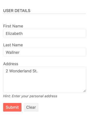
Part of the KendoReact form components, the React TextArea component is suitable for any scenario that requires multiple lines of text or values to be entered in a form field. Thanks to the various KendoReact themes, the TextArea (also known as Multi-line TextBox) component fits naturally into any design language and you can adjust its look and feel based on custom UX requirements.
-
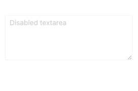
Disabled TextArea
For scenarios that require the React TextArea to prevent user interactions until certain criteria are met, the KendoReact TextArea component can switch between being enabled (fully operational) or disabled (prevent user interactions) through a single configuration option. The disabled state also automatically updates the appearance of the React TextArea component to ensure there is a clear visual cue that the UI element is disabled.
-
Controlled Mode
The KendoReact TextArea component can operate under both uncontrolled and controlled modes. This gives React developers the flexibility to handle the state of the React TextArea component in whichever approach they prefer.
-
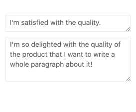
Sizing
The dimensions of the React TextArea component can be defined in multiple ways. This includes setting the initial height of the TextArea component and controlling if the component should automatically resize based on the content entered by the user.
-
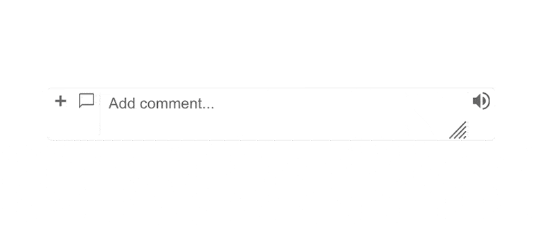
Prefix and Suffix Adornments
Elevate user interactivity leveraging the option for adding prefix and suffix adornments. These are custom items, usually an icon or button, inside the field before or after the input area. Typical prefix adornments are currency symbols or unit indicators, while suffix adornments are often used for password visibility toggles, formatting or clearing the input.
-
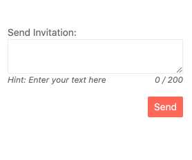
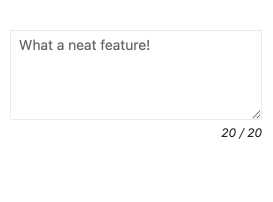
Character Counter
The KendoReact TextArea component comes with a built-in character counter, which gives end-users a real-time indication of the number of characters currently typed into the React TextArea component and the character limit.
-
Forms Support
The React TextArea component can be easily integrated into an HTML form, a KendoReact Form component or any other third-party solution for building forms in React.