
KendoReact
React Splitter
- Flexible and fully accessible yet simple React Splitter component: resize, collapse or scroll any pane (content area).
- Part of the KendoReact library along with 120+ free and paid enterprise-grade UI components.
- Includes legendary technical support, design resources, comprehensive documentation, demos, and more!
-
Separate Web Content into Sections for an Intuitive User Flow
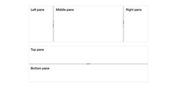
The React Splitter enables developers to define sections of a page in a column and row structure. Each section can also be resized by simply dragging the provided handlers, and can be expanded and collapsed.
-
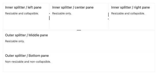
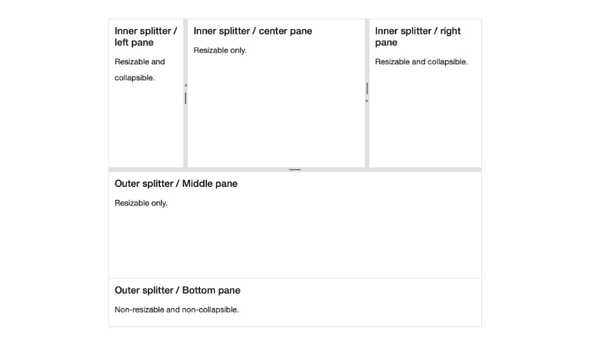
Panes
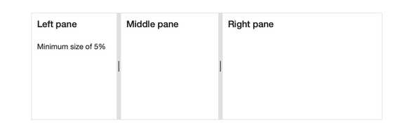
Panes are at the heart of the KendoReact Splitter. Each content area of the React Splitter is a Pane, and each Pane has options to help define dimensions and allow for resizing, collapsing or scrolling on a pane-by-pane basis.
-
Orientation
The KendoReact Splitter allows for each Pane to be arranged either horizontally or vertically.
-
Keyboard Navigation
With its built-in Keyboard Navigation, the KendoReact Splitter allows users to navigate between panes and use keyboard interactions to resize panes.
-
Accessibility
The KendoReact Splitter is compliant with Section 508 and WAI-ARIA standards, and is AAA rated with WCAG 2.0.

