KendoReact
Free React ProgressBar
- Visualize the progress of a task that's loading with this functional yet lightweight React ProgressBar component.
- Part of the KendoReact library along with 120+ free and paid enterprise-grade UI components.
- This component is free to use, including in production—no sign-up or license required!
-
Configurable Progress Bar
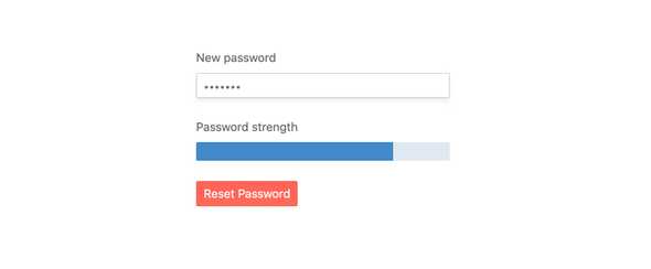
The KendoReact ProgressBar is the perfect component for displaying any form of progress in a React application. This can include a process like loading data or waiting for components to be loaded, or stepping through multiple steps and showing how much has been completed and what remains.

-
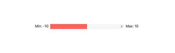
Value and Ranges
By default, the KendoReact ProgressBar starts from 0 and goes to a max value of 100. This may not be applicable for all scenarios, which is why the KendoReact ProgressBar exposes both min and max values to help define the range, as well as the ability to set the value of the React ProgressBar.
-
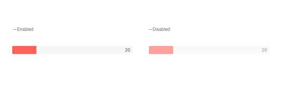
Disabling ProgressBar
For scenarios that require the KendoReact ProgressBar to be disabled, a state where users cannot interact with the component, this can be done by setting a single configuration option.
-
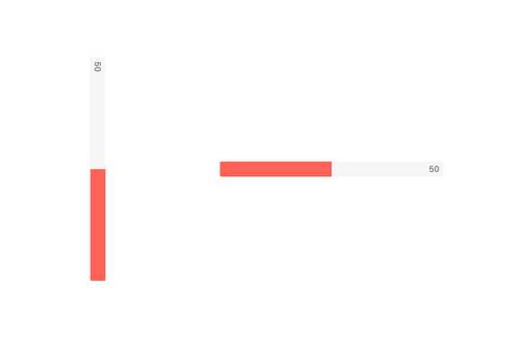
Orientation
The React ProgressBar supports being rendered in both horizontal and vertical orientations.
-
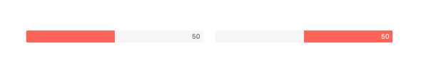
Direction
By default, the KendoReact ProgressBar fills itself from left to right. For scenarios that require the Progress to go from right-to-left, this can be done by setting the reverse property to true, reversing the direction of the KendoReact ProgressBar.
-
Label
Labels representing the current value of the KendoReact ProgressBar can be rendered within the component at the start, center or end of the progress area. Additionally, these labels can include additional text and formatting options by defining the label property.

-
Animation
By default, the KendoReact ProgressBar will show an animation as the value of the component changes. To disable this animation, or customize the behavior of the animation, one can work with the available configuration options to tweak the React ProgressBar to fit any requirements.

-
Appearance
Aspects of the KendoReact ProgressBar like height and width, or more advanced scenarios like defining styles based on the current value of the component, can be completely customized to make the KendoReact ProgressBar adhere to styling requirements.
-
Globalization
The KendoReact ProgressBar supports globalization by being rendered in a Right-to-Left mode.