KendoReact
Free React Popover
- The perfect component for displaying rich content when users hover, click or focus on elements.
- Part of the KendoReact library along with 120+ free and paid enterprise-grade UI components.
- This component is free to use, including in production—no sign-up or license required!
-
Display Information on Click or Hover
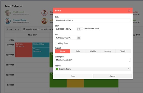
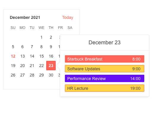
The KendoReact Popover component is perfect for displaying rich content when users hover, click or focus on elements within any React application. The difference between it and the React Popup or the React Tooltip components is that the Popover supports more complex content and layouts. A common use case for this component is the additional element displayed with calendar events, which might include a list of attendees, meeting room information or agenda notes. Another common scenario is to add a Form or an Editor within the component - a popular workflow in Schedulers used when you want to enable your users to make quick edits through a popover.
-
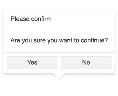
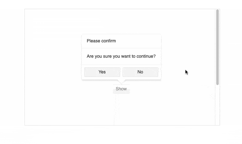
Configurable Title, Callouts and Actions Bar
To make things easy for developers, every element of the React Popover is configurable, including the title and actions bar (a "footer" of sorts). The actions bar can be used for adding buttons or a text box, for example. Additionally, you can enable or disable the callout element (the arrow that links the Popover to the component it is linked to).
-
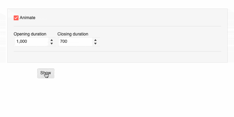
Animations
The React Popover allows you to enable or disable its opening and closing animation.
-
Collisions Support
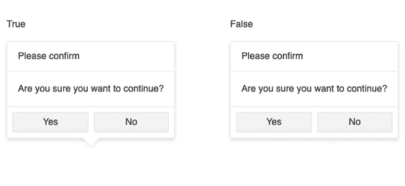
To prevent collisions with viewport edges, you can enable Collision support in the React Popover to control how the component behaves when the area it should be displayed in is not fully visible. You can choose between several options: move the Popover horizontally until it is fully displayed, flip its position or rendered it at the original position - an option that's helpful when the Popover is focused on open and the user scrolls to it.
-
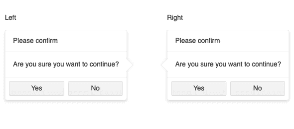
Positioning
The React Popover can be configured to open in four different directions relative to the current anchor or offset: on top, bottom and aligned to the right or left.
-
Support for Document Scale
Scaling can be tricky to handle and often breaks the user experience when using regular popups, but the KendoReact Popover fully supports this action. This can come in especially handy if you expect to have users browsing your app on mobile devices with large resolutions, though it's also useful to have in other scenarios.