
KendoReact
React MultiViewCalendar
- Easily add multiple calendars side by side to enable the user to select dates across any range.
- Part of the KendoReact library along with 120+ free and paid enterprise-grade UI components.
- Includes legendary technical support, design resources, comprehensive documentation, demos, and more!
-
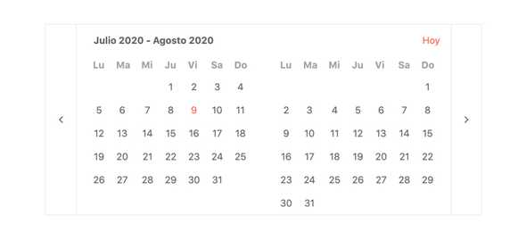
Display Multiple Calendars in a Single React Component
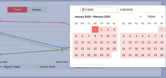
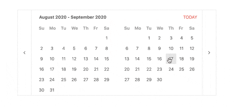
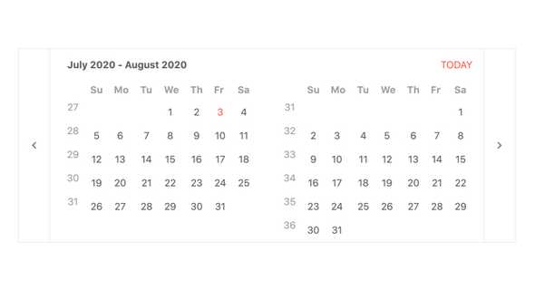
The React MultiViewCalendar component offers a user interface with multiple calendars side by side to enable end users to select a range of dates spanning over multiple months. The component by default has an end and a start date, and dates can be selected across any time range.
-
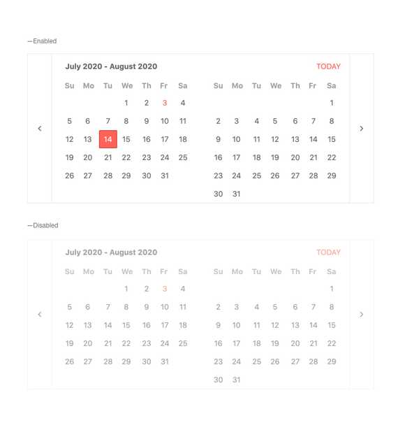
Disabled MultiViewCalendar
For scenarios that require UI elements to be disabled until a certain requirement has been met, the KendoReact MultiViewCalendar can be disabled with a single property and can be toggled on or off. This ensures that the React MultiViewCalendar prevents any interaction and showcases a clear visual indication that the component is disabled.
-
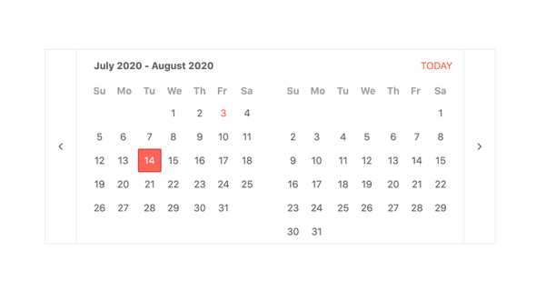
Focused Date
The calendars featured in the KendoReact MultiViewCalendar always have a focused date. By default, todayâs date is used. This focused day has a slightly different visual style to make it stick out from the rest of the available days. What day is focused is of course completely customizable and can be changed by passing in a new day to a configuration option.
-
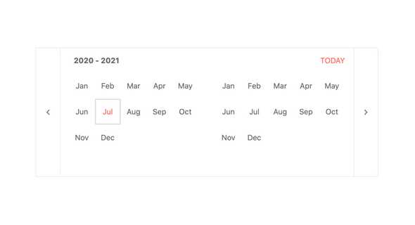
Multiple Views
By default, the KendoReact MultiViewCalendar showcases two calendars side by side. With the Multiple Views feature, any number of calendars can be added to the collection of displayed calendars.
-
View Selection
The View Selection feature of the KendoReact MultiViewCalendar allows for the built-in calendars to render a different initial view, including showing the days of the month, months of the year, years of the decade and decades of the century.
-
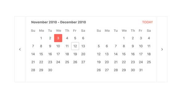
Reverse Range
Selection within the KendoReact MultiViewCalendar can be done both from a start date to the end date, as well as the end date to the start date. Thanks to the reverse range selection feature of the React MultiViewCalendar, no matter which order dates are selected, the component will always keep track of the start and end dates.
-
Week Number Column
With a single property, the KendoReact MultiViewCalendar component can show or hide a column responsible for displaying the appropriate week number next to each week displayed in the rendered calendars.
-
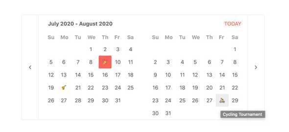
Custom Rendering
The KendoReact MultiViewCalendar enables developers to render custom components instead of the default parts of the component including the cells of the calendar, the week column cells, as well as the title element of any calendar.
-
Controlled and Uncontrolled Modes
React components used in forms can come as uncontrolled components, which let the form data be controlled directly by the DOM, or as controlled components where the form data is handled by a React component. By default, the KendoReact MultiViewCalendar is in uncontrolled component mode, but can be a controlled component with little to no extra configuration.
See React MultiViewCalendar Controlled and Uncontrolled Modes demo
-
Globalization
The KendoReact DateInput component supports globalization out of the box, which means that the format of the date placeholder and date can change depending on the locale of the user without needing to manually reconfigure the React component.
-
Keyboard Navigation
The KendoReact MultiViewCalendar has built-in methods for selecting a range dates using just keyboard navigation.
-
Accessibility
Creating accessible React UI components is a core concept of KendoReact, and the React MultiViewCalendar is no exception! The KendoReact MultiViewCalendar is built to be compliant with Section 508 and WAI-ARIA standards, and is AAA rated with WCAG 2.0.

