
KendoReact
React MultiColumn ComboBox
- Create a DropDown on steroids by adding a multi-column interface with filtering, grouping and virtualization.
- Part of the KendoReact library along with 120+ free and paid enterprise-grade UI components.
- Includes legendary technical support, design resources, comprehensive documentation, demos, and more!
-
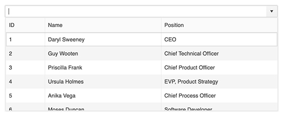
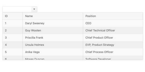
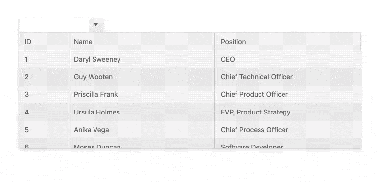
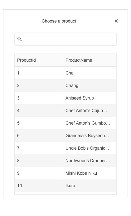
Display Selectable Options in a Drop-down Table
The React MultiColumn ComboBox provides a dropdown component that displays information about items in multiple fields arranged in columns. This gives end-users additional information associated with data items beyond the traditional list of a single-string text. Once a user selects an item, a single value will be displayed in the input. The KendoReact MultiColumn ComboBox comes with filtering, grouping, virtualization and more handy features.
-
Data Binding
The KendoReact MultiColumn ComboBox can be bound to various data types, including data created on the client-side as well as data pulled from the server-side. With simple configuration options, any collection of data can be bound to the React MultiColumn ComboBox and the component can be set up to display all fields or just a subset of the available fields. Additionally, developers have full control over the displayed field when a user selects an item, as well as defining whether the underlying value should be tied to a different field.
-
Accessibility
Accessibility is a core aspect of the KendoReact suite. The KendoReact team understands how important accessibility is for the web and this drives us to make it an integral part of every component. The KendoReact MultiColumn ComboBox supports keyboard navigation and complies with Section 508 and WCAG 2.0 accessibility standards with an AAA rating.

-
Filtering
When filtering is enabled, the input element of the KendoReact MultiColumn ComboBox allows users to start typing a value and automatically reduces the number of available items based on the user input. Extremely useful when users navigate through large datasets, the filter feature can be enabled with a single configuration option.
-
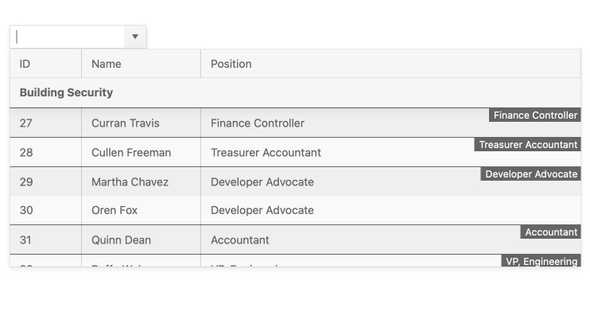
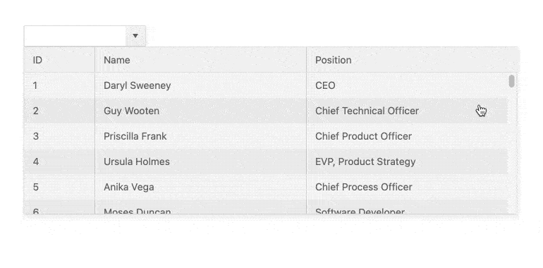
Grouping
When handling larger sets of data, it is very helpful to organize information in categories. With grouping enabled, the React MultiColumn ComboBox can group all data items by a particular field. The groups will be displayed in several ways throughout the list of items, which provides an intuitive user experience when scrolling through the data.
-
Adaptive Rendering
The KendoReact MultiColumnComboBox supports an adaptive mode, enabling a mobile-friendly rendering of the component popup. The component automatically adapts to the current screen size and alters its rendering accordingly.
-
Virtualization
The KendoReact MultiColumn ComboBox comes with built-in virtualization, offering a significant performance boost for loading and displaying large datasets. With Virtualization enabled, only the currently displayed items are rendered within the MultiColumn ComboBox dropdown, letting additional data load as the user scrolls to a particular point within the available list.
-
Prefix and Suffix Adornments
Elevate user interactivity leveraging the option for adding prefix and suffix adornments. These are custom items, usually an icon or button, inside the field before or after the input area. Typical prefix adornments are currency symbols or unit indicators, while suffix adornments are often used for password visibility toggles, formatting or clearing the input.
-
Keyboard Navigation
The MultiColumn ComboBox has built-in keyboard support to help interact with, scroll through, and select data items using just the keyboard.
