KendoReact
Free React Floating Action Button
- Sleek and interactive button interface for your React app, which can display a sleek dial when clicked.
- Part of the KendoReact library along with 120+ free and paid enterprise-grade UI components.
- This component is free to use, including in production—no sign-up or license required!
-
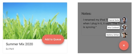
Show the Most Common Action on Click
The KendoReact Floating Action Button is a button that appears to “float” above the content of any React application, usually serving as a shortcut to a single, common action like adding an item or composing a new email. The React Floating Action Button component can be customized to make sure the button fits any application design. Additionally, the button can feature a "speed dial" set of buttons that will animate out of the main button and provide multiple options to select from.
-
Disabled State
For scenarios that call for preventing user interaction until certain requirements are met, the React Floating Action Button component can be disabled with a single configuration option. This gives users a clear visual indication that the React component cannot be interacted with.

-
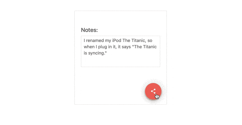
Content Types
The content within the KendoReact Floating Action Button can be completely customized through the available properties. Access the icon, iconClass and text properties to define the React Floating Action Button icon, apply a custom CSS class to control the style of the button and set text displayed within the component.
-
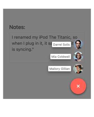
Speed Dial
If additional action items should be available to users, the speed dial feature of the KendoReact Floating Action Button is the perfect solution. It represents a list of additional buttons that appear above the React Floating Action Button when the main button is clicked. You can customize the speed dial buttons to give them their own unique style.
-
Positioning
The KendoReact Floating Action Button provides several configuration options to assist with defining where the React component should be displayed within the application. The available configuration removes the hassle of manual calculations and instead lets developers fix the position of the React Floating Action Button by setting the horizontal and vertical values through easy-to-remember options like "start", "center", "end", "top", "middle" and "bottom".

-
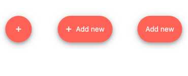
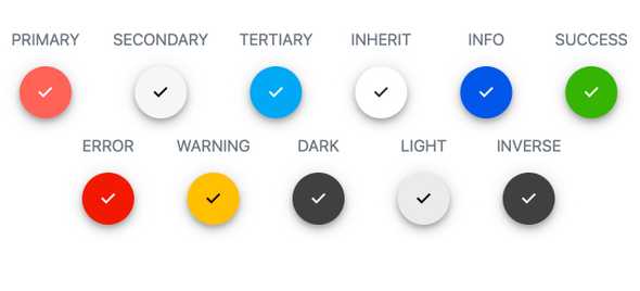
Appearance
You can set the theme color, shape and size properties of the component to create a uniquely styled React Floating Action Button. Choose from ready-to-use theme colors like success, warning, error and more and define the shape of the KendoReact Floating Action Button to be rectangular, circular or go with the default pill shape.
-
Keyboard Navigation
The KendoReact Floating Action Button supports keyboard navigation and enables users to perform the targeted action using just the keyboard.
-
Accessibility
The KendoReact team understands how important accessibility is for the web and this drives the team to make accessibility a core feature of every component. The KendoReact Floating Action Button complies with Section 508 and WCAG 2.0 standards with an AAA rating.