KendoReact
Free React Dialog
- This flexible React Dialog component prompts users to take specific actions by interacting with a modal dialog.
- Part of the KendoReact library along with 120+ free and paid enterprise-grade UI components.
- This component is free to use, including in production—no sign-up or license required!
-
Display Information in a Modal Window
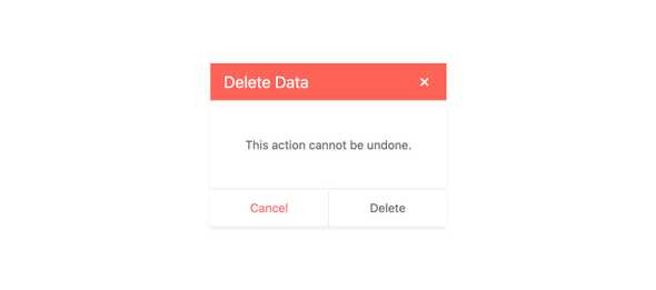
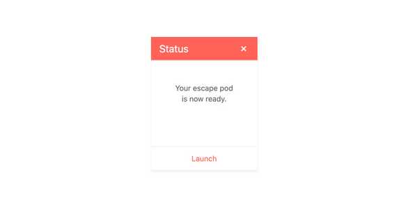
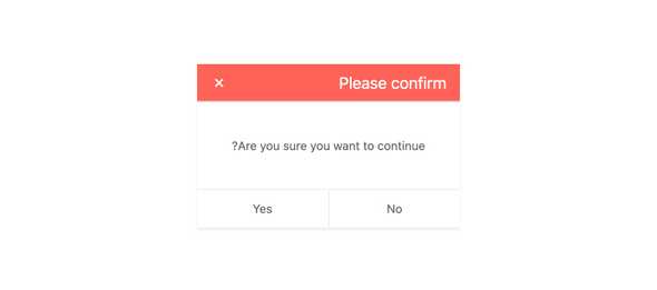
The React Dialog component, part of KendoReact, presents a modal window with content and prompts the user to take specific actions by interacting with built-in buttons for different actions. This React UI component shines whenever a decision has to be made that requires the end-user to focus and bring the component to the front of the users' screen.
-
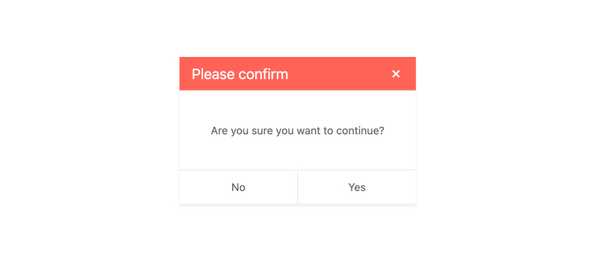
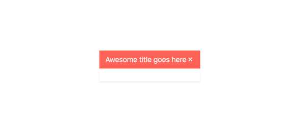
Title
Every KendoReact Dialog component has a title area that can be blank, or contain custom text, to give the user context around what the Dialog prompt is all about.
-
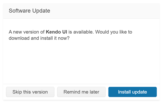
Action Buttons
The KendoReact Dialog has the flexibility to define custom actions and buttons at the bottom of the component, referred to as the Dialog Action Buttons. Each option in this area has a button that developers can hook into in order to perform an action based on the userâs selection.
-
Visibility
Creating centered modal windows can be tough to do from scratch, but the KendoReact Dialog component will always display itself as a modal dialog centered in the screen. The visibility of the React Dialog component can be toggled to visible or hidden with a single property.
-
Dimensions
By default, the KendoReact Dialog has some internal calculations for height and width, but these can easily be overridden by using the width and height bindings of the Dialog component.
-
Keyboard Navigation
To help users traverse the KendoReact Dialog component with keyboard navigation the component has several built-in keyboard shortcuts that can be used to not just interact with the Dialog component itself, but also elements contained within it.
-
Globalization
Many apps written with KendoReact require support for Right-to-Left, or RTL, within the components. With the KendoReact Dialog, Right-to-Left support can be achieved with a single property setting.
-
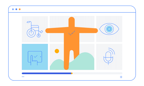
Accessibility
Continuing a tradition of putting accessibility at the forefront of building React UI components, the KendoReact Dialog is AAA rated for WCAG 2.0, and compliant with both WAI-ARIA and Section 508 standards.