
KendoReact
Free React Checkbox
- The React CheckBox component makes it easy to maintain a consistent look and feel throughout your app.
- Part of the KendoReact library along with 120+ free and paid enterprise-grade UI components.
- This component is free to use, including in production—no sign-up or license required!
-
Customizable Checkbox Component
The KendoReact Checkbox moves beyond the traditional HTML input element and provides styling that fits with all KendoReact themes, allowing users to maintain a consistent look and feel throughout their entire React application. The Checkbox supports a variety of states that can be easily set to match your requirements.
-
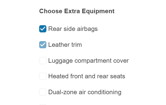
Checkbox States
The KendoReact Checkbox supports unchecked, checked and indeterminate states out of the box.

-
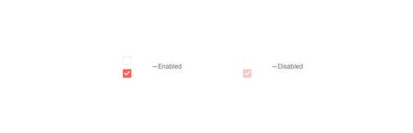
Disabled Checkbox
For scenarios where users should not be able to interact with the KendoReact Checkbox until certain requirements are met, the enabled and disabled states can be toggled between through a single configuration option.
-
Labels
To make implementing the KendoReact Checkbox as easy as possible, the React UI component comes with a built-in Label property, which can be placed before or after the actual checkbox element. For scenarios where the built-in label is not suitable, a custom label can be easily applied.

-
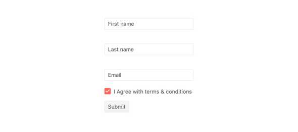
Forms Support
The KendoReact Checkbox component can be easily integrated with a HTML form, any third-party library for React forms or the KendoReact Form component.
-
Controlled and Uncontrolled Modes
By default, the React Checkbox component is in an uncontrolled state which means that the component maintains its own state. For scenarios that require a controlled component, the value or checked properties can easily be used.
See the React Checkbox Controlled and Uncontrolled Modes demo
-
Keyboard Navigation
The KendoReact Checkbox can be interacted with via keyboard navigation, offering keyboard shortcuts to iterate through the various checkbox states.
-
Accessibility
The KendoReact Checkbox is compliant with Section 508 and WAI-ARIA standards and is WCAG 2.0 AAA rated.

