KendoReact
Free React Badge
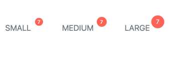
- Quickly and easily add a visual indicator to other UI elements in your React app.
- Part of the KendoReact library along with 120+ free and paid enterprise-grade UI components.
- This component is free to use, including in production—no sign-up or license required!
-
Show Contextual Information About an Element
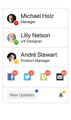
The React Badge component takes inspiration from modern user experiences across web and mobile applications alike and provides an element to indicate unread messages or notifications. With the KendoReact Badge component, you can easily attach badges to existing UI elements. It comes with built-in support for text, settings for size, positioning and overlap as well as the ability to just showcase a simple dot. The KendoReact Badge component can be added to any existing user experience with a single line of code and minimal configuration.
-
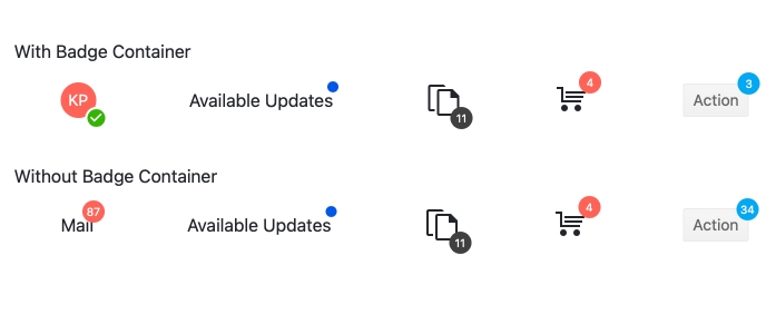
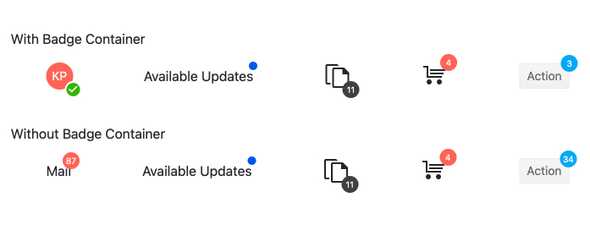
Badge Container
The KendoReact Badge is commonly used as a child component of another UI element to trigger notifications. For React components or HTML elements that are unable to have child elements, you can use the KendoReact BadgeContainer to wrap around these elements and still attach a React Badge component. This helper component ensures that any UI element in a React application can have an associated badge.
-
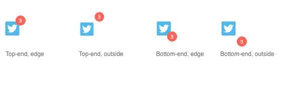
Positioning
The KendoReact Badge component provides several options to position the badge in relation to its parent element, whether this is an HTML element or a React component. React developers can simply use configuration options for positioning rather than complex CSS or manual calculations.
-
Appearance
Out of the box, the React Badge component provides several different styles that can be set through a single configuration option. Styles include, but are not limited to, info, success, warning, error and more. Additionally, the KendoReact Badge component provides settings for its shape, size, fill and border, which allows to add padding around the badge, to ensure that the React Badge component can fit any application scenario.