1

Choose a Theme
Use one of four professional themes:
- Use out-of-the-box
- Customize to meet brand guidelines.

Accelerate development with 120+ feature-rich, accessible, and customizable MVC components, an IDE-integrated AI Coding Assistant and more.
30-day FREE trial. Free technical support and training during your trial. No credit card requred.
ASP.NET MVC UI controls are also part of Telerik DevCraft. Learn more.
Choosing tools for ASP.NET MVC projects can be overwhelming. Telerik UI for ASP.NET MVC gives you everything you need…no more library hunting.
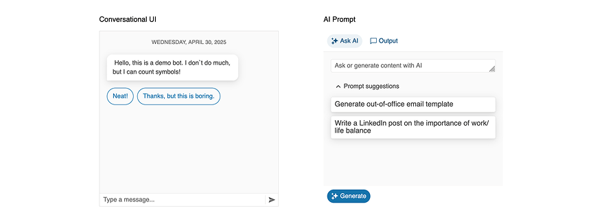
MCP Servers for Developer Productivity
AI tools that bring Telerik UI context to your LLMs for better outputs.
AI-Ready Components
A single place to find AI-ready UI components and Smart Features across Telerik UI.
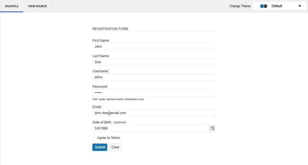
Worked with a design-friendly UI library before? With or without a designer on your team, Telerik UI for ASP.NET MVC helps you build cleaner UIs and smoother UX with less effort.
Use one of four professional themes:

Use ThemeBuilder to style your app without dealing with complex CSS rules.

Get all your styling questions answered with the detailed design and front-end documentation.

Give the Figma UI kits to your designers and start speaking the same language.

Import the Figma design into ThemeBuilder to generate the CSS.

Map the Figma variables to your UI components in ThemeBuilder and automatically sync design updates.
Get all your styling questions answered with the detailed design and front-end documentation.
Telerik UI for ASP.NET MVC components offer unmatched built-in accessibility and comply with WCAG 2.2, WAI-ARIA and Section 508.
Telerik UI for ASP.NET Core makes your job easier without getting in the way.
120+ high-quality ASP.NET MVC web components, AI Coding Assistant, ThemeBuilder, four professionally designed themes, and Visual Studio Productivity Tools.
per developer,
per year
per developer,
per year
per developer,
per year
per developer,
per year

Check out these runnable sample apps built with Telerik UI for ASP.NET MVC and get the source code.
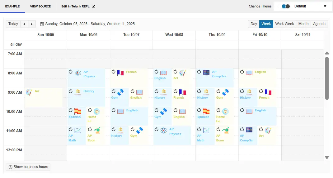
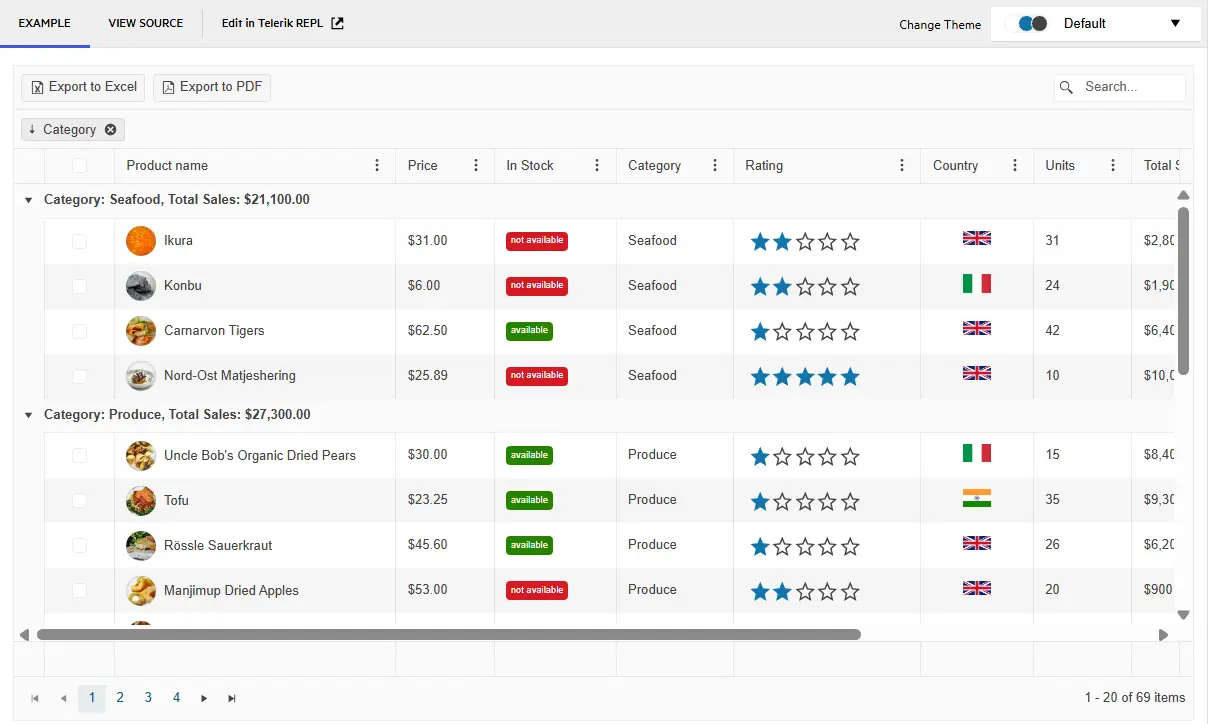
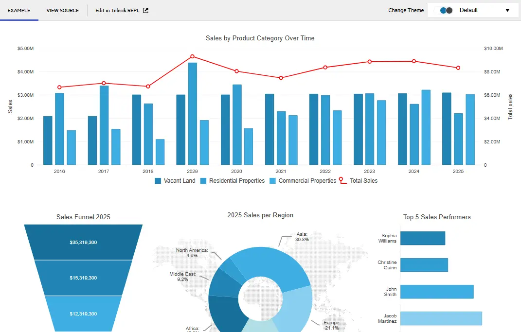
Create a feature-rich admin interface with advanced data visualization, scheduling tools, and interactive components for building powerful business applications.
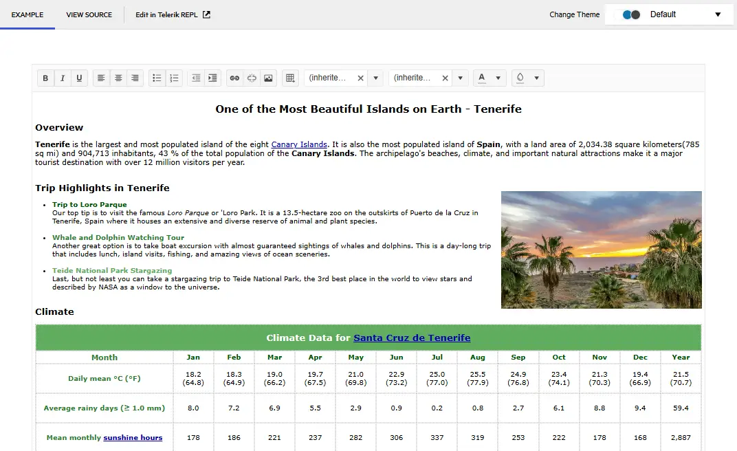
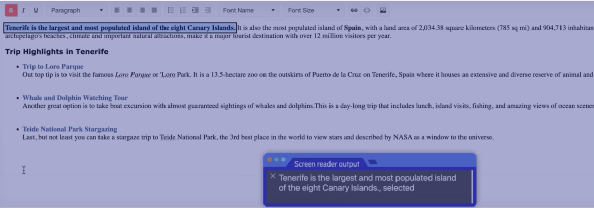
Get a comprehensive travel planning platform, featuring destination browsing, interactive maps, booking calendar, and trip management capabilities.
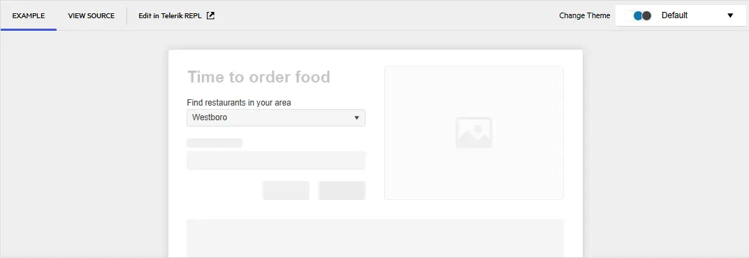
Explore a responsive web application that seamlessly integrates Telerik UI for ASP.NET MVC controls with Bootstrap’s grid system and styling features.
Awards
Greatness—it’s one thing to say you have it, but it means more when others recognize it. Telerik is proud to hold the following industry awards.
Visual Studio Integration
Maximize your efficiency with the Telerik UI for ASP.NET MVC extension for Visual Studio. It comes with handy templates that ease the creation of new projects and lets you add Telerik UI for ASP.NET MVC to an existing project or upgrade the UI for ASP.NET MVC version.
Learn more
Embedded Reporting
Transforming raw data into actionable insights is the core function of reporting. Simplify development workflow with intuitive embedded reporting tool that help developers to enable business users to easily create, edit and view reports on their own. Embed Reporting into Blazor, Angular, ASP.NET Core/MVC and more apps.
Visit the following pages for more information:
Learn more Telerik Reporting Explore Embedded Reporting for Business Users Check out Report Designers Check out Report Viewers
Video Course
Telerik courses on YouTube provide step-by-step video tutorials for a variety of .NET and JavaScript products. It is the perfect place to get started with Telerik UI for ASP.NET MVC and accelerate your onboarding process.
From installation to advanced features, this video course equips you with the essential skills and knowledge to kickstart your ASP.NET MVC journey.
Learn More

30-day FREE trial including technical support and training. No credit card required.
ASP.NET MVC UI components are also included in DevCraft bundles. Learn more.


