background

UI for WPF

WPF Diagrams

  • The WPF Diagrams allow designing workflows, representing data logic, architect data-visualization and much more!
  • Part of the Telerik UI for WPF library along with 160+ professionally-designed UI controls.
  • Includes support, documentation, demos, virtual classrooms, Visual Studio Extensions and more!
WPF Diagrams control
  • Smart Routing

    The control employs a mechanism to make sure that the connections in the diagram don’t overlap or intersect, which connecting the different shapes and objects, resulting in a better visualization and readability for the end user.

    See the WPF Diagram docs: Overview

    WPF Diagram showcasing Smart Routing
  • Variety of Layouts

    Layout in RadDiagram refers to the way shapes and connections are arranged on the diagramming surface. This component provides a dozen of Layout algorithms which can be easily customized.
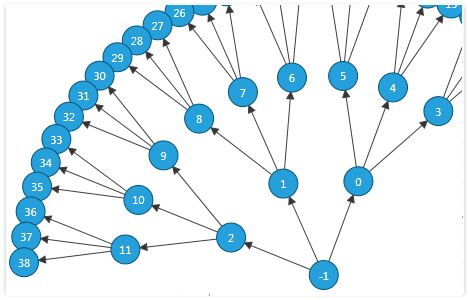
    WPF Diagram showcasing small layout
  • SettingsPane

    This diagramming component provides you with a ready-to-use view that contains the most common features and settings of a single RadDiagramItem (Shape or Connection).      
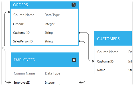
    WPF Diagram showcasing settings Pane
  • Table Shapes

    Create TableShapes and easily organize and display your data relations in them.
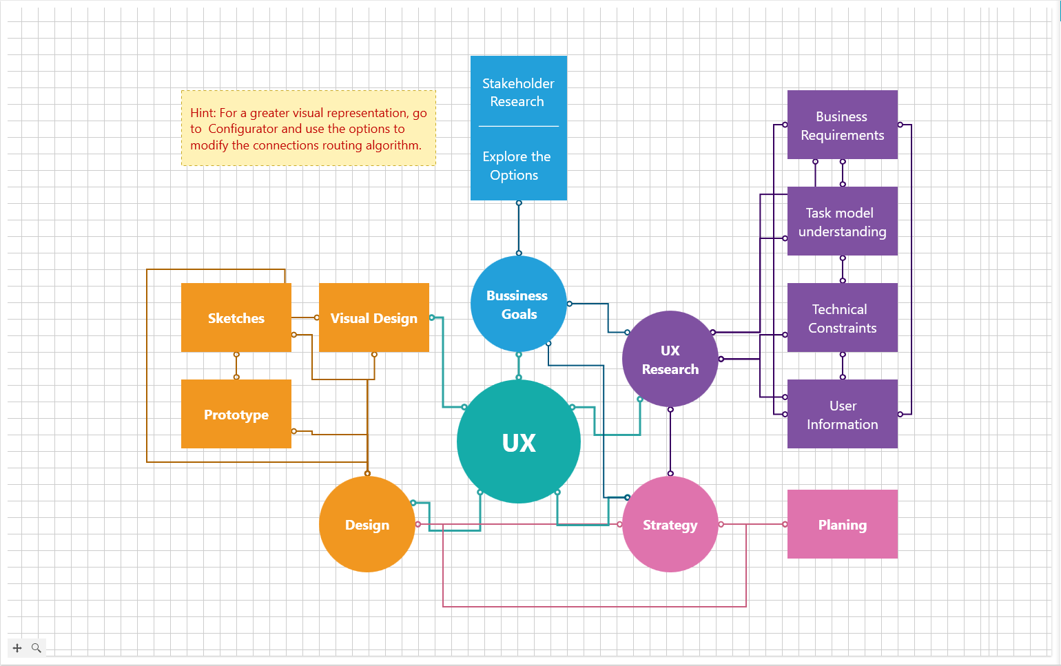
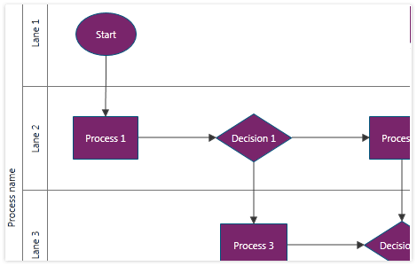
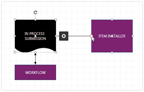
    WPF Diagram displaying table shapes
  • Swimlanes

    Easily create process flow diagrams and organize the processes in swimlanes.

    WPF Diagram control displaying swimlanes
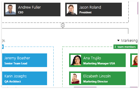
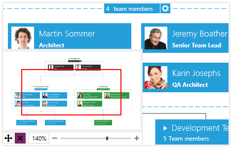
  • Organizational Diagrams

    With RadDiagrams you can easily display multiple types of organizational charts and hierarchies.

    WPF Organizational diagram
  • Rich Commands and Events Model

    Various routed commands and events are exposed to allow handling a diagram-related action in advance (tunnelling events) or afterwards (bubbling events). The extended API enables you to create custom shapes, connections and diagrams.
  • Various Diagram Tools

    RadDiagram offers a variety of tools to make development easier. Use the mouse tools for selecting, creating connections or panning the viewport. Utilize the drawing tools to draw custom shapes. The TextTool enables you to dynamically create TextShapes to label your structures.
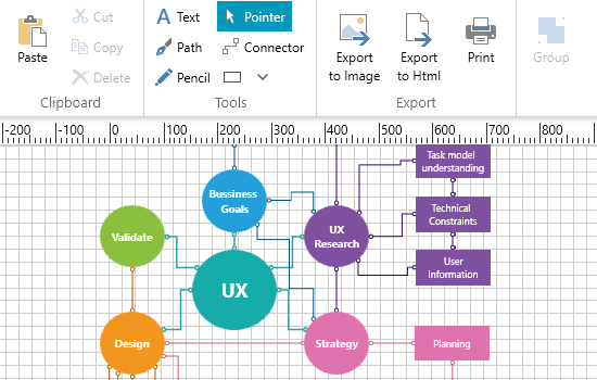
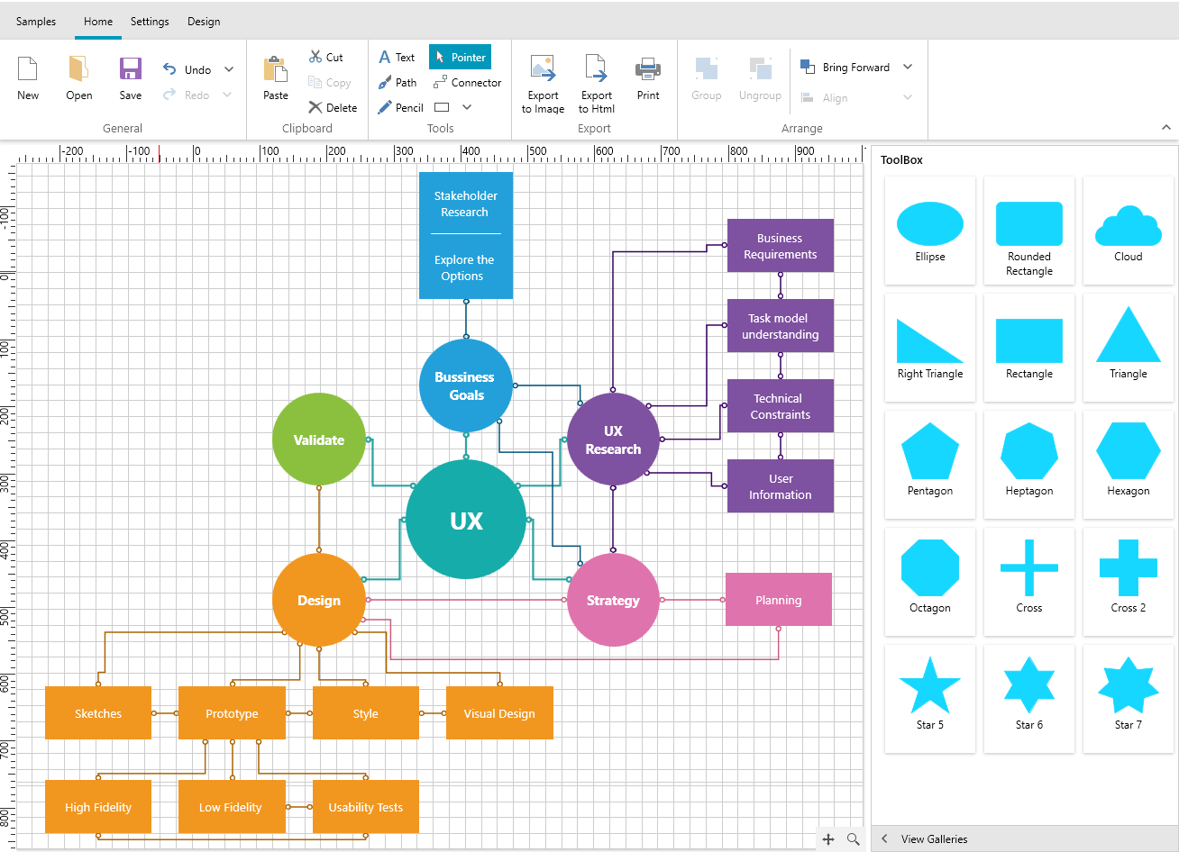
  • Built-in Ribbon UI

    Instead of building your own ribbon UI for the Diagram control, you can simply choose the DiagramRibbon control straight from your toolbox, enabling your end-users to work with the diagram component.

    WPF Diagram control showcasing a Ribbon UI
  • Save/Load Layout

    Easily save/load a diagram to external storage-like disk or isolated storage.
  • Printing Options

    Print a diagram on multiple pages and export to a variety of formats such as PNG and BMP.
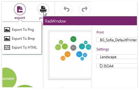
    WPF Diagram control showcasing printing options
  • NavigationPane

    The NavigationPane provides an overview of the entire diagram showing the big picture, including shapes that are outside of the viewport.

    WPF Diagram control showcasing navigation pane
  • Pan and Zoom

    Manipulate the viewport/camera by dragging (pan) and zooming operations, both from the UI or through the API.
    WPF Diagram control showcasing pan and zoom
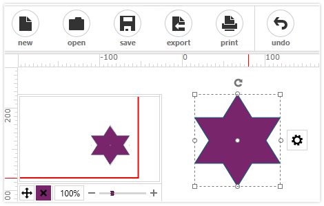
  • Cut/Copy/Paste/Delete/Undo/Redo

    Easily cut/copy and paste shapes and connections inside a diagram, between diagrams or even between Silverlight and WPF diagram applications. Undo/Redo – works for each and every operation. Extensible API is available.
    WPF Diagram control showcasing various commands
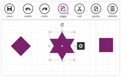
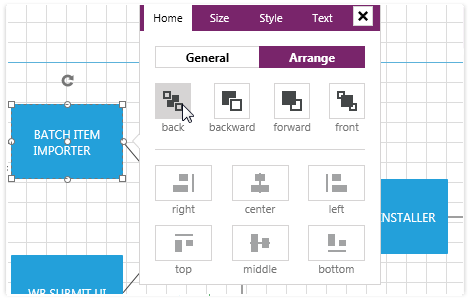
  • Rotate and Resize the Shapes

    Manipulate the items through the UI or by using the proper APIs. You can easily rotate, resize, select or change the order of items.
    WPF Diagram control showcasing rotating and resizing shapes
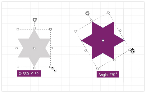
  • Shapes and Connections Editing

    Switch between Edit and Normal mode for both Shapes and Connections. Custom templates for edit mode are available.


    WPF Diagram showcasing editing of shapes and connections
  • Also Available...

    The Diagram control is also available for these popular frameworks:

Frequently Asked Questions

  • What is WPF Diagram?

    Telerik UI for WPF Diagram control empowers you to design versatile and interactive diagram layouts for your data visualization application. Noteworthy features encompass data binding, a comprehensive array of diagram shapes, item customization, clipboard maneuvers, pan and zoom capabilities, undo and redo functions, and a host of additional functionalities.

    The Diagram is a part of Telerik UI for WPF control library. Try it out by signing up for a free 30-day trial.

  • How can I try the Telerik UI for WPF Diagram control?

    You can try all Telerik UI for WPF controls by signing up for a 30-day FREE trial. During your evaluation, you will have access to all the components, technical support, documentation and getting-started resources.

    See the WPF Diagram Getting Started article for a quick tutorial and don’t forget to sign up for a free 30-day trial to get free support.

  • What support options does Telerik UI for WinForms offers?

    Depending on your needs, Telerik UI for WPF offers the following flexible support options:

    • Lite support: 72-hour response time, 10 support incidents
    • Priority support: 24-hour response time, unlimited support incidents
    • Unlimited support: everything in Priority support, plus 4-hour ticket pre-screening and phone assistance

    Learn more about flexible support and pricing options.

  • Where can I find demos of Telerik UI for WPF and see a Diagram in action?

    The demo application is designed to demonstrate the power of the Telerik UI for WPF controls suite. You can download the Telerik UI for WPF demo app on your Windows devices.

  • How many components are included in the Telerik UI for WPF suite?

    Telerik UI for WPF offers a wide range of 160+ controls to enable your development of Windows applications. The WPF UI library is constantly growing. For upcoming release information, visit our Roadmap.

  • How can I buy Telerik UI for WPF controls library?

    This control is one of over 160+ in the Telerik UI for WPF controls library which is also a part of the Telerik DevCraft bundle.

    The Telerik UI for WPF library comes with several purchase options, giving you flexibility based on the needs of your project. The license is perpetual, with subscription options for support and new updates. Please refer to the Telerik UI for WPF pricing page for more information.

All WPF Components

Next Steps