UI for WPF
WPF TimeSpanPicker
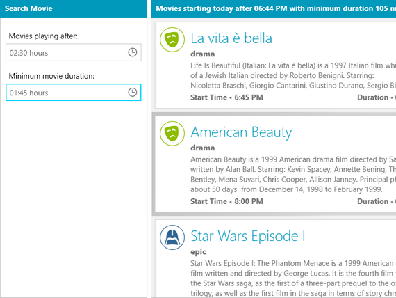
- Provide full control over time and duration in any app that requires the user to set duration via the built-in components for days, hours, minutes, seconds and milliseconds. You can easily define minimum/maximum ranges and specific value step for the components. The Telerik TimeSpanPicker supports DateTimePicker integration, Watermark content, Editing, Events and more.
- Part of the Telerik UI for WPF library along with 165+ professionally-designed UI controls.
- Includes support, documentation, demos, virtual classrooms, Visual Studio Extensions and more!
-
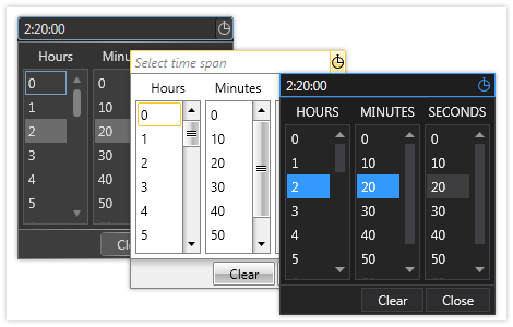
Pick Time Spans with Ease
The RadTimeSpanPicker for WPF enables your end users to easily pick timespan values in desktop applications. Provide full control over time and duration in any app that requires the user to set duration.
Combined with the DateTimePicker control, the TimeSpanPicker enables end users to define duration of a certain action. In addition, the control can also be customized to let the users choose between weeks and days.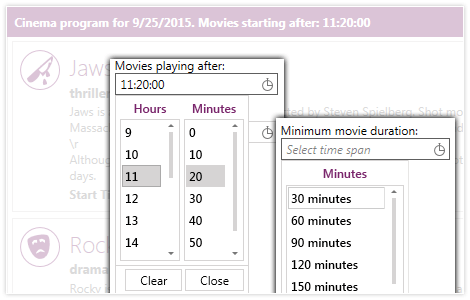
-
Editing
In addition to being able to change the value of the TimeSpan through the drop down of the control, you can edit it by directly entering the value in the text input box. The editing feature provides the following functionalities:
- Keyboard Navigation (through the sections)
- Sections Spinning
- ValueEditing Event (to fully customize the editing behaviour)
For more details about this feature - check out the Text Editing help article.

-
Predefined Themes and Appearance
The RadTimeSpanPicker for WPF comes with more than 15 predefined themes to use for easy personalization and a professional look and feel.