UI for WPF
WPF Callout
- Display additional information, warnings, hints, and highlight relevant data with the Telerik Callout control for WPF. Ships with several different forms of its body and arrow element and full customization abilities to satisfy the needs of any scenario.
- Part of the Telerik UI for WPF library along with 165+ professionally-designed UI controls.
- Includes support, documentation, demos, virtual classrooms, Visual Studio Extensions and more!
-
Rich WPF Callout for Professional Applications
The WPF Callout control is a content UI control designed to display additional information such as warnings, hints, tips or any other relevant information that needs to be highlighted. The control and its elements can be customized to fit the overall look-and-feel of your WPF application and can be declared in either XAML or placed inside a popup element.
-
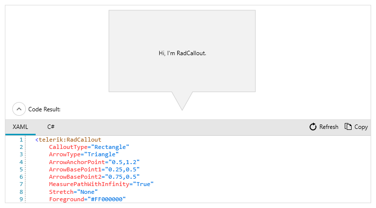
Callout As Static Element
The Callout control for WPF can be easily implemented to display the relevant information in XAML and placed in any parent container.
-
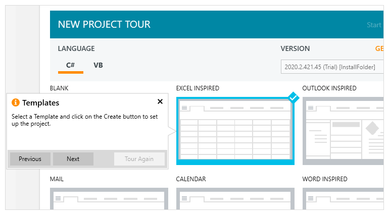
Callout Control In Popup
Alternatively, you can place the Callout control inside a popup to enable your end-users to easily interact with the content control via actions such as clicking, mouse hoover, navigation, etc.
-
Animations
When implemented inside a popup, the WPF Callout control supports various animations for its appearance such as Fade, Move, Reveal, Scale and many more
-
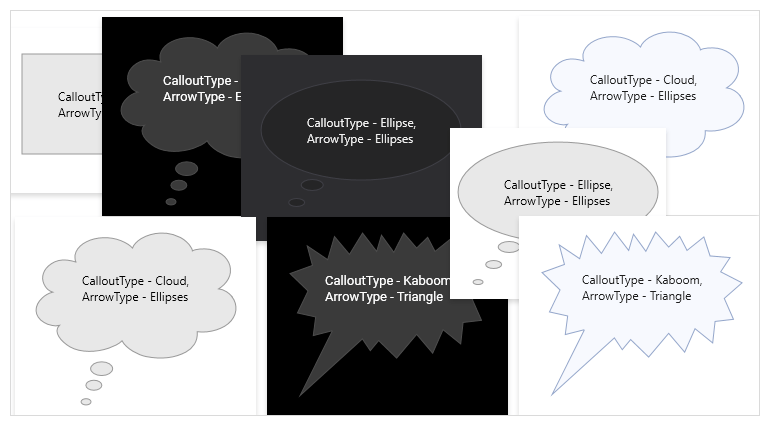
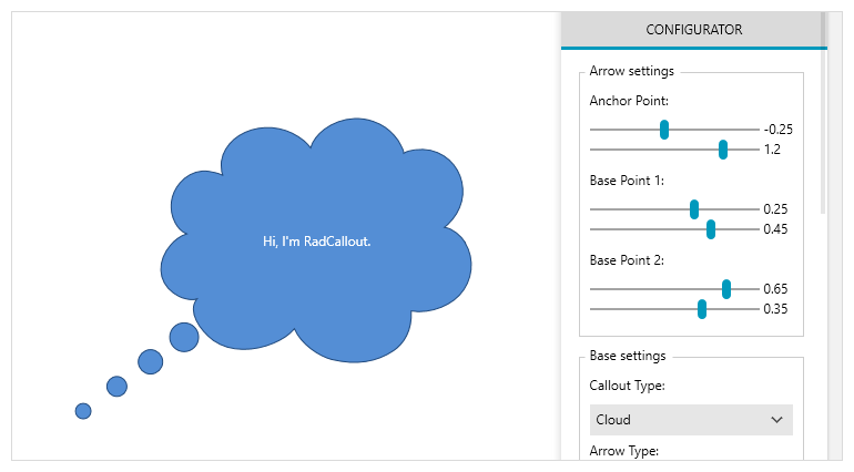
Variety of Shapes
The elements of the Callout control, such as its body and indicating arrow, can be visually customized with several built-in forms or alternatively, you can create your own forms by applying a custom geometry to the control.
-
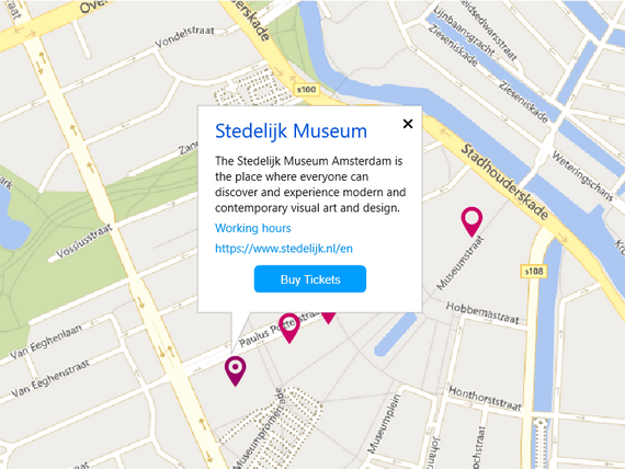
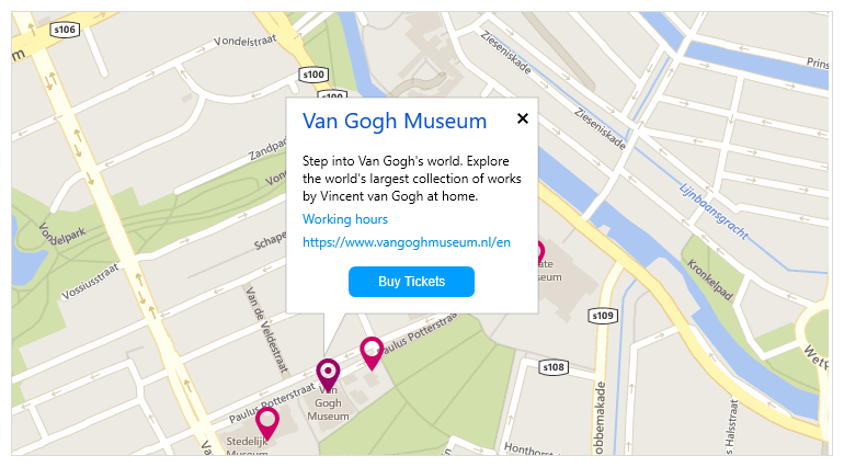
Integration in other controls
You can easily integrate the Callout control with other UI controls from the Telerik UI for WPF such as Maps, Charts, Tooltip, etc.
-
Theming
Just like the rest of the controls from the Telerik UI for WPF, the Callout controls comes with a set of themes you can use to create a consistent and modern looking user experience.