UI for WPF
WPF PipsPager
- Telerik UI for WPF PipsPager control helps you to navigate through a linearly paginated collection.
- Part of the Telerik UI for WPF library along with 165+ professionally-designed UI controls.
- Includes support, documentation, demos, virtual classrooms, Visual Studio Extensions and more!
-
Navigation Options
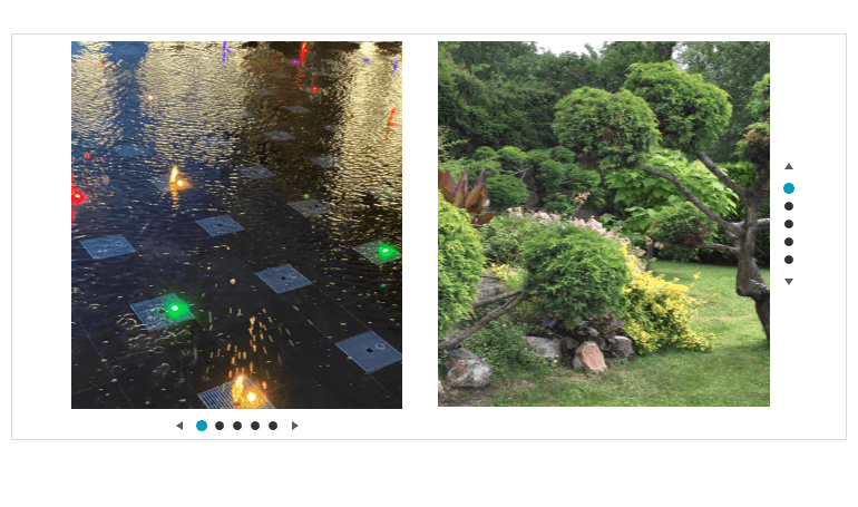
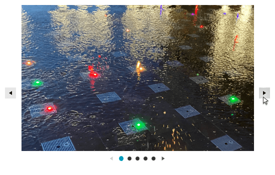
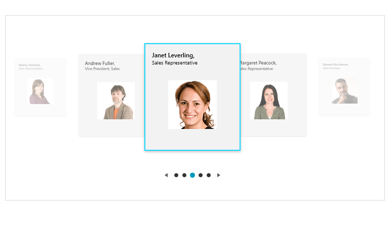
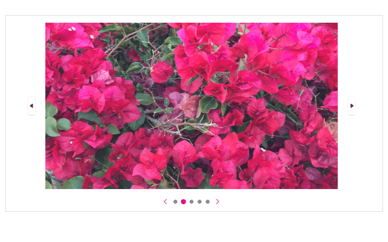
The Telerik UI for WPF PipsPager control facilitates navigation through a linearly paginated collection by utilizing navigation buttons and glyphs known as pips. This intuitive control enables users to easily navigate through pages of content in a visually appealing manner. The PipsPager comes with horizontal and vertical orientation options.
-
Customizing Navigation Buttons
The WPF PipsPager control allows customization of the navigation buttons. You can adjust their visibility, position and style. Moreover, you have the flexibility to define an auto-hide period for the buttons, allowing them to be automatically hidden after a specified duration. Additionally, you can enable or disable infinite scrolling functionality based on your specific requirements.
-
Orientation
The WPF PipsPager control offers customization options for navigating data, allowing you to choose between vertical or horizontal orientation.