
UI for WPF
WPF OfficeNavigationBar
- Telerik OfficeNavigationBar for WPF control offers intuitive user navigation thanks to its navigation items with text and/or image, display modes, peek popup and more.
- Part of the Telerik UI for WPF library along with 165+ professionally-designed UI controls.
- Includes support, documentation, demos, virtual classrooms, Visual Studio Extensions and more!
-
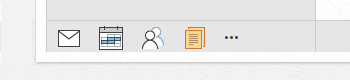
Full-featured Office Navigation Bar
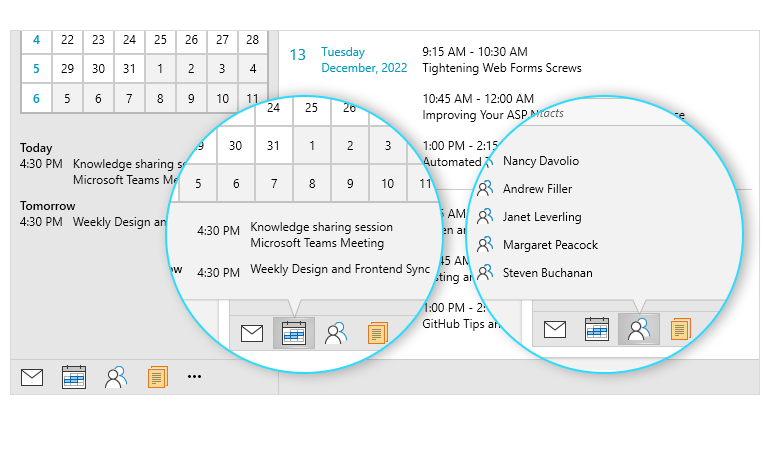
The Telerik UI for WPF OfficeNavigationBar is a powerful control that allows creating an intuitive navigation in your WPF app. Its look and feel mimics the one of Microsoft Outlook, where the user can select from navigation items with text and/or image. The control features convenient peek functionality visualized as a popup that is completely customizable. It can host WPF controls, allowing users to either take action or get a preview of a view.
-
Display Modes
You can toggle between the two display modes of the control: compact and full. Compact mode is a text-only or image-only view for minimal designs and tight spaces, whereas Full mode combines both text and image for each navigation item. A single property allows you to choose the view mode that best fits the layout of your WPF app.
-
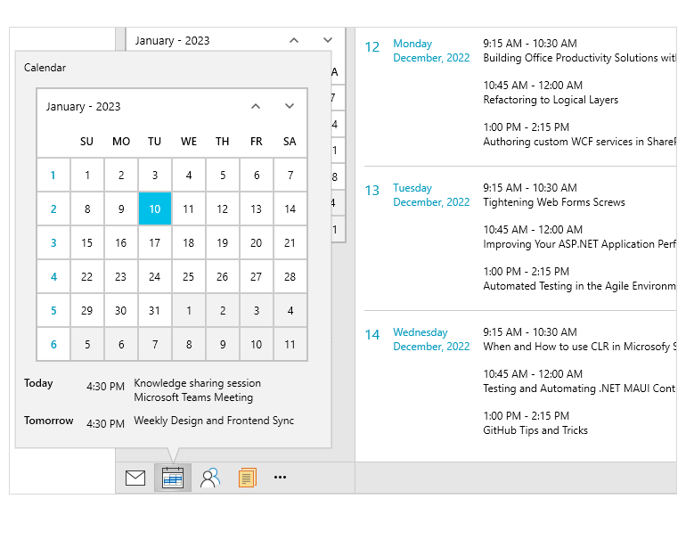
Peek Popup
The Navigation Bar Popup is displayed upon hovering over an item. The window itself allows hosting Telerik UI for WPF controls within it, for example, it can display a calendar for the user to select a date or a list of meetings.
-
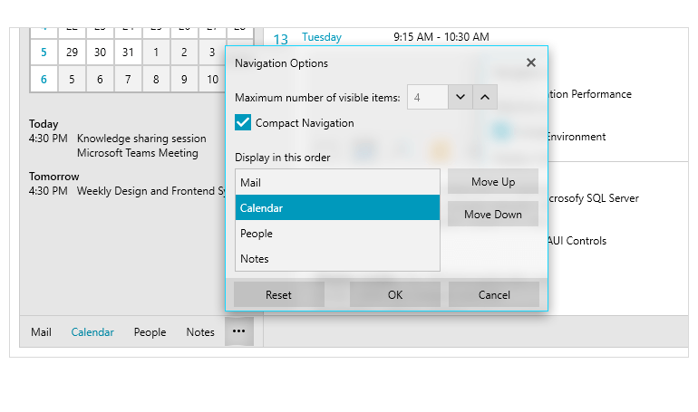
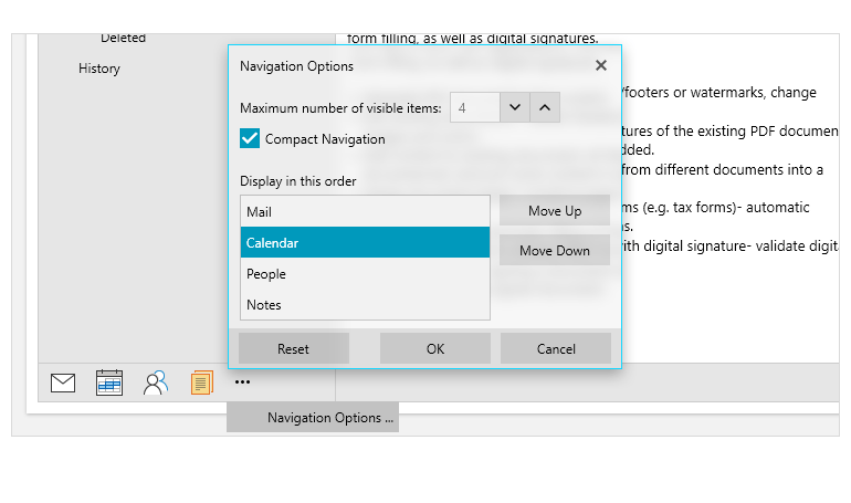
Navigation Options Window
The Navigation Options Dialog allows users to edit the number of visible navigation items, rearranging them and selecting between Compact or Full OfficeNavigationBar mode.
-
Drag and Drop
The fastest way to reorder the OfficeNavigationBar items is via the drag and drop feature.
-
Overflow Menu
Depending on the size of the control and the layout of the application, there may be cases where not all the control items are visible. The items that don’t fit the designated area will be automatically moved into the overflow menu. The user can access the menu by clicking the three dots and select an item from the overflowed list.
