
UI for WPF
WPF MultiColumnComboBox
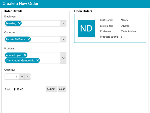
- The Telerik MultiColumnComboBox for WPF comes in handy when searching and selecting data from large multi-column data sets. It provides multiple selection and navigation options, different filtering functionalities as well as search auto complete features.
- Part of the Telerik UI for WPF library along with 165+ professionally-designed UI controls.
- Includes support, documentation, demos, virtual classrooms, Visual Studio Extensions and more!
-
Comprehensive Multi-Column ComboBox
The MultiColumnComboBox is a compound component, which is a combination of a few controls – Grid, DropDownButton and the WatermarkTextBox, enabling end-users to search and select data from a multi-column list faster and effortlessly, while saving real estate on the screen. Extreamly, useful for variety of input scenarios where the need to quickly find data in larger dataset exists.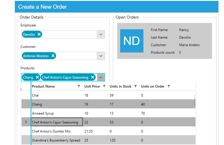
-
Various Selection and Navigation Modes
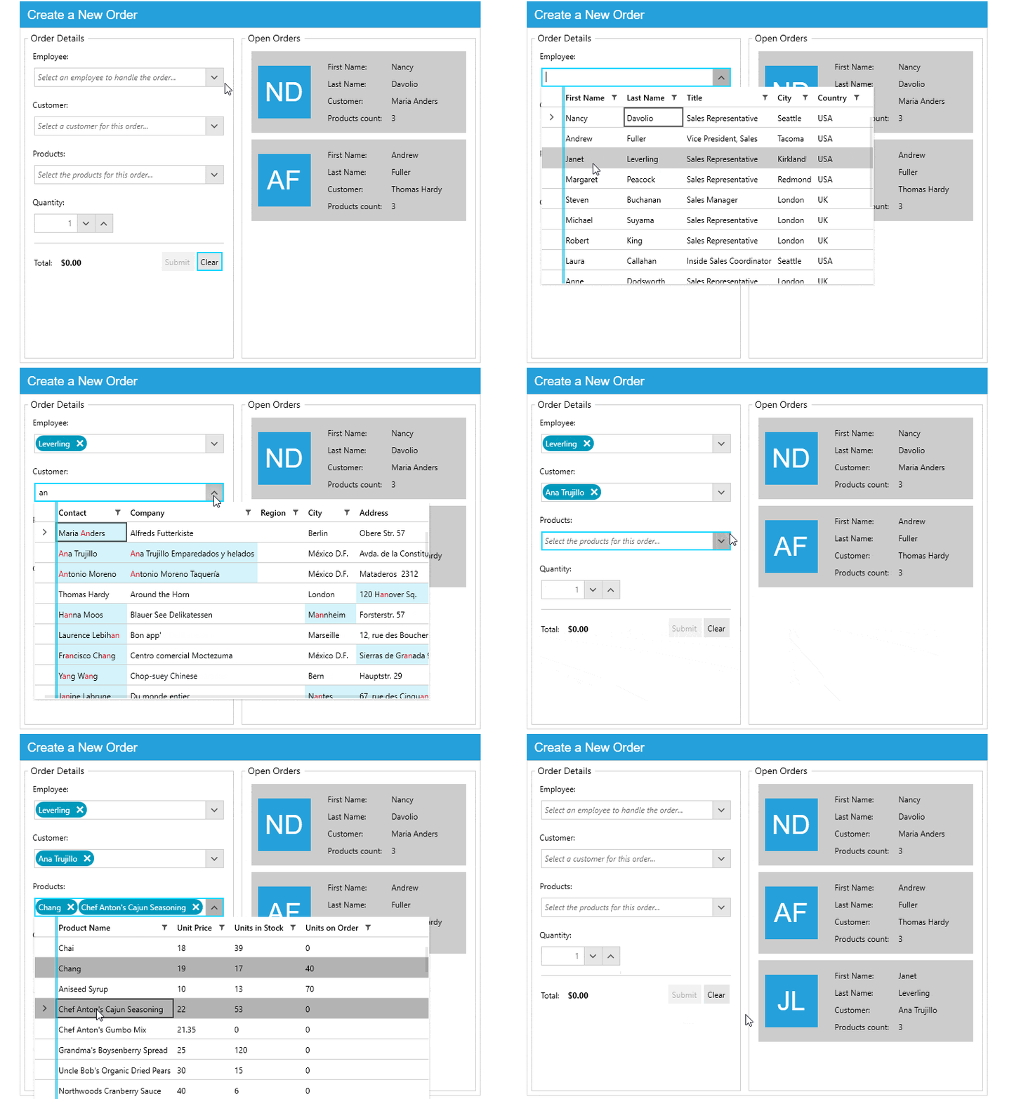
The MultiColumnComboBox in Telerik UI for WPF provides various selection (single, multiple, deselection) and navigation options to serve various business scenarios.
The control exposes the following properties and events for handling the user selection.
- SelectedItem: Gets or sets the data item that is selected.
- SelectedItems: Gets the data items that participate in the selection. It is useful in case multiple selection is used.
- SelectedValue: Gets or sets the selected property value.
- SelectedIndex: Gets or sets the index of the selected item.
- SelectedValuePath: Gets or sets the property path of the property used for the selected value.
-
Filtering
Having in mind that the “body” of the control features a Grid, you can easily filter each of the columns of the data set in order to narrow down the data to whatever the user searches for.
For more information visit the MultiColumnComboBox product documentation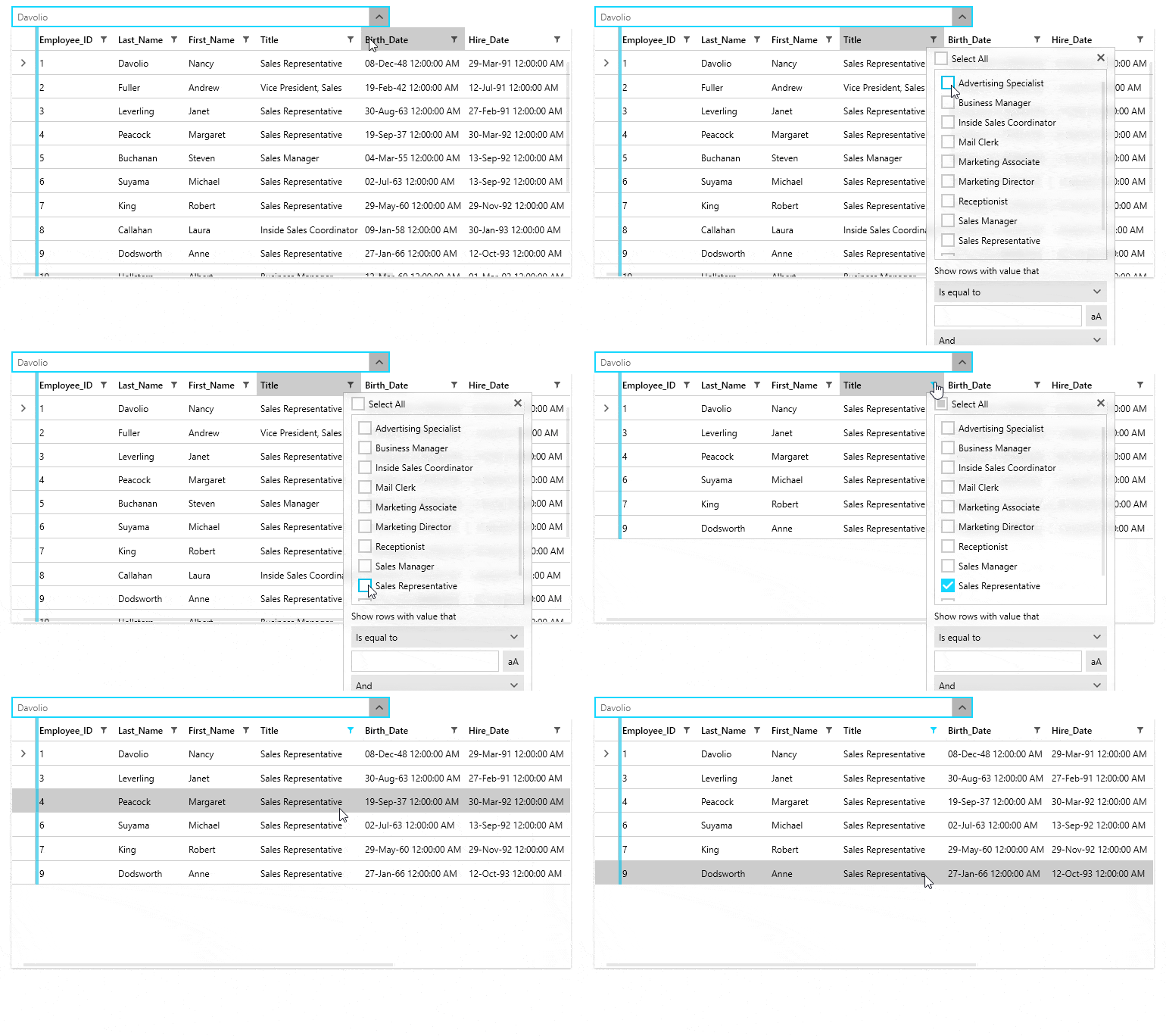
-
AutoComplete Search Support for Faster Data Manipulation
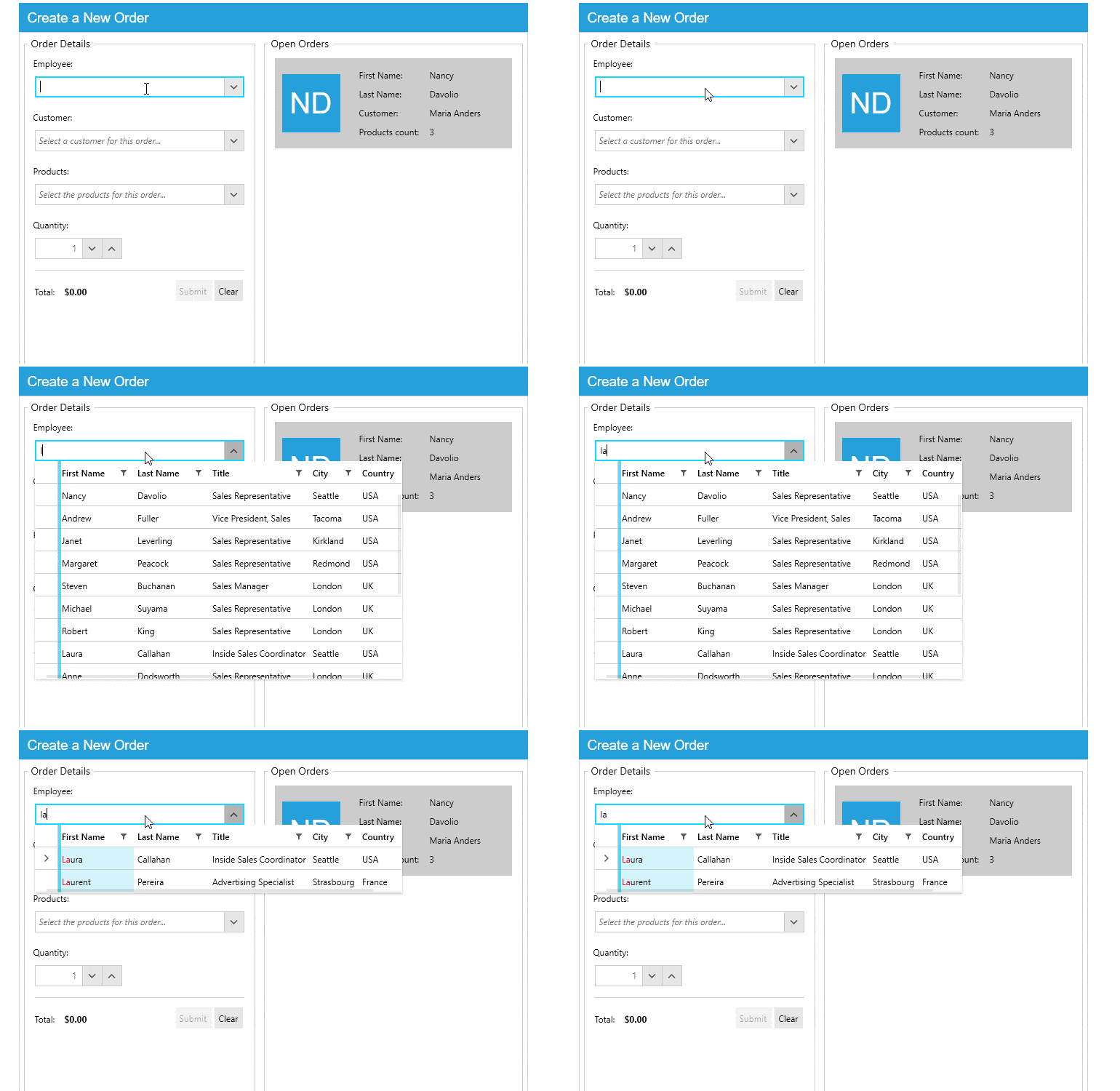
The control offers a built-in set of auto-complete options to facilitate searches through large datasets. The available options are:
- Append – Filters and Highlights the data
- Search – Filters the data, but does not provide suggestions
- Suggest – Both filters and provides suggestions for Data
- SuggestAppend – Filters, highlights and suggests
-
Appearance and Customization
The MultiColumnBox provides for a wide range of customizations and theming support out-of-the-box to adopt the UI of the control to the rest of your application.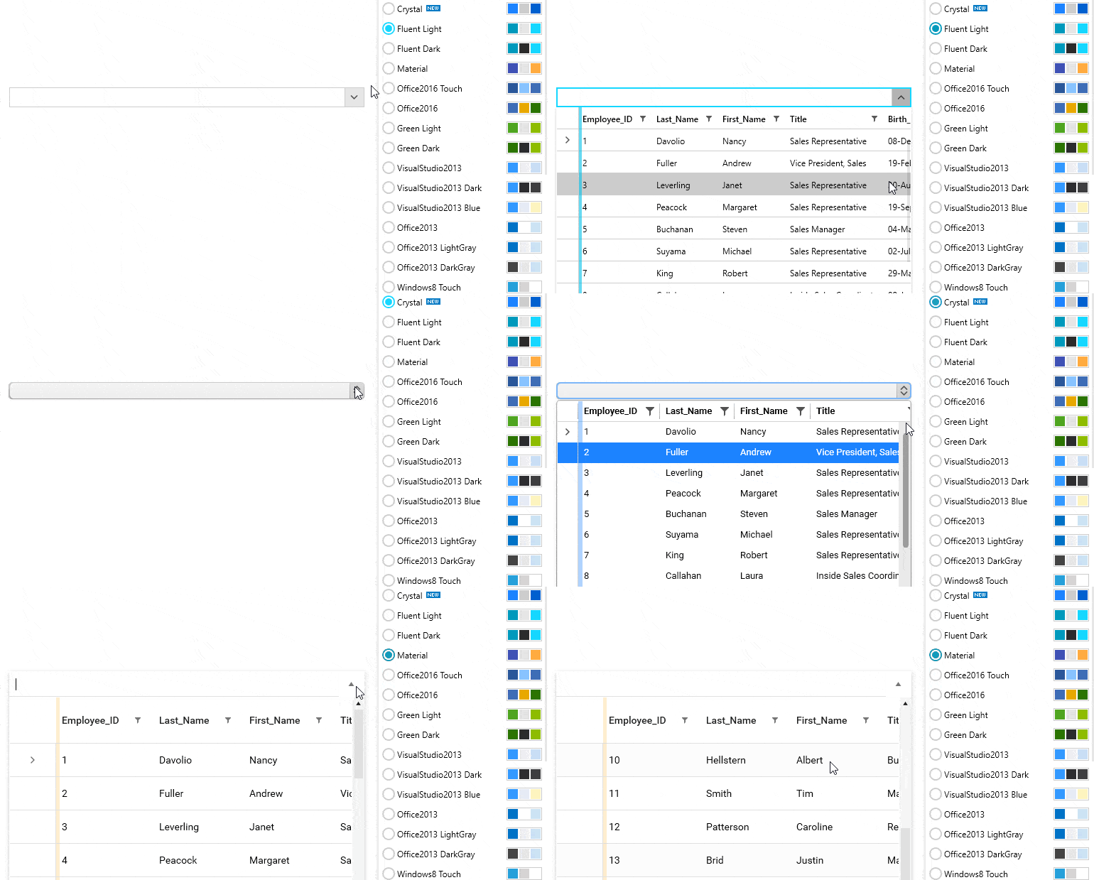
-
All the power of the Grid control
Since MultiColumnComboBox contains a full features GridView control in its popup, all of the grid features are available to populate and manipulate the dataset.
To see the robust data crawling and powerful analysis capabilities of the Telerik MultiColumnComboBox check out the WPF demos
All WPF Components
Data Management
Data Visualization
Scheduling
Layout
Navigation
- Speech-to-Text Button New
- SlideView
- PipsPager
- OfficeNavigationBar
- HyperlinkButton
- Callout
- Notify Icon
- TabbedWindow
- NavigationView
- RadialMenu
- ContextMenu
- TreeView
- ToolBar
- TabControl
- RibbonView
- PanelBar
- OutlookBar
- Menu
- Buttons
- Breadcrumb
Media
Editors
File Upload & Management
- File Dialogs
- SpreadStreamProcessing
- CloudUpload
- PdfProcessing
- SpreadProcessing
- WordsProcessing
- ZIP Library
Interactivity & UX
- HighlightTextBlock
- CircularProgressBar
- Virtual Keyboard
- StepProgressBar
- Badge Control
- Splash Screen
- Touch Manager
- Conversational UI
- DesktopAlert
- ToolTip
- ProgressBar
- PersistenceFramework
- BusyIndicator
- DragAndDrop
Navigation
Tools
Pdf Viewer
