UI for WPF
WPF Slider
- The Telerik WPF Slider is a flexible UI component that allows users to select a value from a defined range. The control is completely customizable in terms of appearance and offers numerous configuration options like orientation, small change, mouse wheel support, selection range, snap to tick, tick placement, tick template and more.
- Part of the Telerik UI for WPF library along with 165+ professionally-designed UI controls.
- Includes support, documentation, demos, virtual classrooms, Visual Studio Extensions and more!
-
Horizontal and Vertical Orientation
RadSlider is an easy addition for any numeric range-based feature because it is fully customizable and supports both vertical and horizontal orientation.

-
Single or Multiple Thumbs Support
RadSlider can be used for selecting a single value or a range of values thanks to its support for single or multiple thumbs.
-
Controllable Tick Frequency
The ability to control tick frequency and to snap to tick marks ensure you have complete control over values entered. -
Multiple Thumbs Support
Configure the slider to support multiple thumbs and enable the end users to control the values and ranges of their selection. The feature is packed with classes and properties that allow maximum flexibility when defining a value.
Classes and properties of the multiple thumbs feature for Telerik UI for WPF Slider control:
- SliderThumb class: represents a single thumb which can be dragged by the user and exposes a single Value property of type double.
- RangeSliderThumb class: represents a control with two draggable thumbs, as well as an extra thumb in between to drag the whole range. The class exposes properties such as the smallest and largest value of a specified range, minimum and maximum value distance, and more.
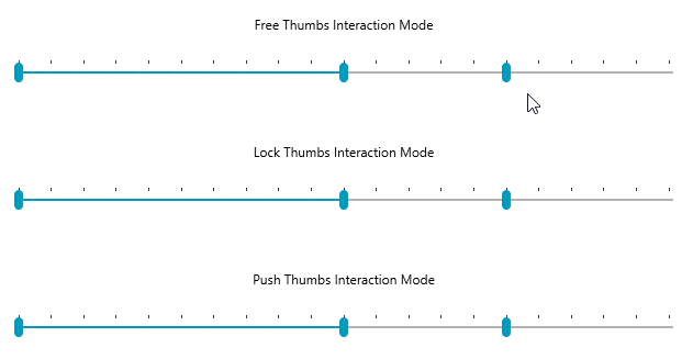
- InteractionMode property: control the action of the individual thumbs when they come in contact with another thumb. There are three different interaction modes: free (the active thumb interacts with the thumb in free mode), lock (when the active thumb interacts with a locked thumb), push (when the active thumb interacts with the other thumb in a push mode).
- ThumbStyle property: gives you the ability to apply a specific style only to a certain thumb.